
CTA buttons, also known as call to action buttons should be used on all your marketing materials. Whether you are opting for content marketing, email marketing, performance marketing, social media marketing, marketing via landing pages, websites, blogs or any such medium, adding clickable CTAs or hyperlinks will become very beneficial for you.

As against clickable texts, it was found that clickable CTA buttons improve the conversion rates significantly. This has made it a vital strategy for all marketing campaigns in this digital era. This article will take you through 28 Call to Action (CTA) examples for A/B testing.
What is Call to Action (CTA)?
Call to action is a marketing term that refers to the next step a marketer wants its audience or reader to take. It is hence a piece of content such as an image, button, form or text with the intention of prompting users to perform a specific action. These actions can be downloading something, filling up a form, signing up for a free trial, making a purchase and many such actions.
Call to action uses action verbs and is typically written as a command. For example, sign up, buy now, subscribe here, download from here, add to cart and so on.
Call to action is a key element in a webpage, as without it the user would not know what to do next. Considering it informs the potential customers what to do next, it helps in removing the friction of them moving down the sales funnel. Ultimately, this leads to higher conversions, increasing sales and profit margins.
What is A/B Testing?
A/B testing, also known as split testing refers to a randomized experimentation process wherein two or more versions of a variable (like web page, page element, etc) are shown to different segments of the website visitors at the same time to determine which version has the maximum impact, highest conversion rate and drives KPIs like marketing KPIs.
A/B testing helps in eliminating all the guesswork out of website optimization and enables proper optimization of the website based on the data derived from this testing. In A/B testing, A refers to the control of original testing variable whereas B refers to the variation or a new version of the original testing variable. The version that improves your business metrics is the winner, which when implemented on your website and its pages will help in optimizing your website and hence in increasing your returns on investment.
In case of call to actions, to which each audience responds differently, A/B testing helps in finding the one for each of your marketing campaigns that yields the highest conversion rate, or is seen the maximum number of times by your audience.
28 Call to Action Examples for A/B Testing
Newsletter CTAs
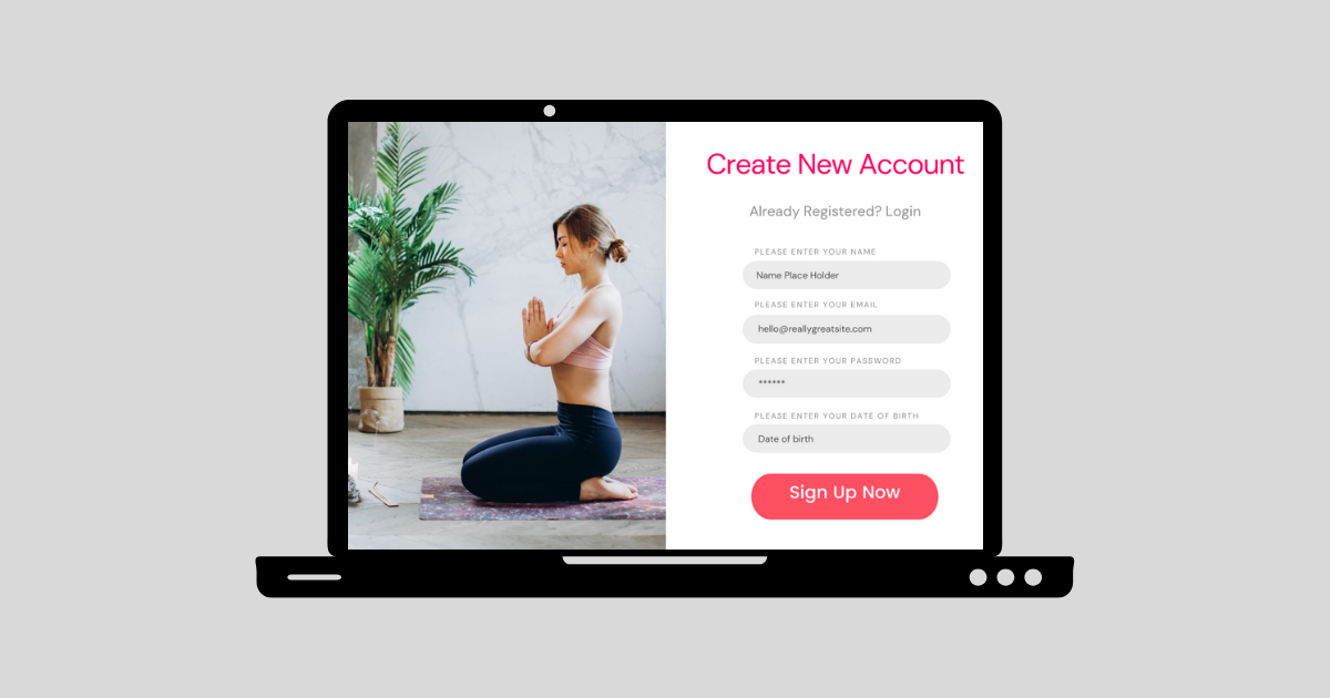
Call to Action Example 1
This call to action example is from Klientboost’s newsletter page, which was found to be the most successful as it is making its call to action state exactly what a user is doing.
Examples of such CTAs are:
- Get My Offer
- Redeem My Price
- Book My Demo
All of these are based on the exact action that will be happening once the user clicks on the CTA. In case of Klientboost, it does an amazing job of encouraging users to subscribe to their newsletter by the following ways:
- A well-designed pop-up
- Clear and Bold CTA
- CTA’s words are straight to the point
- The CTA button is in red, which satisfies the WCAG contrast ratio of at least 3:1 for graphics and user interface components. This contrast ratio makes your page aesthetic as well as convincing of undertaking the call to action.
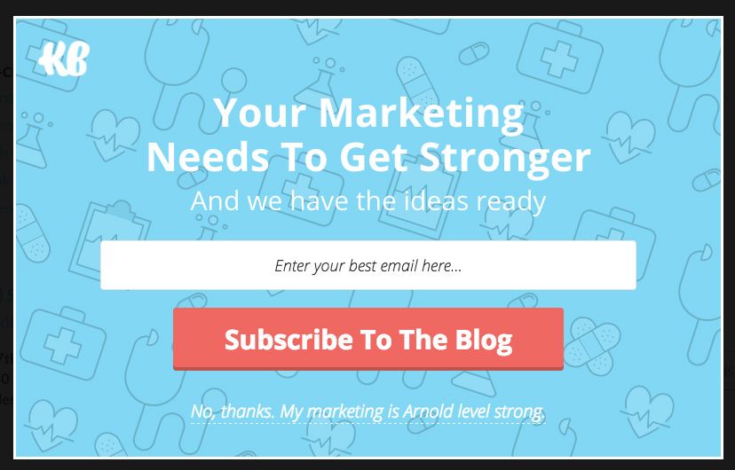
Call to Action Example 2
One of the biggest beginner’s mistakes that marketers are found to commit during designing their CTA’s is lack of contrast between the CTA and the page background. One of the rules for conversion rate optimization is that your CTA’s color should be in contrast to the background and everything around it.
This CTA example of Backlinko has ensured optimized conversion rate for itself by following these practices:
- CTA stands out boldly and commands the user's attention as it is red in color. On the entire page, red is not a color that is seen elsewhere.
- This contrast is so high that even if it did not have directional cues on what needs to be done, the red sign-up button will grab your attention sooner rather than later.
Call to Action Example 3
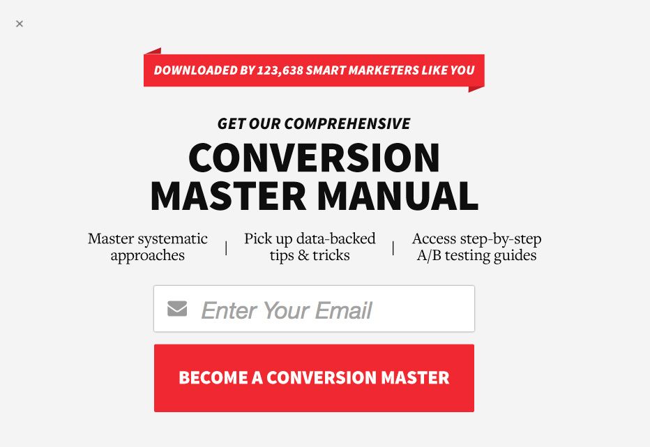
This call to action example of ConversionXl’s newsletter subscription is one of its kind because of the following:
- Its bold red CTA stands out from the rest of the page
- Inclusion of benefit oriented statements in the CTA text, i.e. “become a conversion master,” instead of simple CTAs like subscribe.
- As it has a benefit oriented statement already included, users will be primed for the value they will be receiving which will make them convert more.
- The CTA is also backed by statistics and a praise, “downloaded by 123,638 smart marketers like you,” wherein the statistics will help in winning trust of your visitors and the use of word “praise” will make them sign-up for the newsletter so that they are also a part of all the smart marketers who have already signed up.
The whole CTA plays on the customer’s and sales psychology which will lead to increase in conversion rate.
Call to Action Example 4
Choice of words and content positioning are important elements to get your CTAs to have higher conversion rates. In this call to action example,

The “free access” phrase for content upgrade was changed to “free lifetime access.” This will perform better in the A/B testing and hence should be used for your CTAs because:
- It increases the perceived value of your product
- Makes the content of the upgrade more exciting, which encourages higher conversion rates.
Product CTAs
Call to Action Example 5
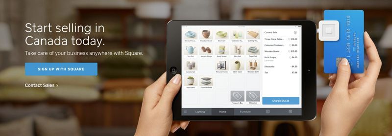
This call to action example follows all the best practices of CTA which are:
- Stating exactly what the CTA button will do
- While doing so, it is kept directly tied to the content page
The website as well as the CTA is designed such that it tells the visitors your core value proposition at just a glance. In this case, it is “start selling in Canada today,” which is followed by the simple yet appealing CTA named “sign up with square. The highlights of this example are:
- Quick communication to the users of square will be a beneficial app for them
- The CTA gives immediate steps in order to get started
- The colour contrast ratio is maintained to attract the audience
- Shows all the wide range of possible actions that you can take with the app
Call to Action Example 6
In order to avoid paradox of choice and make sure that multiple CTAs per page does not have a negative impact on your conversion rate and therefore your net sales, the best landing pages carrying CTAs tend to have only one focused CTAs for each segment of your audience. However, you can also have 2 CTAs in one page in order to serve multiple of your audiences. This call to action example has just that.
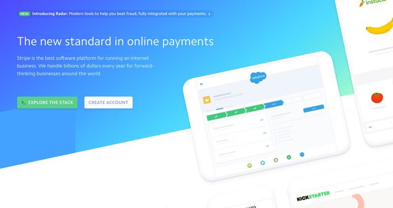
This is a screenshot of Stripe's homepage with 2 CTAs, one for allowing the users to explore their app in case they are still new to it, and another one for creating an account and getting a set-up. The benefit of these set of CTAs is:
- It allows you to learn more about your product as well as it allows you to get started
- Both the CTAs have different colors to highlight their different functions.
- The CTAs are using clear directional language, again differentiated as per their function.
- The language of the CTAs is such that it instills curiosity, which is also ensured by the presence of 2 CTAs side by side.
- It is easily accessible
Call to Action Example 7
One of the other methods of optimizing your conversion rates is by having your text headline and CTA copy together. This is especially useful in case of announcing special offers, launching a new product and for many such instances.
This call to action example, set on the offer landing page of Ancestry is a good example of the same because:
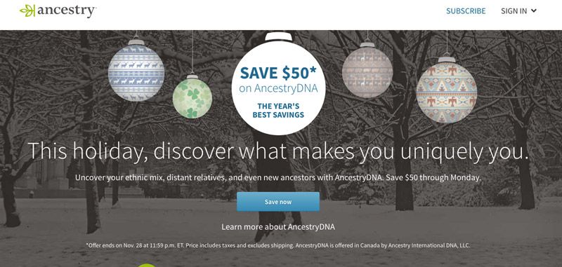
- The “save now” CTA helped them in reinforcing the discounts that they were offering. This can also be “notify me”, “remind me” and other such CTAs.
- The value that is being offered is being highlighted just above the CTA which ensures conversions.
- By mentioning the offer’s deadline, the CTA is creating a sense of urgency.
- By mentioning what is on offer, they are also increasing the crowd’s attraction towards it.
Call to Action Example 8
A call to action does not always have to be designed through landing page funnels or be super complicated. It can be as simple, yet as specific as this call to action example of feedly.
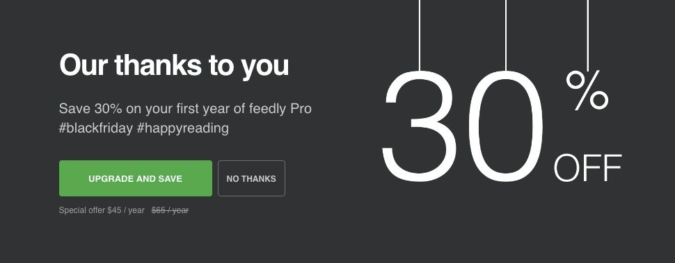
The highlights of this CTA are:
- It combines the dual benefits that it is offering- action of upgrading which will give the benefit of saving
- This double incentivizes the users to convert
- The CTA is hyper relevant to the page’s offer which ensures that your audience are not sent away due to irrelevant content
- The CTA button maintains the color contrast rules of 3:1 as given by WCAG which grabs the visitor's attention as soon as they land on the page.
- The original as well as the offer prices mentioned right below the CTA button highlights the benefits that your potential customers will be able to avail.
Call to Action Example 9
One of the important features to take care of while designing your CTAs are the surrounding areas. These surrounding areas will have a huge impact on how your CTAs will perform, and hence should optimize as well as support your CTA as done in this call to action example.
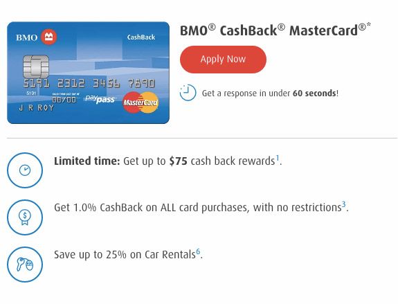
The highlights of this CTA are:
- The CTA is action oriented, by using the words “apply now”
- The CTA button follows the webpage contrast ratio as the background is white, with blue elements, but the CTA button is red in colour.
- It is focused on the specific product under consideration, and highlights its major benefits which will grab potential customers attention and increase the possibility of them converting.
- Under the CTA, there is a disclaimer which says, “get a response in under 60 seconds,” which will remove any objections that the users might have in regards to how long the application process takes.
- The usage of the word, “limited time” creates a sense of urgency and FOMO, which will make your users take immediate action.
- The highlight of “no restrictions” on cashback again serves the purpose of value addition for your users.
Things which can be added around the CTA to increase its effectiveness are:
- Product and service guarantees
- Company phone numbers
- Client testimonials
- Expected turnaround times
These too should be tested during A/B testing of your CTAs to see whether they are benefiting your business or not.
Call to Action Example 10
Essentially, CTAs need to be clear in giving their message as well as the direction that the users should take. Google drive’s call to action example is just this.
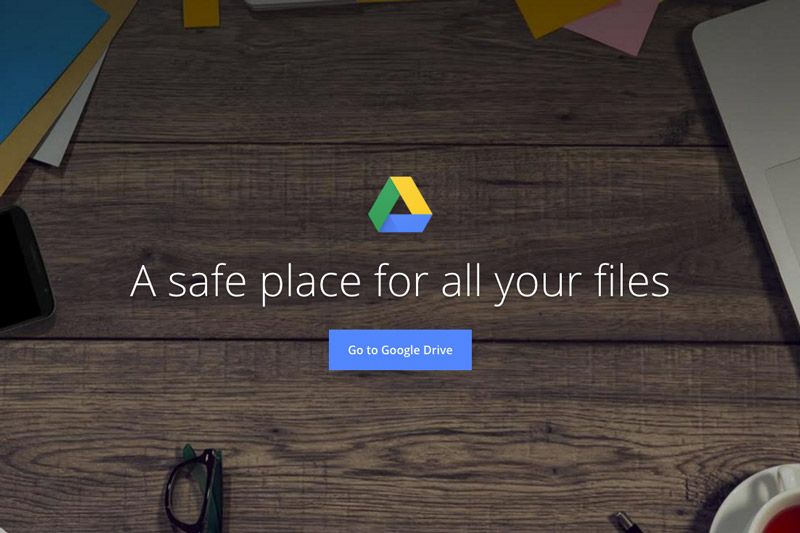
The highlights of this CTA are:
- A simple landing page to welcome users to google drive
- A clear benefit oriented headline- “a safe place for all your files.”
- An easy-to-follow CTA that says- “go to google drive”
- The CTA button is of a blue color that pops up the page and grabs your attention
- Skimmable text, which will reduce page abandonment and therefore increase conversions.
This call to action example is hence a very classy example of how even by having a simple headline, you can provide insights into the key benefits that your product or service offers. In fact, because this CTA is not wordy, it has an added benefit.
Call to Action Example 11
One of the other classy examples of a product CTA is Neil Patel’s blog on which he prompts his users to know more about his courses and consulting services.

The benefits of this call to action example are as follows:
- In comparison to “sign up” and “subscribe now,” “learn more” as a CTA is a low ask from any user. In fact, the user is more likely to move down your sales funnel through this CTA than the other CTAs.
- The CTA is of a good contrasting color.
- By presenting the CTA as an opportunity to find out more about him and his services, he has successfully reduced the friction and been able to drive more users to his subsequent landing pages.
- The testimonial by Alana Mitchell- a business wonder, in the form of “..... helped me grow my business by 300%” is something that will again win the trust of your audience, promote brand awareness and increase your conversion rates and therefore your future gross profits through increased sales.
Free Trials
Call to Action Example 12
A CTA should be one that is aimed at getting the highest conversions so that your sales increase, leading to an increase in your net profit. This call to action example is designed with this in mind.

The highlights of this CTA are:
- The CTA is present on its homepage, with a clear call to action to get users to sign up for free trial.
- It asks for a work email address as this is the one on which they are more likely to click on the email marketing links. Work email address is also considered to be less valuable than your personal email address, which makes it more likely to be given away.
- The CTA is clearly visible, with a proper contrast of colors and size of the button.
- Considering it is placed right on the homepage, with a clear direction of what will start when the user clicks on it, it reduces the chances of misconceptions and abandoning of the page.
- The CTA is supported by 2 lines of how the company’s product is better and how it will benefit you. The language used is authoritative and persuasive at the same time.
Call to Action Example 13
Pipedrive has a simple form that they have included at the bottom of their product pages to prompt the users to sign up for free trial. This call to action example is one of a kind because of the following reasons:
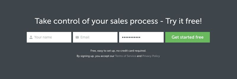
- The placement of the form is perfect. It is placed after all the product details that the potential customers would have gone through. This increases the chances of them wanting to convert, as well as once converted, they are high quality leads. The placement of the form, followed by the free trial is more likely to move them quicker down the sales funnel, along with proper lead management.
- The password field of the form comes with a typed out default password which can be edited if the users want to. This reduces their efforts of filling the form, and hence converting.
- The CTA used is “get started free” which is not only action oriented, but removes all the reservations towards signing up as it is for free.
- The CTA button color is distinguished from the rest of the page, which hence would not be missed by the users.
Call to Action Example 14
One of the rules of any website or blog content is that it should immediately answer a question that is asked. The benefit of using a question is that it grabs the attention of your users and makes them curious, hence increasing the time they will be spending on your page.
To lead this spent time towards a successful conversion, you have to put your CTA in the right manner. This call to action example shows one of the best ways to do it right.
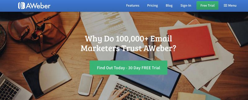
The highlights of this CTA are:
- Their headline, which has statistics, is also a question- “why do 100,000 email marketers trust AWeber?.” This engages the audience, builds their trust, and makes them want to find out more.
- The answer to the question is given in the subsequently following CTA- “find out today- 30 day free trial”
- The duo of headline and CTA is designed such that it shows the value it has to offer to its customers.
- The CTA button is massive, and in a contrasting color which makes it the focal point of the whole page.
Content Upgrades
Call to Action Example 15
CTAs are all about those little elements which improves your conversion rates, because it is these little elements which optimizes your CTA. This content upgrade call to action example from RazorSocial shows all of these elements.
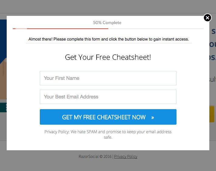
The highlights of this CTA are:
- Their form is short and yet includes all that would be needed for further conversion and further marketing.
- It has a clear and action oriented CTA pop-up in contrasting blue colour.
- “Get my free cheatsheet now,” is the CTA text, wherein “now” is successfully adding a sense of urgency which will definitely increase conversion rate.
- The small arrow on the right on the CTA also increases your conversion rate considerably.
Call to Action Example 16
The A/B testing of CTA will reveal to you what resonates with your audience. Incorporating these insights will benefit you a lot in increasing your conversion rate, reducing operating expenses as against your operating income and improving your cash flow. This call to action example by Marie Forleo incorporates this understanding in its CTA design, whose highlights are:
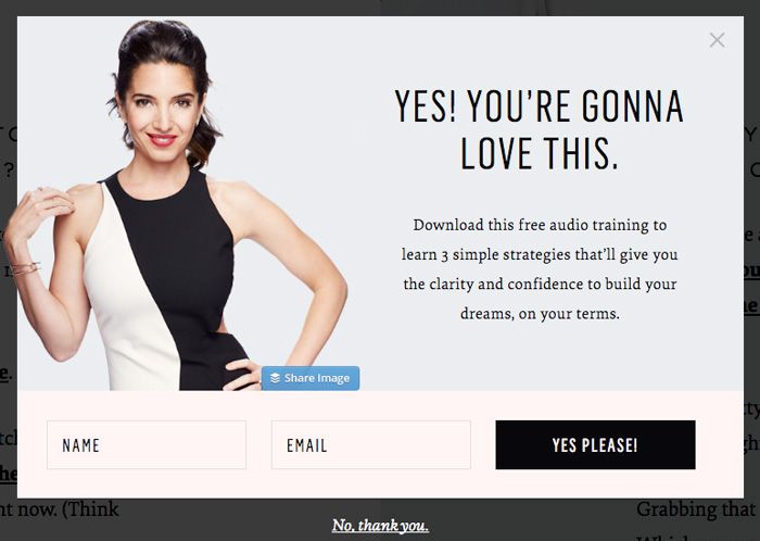
- Black and subtle CTA button, with the text “yes please” resonating with her audience.
- The CTA text and copy is in line with your brand voice as determined by your brand positioning statement.
- The strategies it offers are termed as “simple,” which adds even more value for the users, as they feel sure that after signing up it would be easy to benefit from the audio training course offered by them.
- The headline, “yes, you’re gonna love this!” begins the whole CTA on a very positive note which will have a positive impact on your conversion rates.
- The entire tone of the CTA pop-up is light, conversational, engaging and in line with their audience preferences.
Call to Action Example 17
Your CTA is often placed on a dedicated landing page. This has proven to be more effective in bringing conversions as well as in having higher quality leads. This call to action example has a full landing page that is offering a free excel template as a content upgrade.
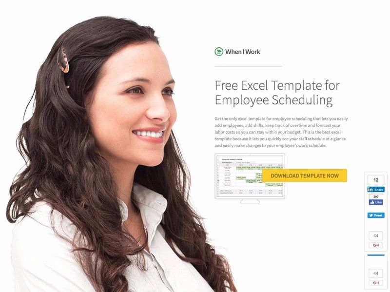
The highlights of this CTA are:
- The hero shot of the female is looking straight at the landing page headline, which ensures that is what you read first.
- From the headline, the user’s attention is automatically drawn towards the yellow CTA button- “download template now”
- The CTA button’s text is specific to the page, which hence shows what should the user expect on downloading as well as the value it has to offer. This will attract a more relevant audience, which in the end will lead to more sales and therefore a positive ratio in favor of operating income over operating expenses.
- Right above the CTA button, a brief paragraph is written on several features of the template that you can use for your benefit. This has the same benefit as discussed in the above highlight.
- There is a panel of social media sharing which shows how many have been sharing the template on linkedin, liking it on facebook and liking it on G+. It also has an option of tweeting it. This social panel will win the trust of your visitors and give the same benefit that a testimonial gives near the CTA button.
Call to Action Example 18
This call to action example is about having an eBook landing page targeting a specific persona and has done a great job of it.
The highlights of this CTA are:
- Have provided an example of the type of content that would be there in the book, which intrigues the readers further. This will lead to more form filling and hence conversions.
- The CTA text “get started” has proven to be one of the highest converting CTAs across all industries. Hence, if even in doubt, start with trying a “get started” CTA on your landing page.
- The CTA form is designed in a manner that it gives clear directions on what to do next and what is to be expected after “getting started.”
- Lastly, the CTA form and button color are the only blue block on the page, which hence grabs the first attention of the visitors.
- Supporting the first attention grabbed by the CTA form and button are the statistics which are shared in huge text. All of these are to keep the audience engaged, so that they do not abandon the page, leading to higher conversion rate.
Call to Action Example 19
The call to action example that will be discussed now has informal text, aesthetic colors and basically a CTA format and design that keeps its audience engaged.

The highlights of this CTA are:
- The CTA text, “yes, I want to grow faster” explains the key pain point that the user will be able to answer by downloading this guide.
- The whole page is designed such that your font is highlighted from its blue background, the green CTA button highlighted from its blue background and the yellow book grabbing attention and building curiosity.
- The color tone is subtle, calming and has a positive feel about it, which will have the same impact on your visitors, making them download the eBook.
- The CTA button is huge in size to attract the visitor’s attention towards it.
- The informal and lighthearted tone makes it a conversational read which will make the visitor engaged with it and even persuaded by it.
Webinars
Call to Action Example 20
This call to action example of a webinar is one of the best because of the following reasons:

The webinar page uses a good contrast between its CTA and the rest of the page.
- CTA text is underlined to show that it is a clickable link that is worth clicking.
- CTA text used is “reserve my seat,” which is one of the most popular CTA texts for webinars as they are more likely to perform well.
- The CTA text also creates a sense of immediacy, which will prompt your visitors to be immediate in signing up too and hence leading to higher conversion rates. Without that sense of immediacy, it is likely they will think a lot about it and leave the signing up for later, only to forget about it.
- The female model’s photograph used is widely smiling, friendly and open, which is the first perception you will have about the webinar, making it more likely that you will convert.
- The headline, “free live masterclass” are all words that are preferred for webinars. These are the kind of webinars that the audience is more likely to sign up for. The heading hence keeps your audience engaged and prompted towards converting.
- The headline is followed by the value that the webinar will provide to those who attend which is followed by a CTA button. This again increases the chances of conversions. Another benefit of this is that even if their visitors delay signing up for later, the benefits will not let them forget about the webinar.
Call to Action Example 21
Wistia tends to do an amazing job with its webinar landing pages. This call to action example is one of their amazing designs and formats.

The highlights of this CTA on its webinar landing page are:
- They used the same color for the headline, CTA and play button on the video to show to the visitors what is important on the page. All of these 3 elements of the page are highlighted and keep the users’ attention focused on them.
- The CTA text- “register for the webinar” is simple but explains well what it will do once clicked upon.
- All the details of the webinar are mentioned right above the CTA button, which hence means that with all the relevant details that they know about the webinar, they are more likely to register immediately if it's convenient for them. It also means that they would not be hampered from registering because the date, time and benefit of the webinar is not mentioned clearly and they are discouraged from going further the landing page funnel to find them out.
Call to Action Example 22
Adding CTA buttons on your landing pages, doing A/B testing on them and then observing the insights gained will help in optimizing your CTAs. This call to action example was designed by wishpond after such testing and is hence the best of its kind in webinar landing pages.
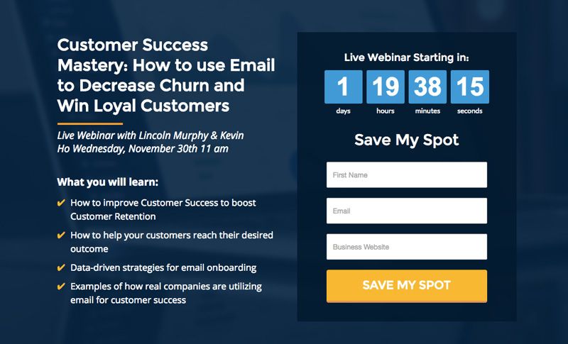
The highlights of this webinar CTA are:
- The CTA button in this webinar landing form is large, contrasting and is matching the text above the form. This emphasizes the purpose of the CTA and hence gives a reason for why someone should convert.
- The CTA text is “save my spot,” wherein “my” speaks to a user in first person. It has been found that using “my” in this manner has positively impacted overall conversion rates.
- The countdown to when the webinar starts is a way of creating a sense of urgency for registering and saving yourself a spot.
- Right beside the webinar signing up form and CTA button, all the relevant information about the webinar is revealed- including the values that it will have for the attendees. This helps in increasing the conversion rates too.
Charity
Call to Action Example 23
World Vision uses CTA’s that are simple and straight to the point. Its call to action examples are as shown below.
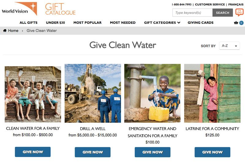
The highlights of its CTA are:
- With each CTA they have given the context of how the donors can help by donating. This context is given right above the CTA button.
- Along with the context, they have even shared the donation range that they are accepting. This detail is given right above the CTA button as well.
- Their CTA button in contrasting blue attracts the visitor’s attention.
- Their CTA button text, “donate now” does a great job of reinforcing the action that a user is about to take.
- They have included photos, communities of the people that the donors will most likely be helping by donating. These will give the donors a sense of personal connection which will increase conversion rates.
Call to Action Example 24
Unicef is one of the classy call to action examples in the charity domain. Unicef accepts donations to help children around the world and this is an image of their homepage. This example also highlights the difference between one’s homepage and landing page and how they should be used for placing CTAs.
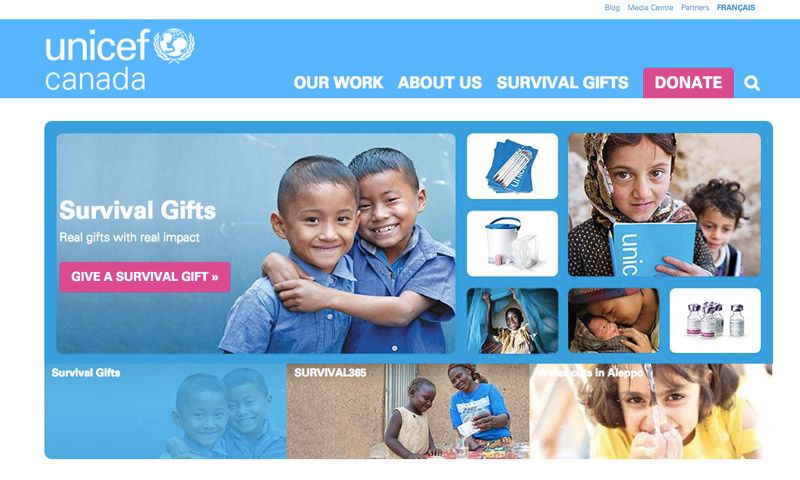
The highlights of these CTAs are:
- They have 2 main CTAs on the page, with the same color, but different text. The one on the right is generic with the CTA text being “donate,” while the one in the below, towards left is a specific CTA with the text being- “give a survival gift.”
- The CTAs are kept consistent on the page by having the same color, but it is prompting users for specific action by having different CTA texts.
- The CTA buttons are of a contrasting pink color, and the addition of children portraits will only add on to the emotional value that the donation holds. This will hence increase the conversion rate.
Demos
Call to Action Example 25
In designing demo CTAs, one of the most important things to take care of is that your headline text is aligned with your CTA text. This makes it clear what exactly the user would be doing when they sign up and can hence help in reducing friction on the page. This call to action example from Deskera books follows this.
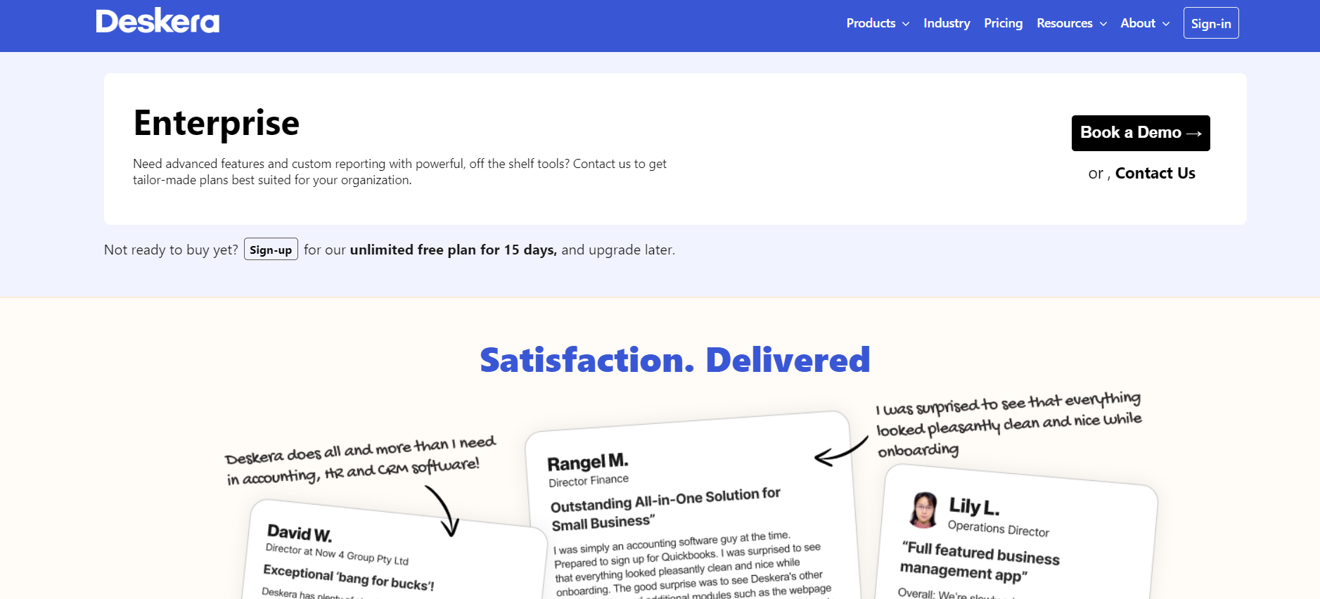
The main highlights of this CTA are:
- There is a common use of the phrase “contact us” in the CTA text as well as the details paragraph written below the headline.
- The CTA button is in a contrasting black color.
- The CTA button is followed by testimonials, which ensures that even if your visitor has not signed up for a trial or demo earlier, by reading the testimonials they might. Having the CTA and testimonials so close has the benefit that your potential customers will have to just scroll up to convert. This placement reduces the chances of delaying it for later or forgetting to convert, which would have been likely had the testimonials and CTA not placed close to each other.
- It is quite possible that your potential customers are reluctant to take a demo, and would rather first like to try the software by themselves. By having a sign-up CTA right below the book a demo will ensure at least one type of conversion by your potential customers.
- The sign-up CTA is followed by “you can upgrade later” which is prompting the customers to upgrade later once their free trial ends.
- Both the CTAs, once carried out, will not only give high quality leads, but also lead to winning customer loyalty and encourage returning customers.
Facebook Ad, Instagram Ad and Emails
The key to writing good social media CTAs are:
- Using strong action words
- Provoke emotion or enthusiasm
- Get creative and make up your own call to actions
Call to Action Example 26
Babbel is a language learning app, whose facebook CTAs are exceptionally good at what they are supposed to do.

The highlights of this facebook call to action example are:
- It quickly establishes a trust factor- “over 500,000 5 star reviews.”
- The primary call to action is clear and direct- “get upto 60% off.”
- They have a “get offer” CTA button to instill a sense of gratification in the audience.
- Including the word “join” in the description lines, which also has the number of reviews in the same sentence, evokes a feeling of belonging with the community.
- “Lifetime access” guarantees that your visitors will not skip the Facebook ad CTA easily, and will skim through the whole of it. This increases the probability of them converting.
- The CTA text uses the word “experts” which again gives a sense of having access to something that is best in the class, making the users convert more.
- They have used beautiful, contrasting colors with a CTA that stands out.
Call to Action Example 27
Headspace is that perfect call to action example of custom-made CTA.
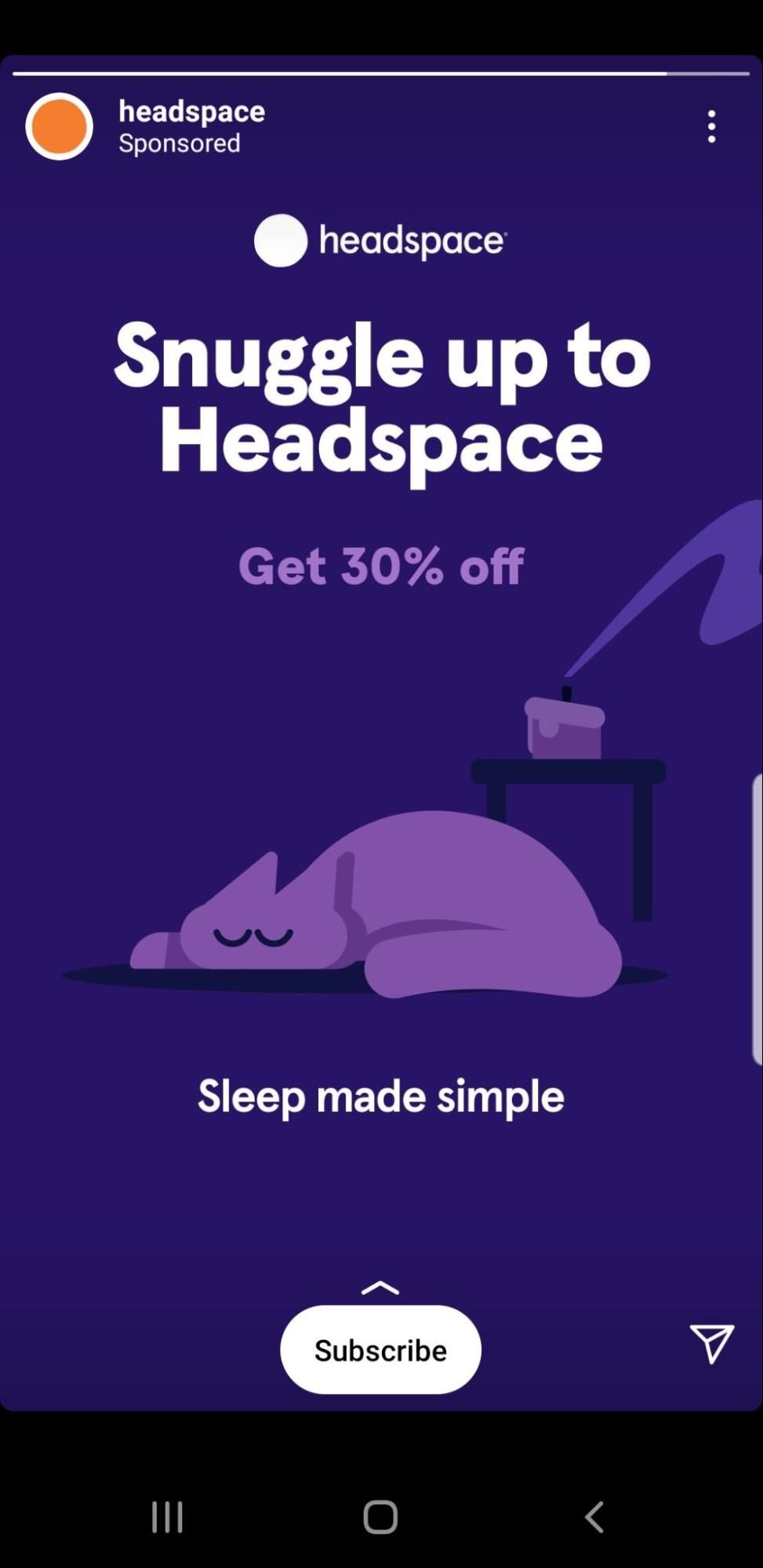
The highlights of this instagram ad CTA are:
- “Snuggle up to headspace” evokes a cozy feeling in users and personalizes the brand.
- Words like “snuggle” fit into sensory words, which are more likely to increase conversions as now the viewers of the ad have a sensory connection to the ad.
- They are opting to draw the attention from the custom-made CTA, and leave the “Get 30% off” as a secondary CTA.
- They use the “subscribe” CTA button after that to show how that snuggling up will be made possible.
- Coupled with the sweet, serene image, the whole CTA experience feels more like a gentle nudge for meditation and less like an ad.
Call to Action Example 28
Juvia’s place uses the best email CTA practices, as used especially by the beauty companies. This highlight of this email call to action example are:
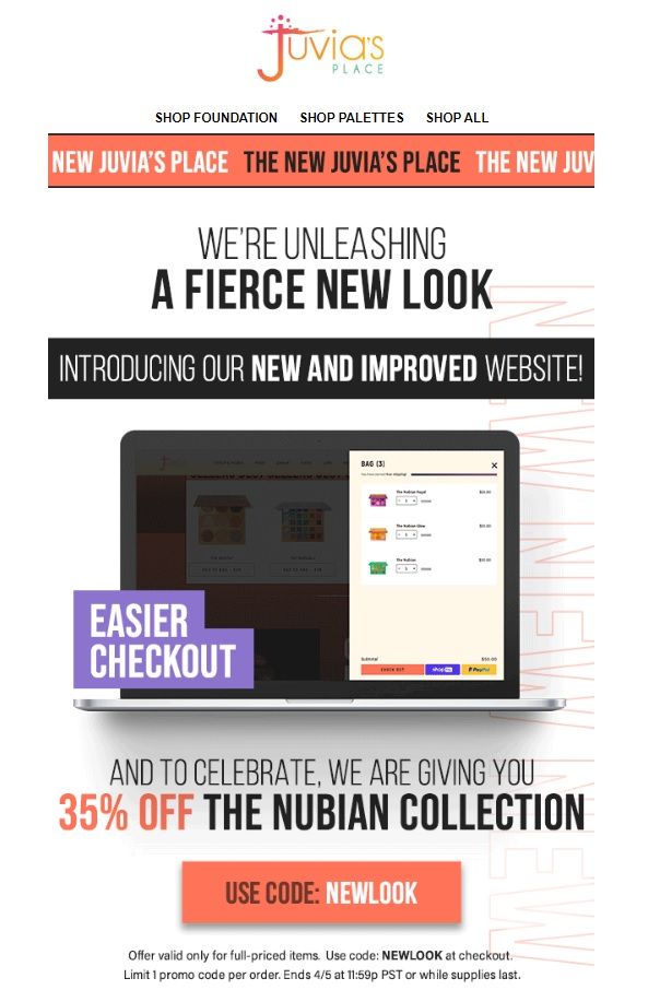
- Big, bright colours and magazine-like layout.
- The main button CTA- “use code NEWLOOK” is an excellent example of how eCommerce companies can customize their CTA strategies and attract more crowds, urging them to directly jump to shop.
- The disclaimer of end time or till when supplies last at the bottom of the CTA ensures that a sense of urgency and FOMO is created which makes the users convert more.
- All the main information is written in orange to make it stand out to the visitors.
- It mentions one of the most attractive benefits of the newly designed website, like “Easier checkout,” which will make you want to check their page out and not deter you from doing so because you are skeptical of getting stuck with long checkout processes.
In such a long email format, there could have been secondary CTA buttons as these are observed to improve the conversion rates.
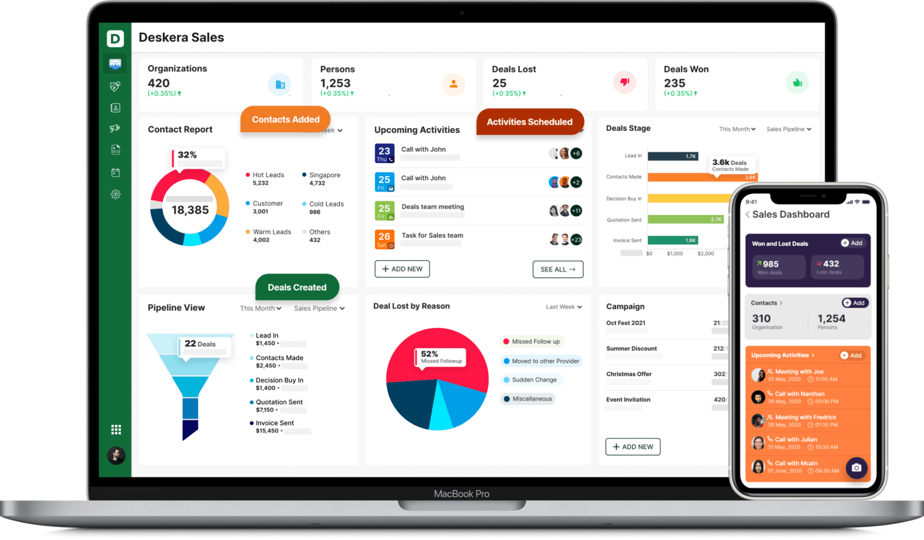
How Can Deskera Assist You With Optimizing Your Marketing Materials?
Deskera is one of the best softwares that facilitates the designing and management of your marketing materials. It allows you to automate your marketing campaigns like, for example, email marketing campaigns. Deskera in fact comes with email marketing templates, which ensures that your marketing campaign is optimized along with your CTA included in it.
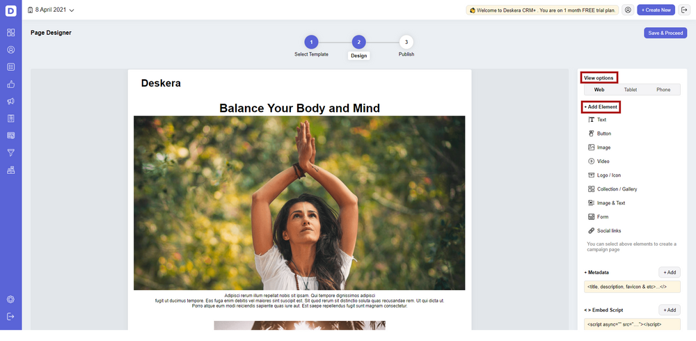
In fact, for optimizing landing pages and their CTAs, you can use Deskera CRM+ which allows customized designing of your landing pages if you do not want to use the already provided templates.
The Deskera dashboard provides all the insights you will need to optimize your CTAs. Whether it is insights on the number of audience visiting the page, number of CTA clicks, number of CTA abandonments or number of conversions, Deskera has it all sorted out for you. Hence, Deskera will help you keep a track of all your business KPIs and your marketing KPIs, hence enabling you to figure out your marketing attribution.
Additionally, Deskera CRM+ also lets you customize your CTAs and take them through A/B testing to find out what works best for you and your business. It is here that you can incorporate the understanding from the insights gained earlier. Deskera CRM software has contacts and deal management through which you can make your customized marketing funnel, sales pipeline and landing pages funnel.
This CRM software also stores all your contacts, along with every relevant information that you have about them in one place. This allows you to design personalized marketing strategies for them.
Additionally, every business needs to keep a track of its financial statements like income statement, profit and loss statement, cash flow statement and balance sheet to know about its budget, cash at hand, its performance and what it needs to do next. Deskera books is of assistance here.
Key Takeaways
CTAs are included in the marketing material with the main purpose of increasing conversion rates, generating leads of potential customers, and moving them towards the final purchase of the goods or services.
CTAs are also aimed at winning your potential customer’s trust and attention by giving them useful content or offers. CTAs are important throughout the buyer’s journey- whether a new buyer or an old one, it helps in improving the customer retention.
Based on the industry, the medium and your business objectives, CTAs will differentiate. Finding the best combination for yourself is made possible through A/B testing of your CTAs, the insights gained from which will help in their optimization.
However, the basics of CTAs like, using CTA buttons, using contrasting colours, have the value mentioned, create a sense of urgency or connection, using simple yet engaging language and having a clear direction given for your users is applicable across every CTA irrespective of the industry or any other such determining factors.
Using CTAs is hence an art that is constantly evolving and needs to be mastered to reap the highest benefits.
Related Articles