
As a result of the pandemic, there has been a surge in software applications to help people connect, work, study, and play. Customers of SaaS services now have more options than ever before. How can you condense the highlights of such complicated items into crisp, trustworthy SaaS landing pages that convert?

During the pandemic, the number of Zoom meeting attendees increased from 10 million in December 2019 to 300 million in April 2020, with 125,000 school systems worldwide utilizing the platform to reach children who were unable to attend school. Overall, businesses that use the cloud are thriving: The sector is now worth $2 trillion, according to Bessemer Venture Partners, with the top five providers—PayPal, Adobe, Shopify, and Zoom—achieving a combined 70 percent rise in value year-over-year.
Consumer SaaS solutions are appealing since you don't have to buy them; you merely subscribe to them. Although apps are available, people can use a web browser and access many services. They're usually less expensive than upfront purchases because you only pay for what you use.
If you are looking forward to understanding the art of creating winning landing pages, we have got you covered. We will discuss the key aspects of SaaS landing pages and illustrate it with the following examples:
- Lumosity
- Typeform
- Adobe Creative Cloud
- GitHub
- DocuSign
- Animoto
- Shopify
- Khan Academy
- Breather
- Hootsuite
- Wix
- HelloSign
- Unbounce
- MailChimp
- Evernote
- Deskera
- Webflow
- Vimeo
- Moderne
- dropbox
- Crazyegg
- Edupath
- Muck Rack
- Analpan
- Domo
- Marketo
- Witista
- Uberflip
- Kissmetrics
What are the Key elements of SaaS Landing Pages?
However, software services are challenging to describe in a few words and images, let alone sell. Customers may be more knowledgeable than they were a year ago, but they are still novices. The value proposition of a particular software solution might be complicated. A landing page must strike the proper mix between offering enough information to get the client to click while neither overwhelming nor tedious.
Because software services exist to assist consumers in doing things better or more simply, your objective is to communicate that messaging as effectively as possible. You'll reach out to your consumers more successfully if you utilize a user-centered design strategy.
Before you begin developing your landing page, take some time to consider who your target audience is. Consider the following inquiries:
- What are the demographics of your target audience?
- What is the issue or need that your tool solves?
- What distinguishes your value offer from the competition?
- What aspect of the product or service will you communicate visually? What is the most significant product element to highlight, whether it's a SaaS app or tool?
- What are the most common blocks for the ordinary visitor? Consider all of the possible reasons why a user would not convert.
The better you understand your audience's requirements and goals, the more effective you'll be at persuading them to take the necessary action, whether it's purchasing right now, arranging a demo, or providing their personal information for a bespoke quotation.
SaaS Landing Pages Examples
Whether you're utilizing a landing page template or starting from scratch, it's critical to follow these best practices when creating your landing page, so here's a list of essentials:
- Make your CTA the center of attention.
- Use eye-catching graphics.
- Reduce the size of the scroll.
- Know your audience.
- Remove all other modes of navigation.
- Make a memorable experience.
- Make sure your website is mobile-friendly.
- Keep your message simple.
- Keep your text to a minimum.
- Put your data in a logical order.
- Make your header stand out.
- Include social media sharing.
- Make use of video.
- Make sure your brand is visible.
Let's look at a few examples to understand better.
#1 Lumosity
All of Lumosity's acquisition efforts aim to funnel consumers to two locations: the front page of the website and the app store download pages. Two key aspects stand out:
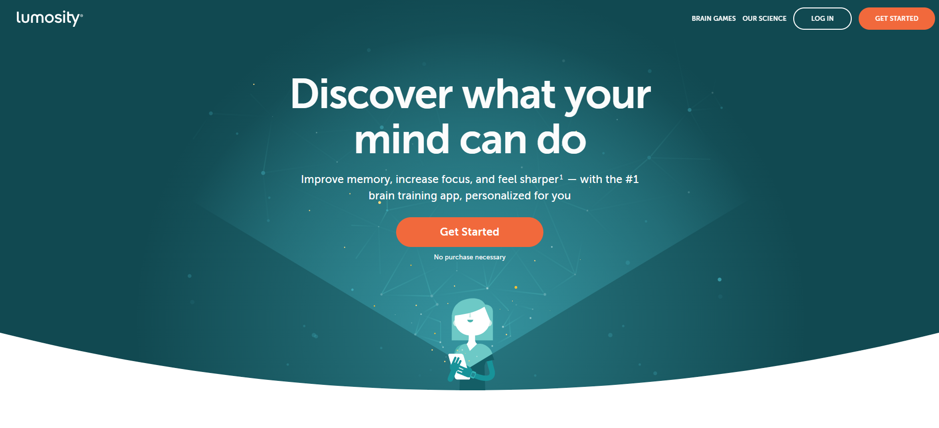
Firstly, four of the five subject sections on this page are science-related. Lumosity is a company that tests concepts rather than changes, and they tried the principle that emphasizes science leads to subscriptions in this variation. It appears that it does.
Secondly, aggressive funneling is a highlight. You'll have to visit the page to see this, but practically every piece on it points to the same place: the beginning of their onboarding process. Do you want to learn more about co-founder Mike Scanlon? Onboarding. Are you interested in learning more about the "prestigious research network" or the "40+ scientific games"? Onboarding. Do you want to "get started"? Onboarding is a positive thing. Lumosity has a simple goal: to guide people through the onboarding process.
So there you have it: an onboarding flow that is unusually well-executed and has at least one brilliant moment.
What can we take away from this?
The simpler, the better. When you need to build an unfamiliar context, adding extra complexity to the flow might sometimes be a net benefit. Ensure that you are aware of your user's psychological condition at the time and that the burden is proportional to her level of commitment.
Optimize based on principle. Consider the deeper psychological and motivational dynamics at play while the user navigates your flow. As a result, you'll get much helpful information you may use in other aspects of your product. Climbing hills isn't the only thing you should do. Alternatively, you could end up stranded at a local maximum. Include a hunger for extreme, principle-driven experimentation in your testing program.
#2 LinkedIn
LinkedIn is a networking social media platform designed primarily for professionals and businesses. This landing page is for companies wishing to advertise on LinkedIn to reach new clientele. It has a fixed menu with a call-to-action that is visible regardless of where you navigate.
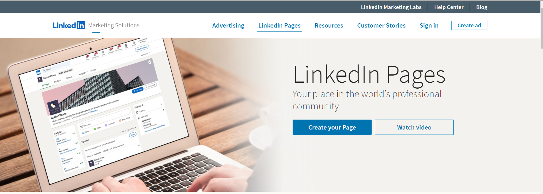
The first fold features the familiar LinkedIn logo, but with a more technical term, 'Business Solutions,' a straightforward headline, and not one, but two CTAs urging the same action: publishing an ad. The landing page then details why you should use LinkedIn ads, including some excellent statistics.
A fixed menu containing the logo and CTA (the menu stays in the exact location as you scroll) helps the landing page reiterate the call to action. It is because the call-to-action is always visible, no matter where you are on their page.
#3 Typeform
One of the top ten SaaS UX designs is Typeform. The website is unique and sticks out while maintaining a simple style that allows the message to be conveyed fast and effectively.
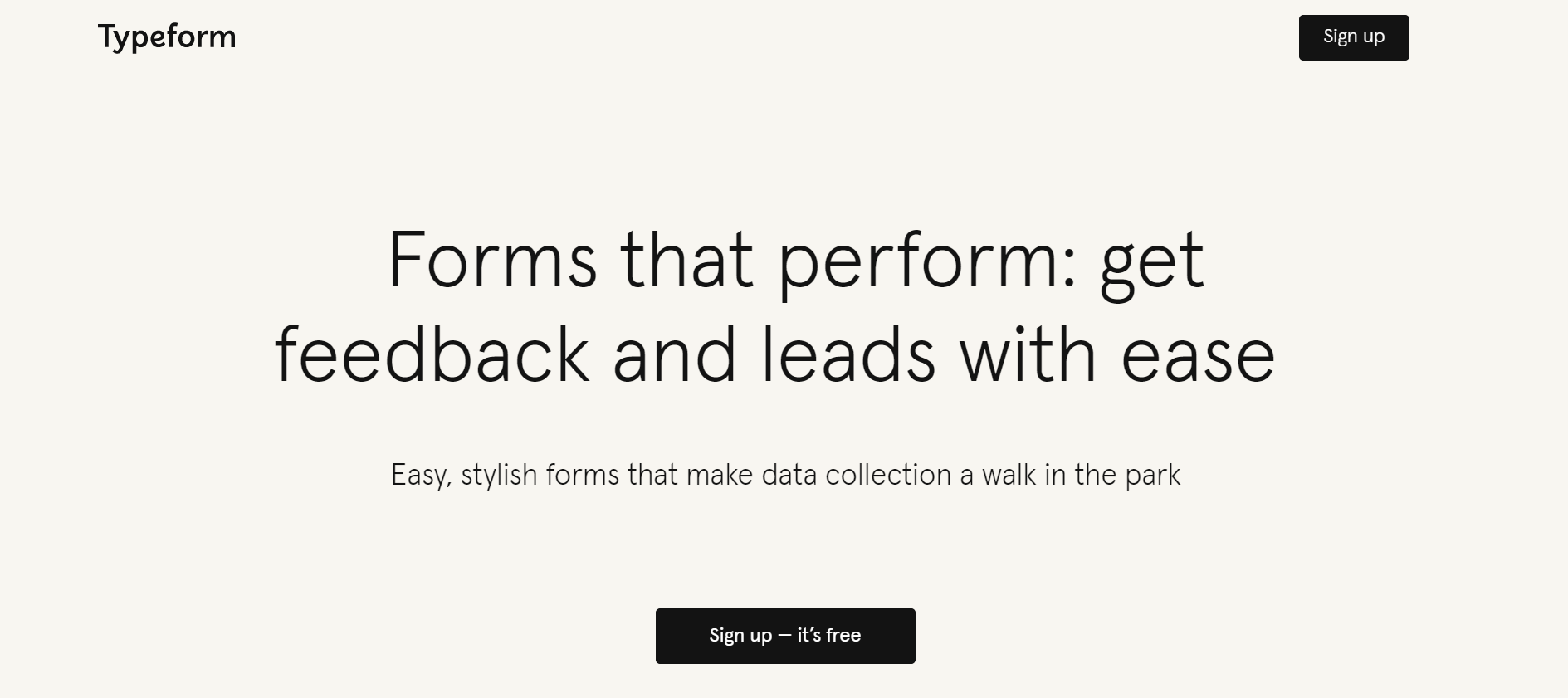
We can quickly determine what the service delivers when we visit the landing page. It allows you to make online forms and surveys. We can also sign up for free or view samples by clicking on a button. It's also worth noting that the purpose of the CTA is to attract users to "Sign Up" or "Try it for Free," which stand out aesthetically among the other CTA buttons.
The navigation is very straightforward, making it easier to navigate the site. Any SaaS design should contain these characteristics.
#4 Adobe Creative Cloud
Adobe, the computer software provider, has a photography plan for photographers who use Photoshop and Lightroom. For people who are interested in photo editing, it is a great deal.
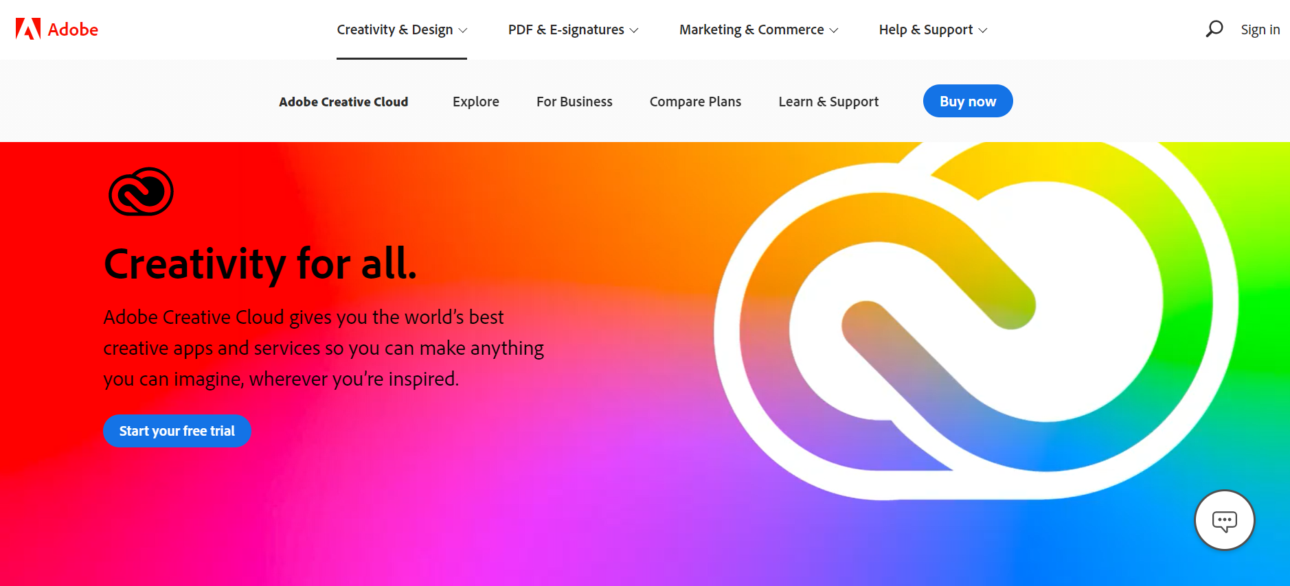
This SaaS landing page enables prospects to learn more about Photoshop and Lightroom independently, in addition to referring them to price sites.
- Examine the plan's inclusions and learn more about each app.
- Answers to frequently asked questions can be found here.
- In linked articles, you can find photography advice.
The entire page was designed with photographers in mind. Each CTA on this website directs the visitor to relevant and intriguing content, prompting further exploration and, eventually, purchase.
To summarise, if your purpose is to prepare the reader for the next step in their buying journey, a click-through landing is a good solution.
It's time to move on to the following SaaS landing page template if you want to collect contact information from visitors to your SaaS websites for lead generation campaigns.
#5 GitHub
We swear we're not attempting to create a theme here, but this is the ultimate example of a long, scrolling landing page/home page combination that works despite its problems. It's a lot of data. There are numerous ways to get distracted. It's also quite lengthy. However, it's a complicated and extensive product, and failing to cover many of these aspects would discourage most visitors from joining up in the first place. After all, if the service will solve multiple facets of your business processes—especially if they're complicated—you'll want to comprehend it fully.
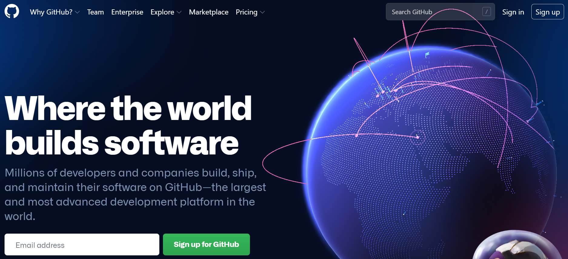
Visitors have two choices: they can explore, or they can sign up. A balanced navigation bar including Pricing, Marketplace, and a Sign-up CTA says it all. Even though the first form visitors see is straightforward and to the point, anyone ready to commit will undoubtedly require additional information. And, even though this page is long and wordy, it does an excellent job of enabling straightforward navigation for anyone who wants to learn more about the offering's possibilities, making exploration an essential part of the conversion process.
What can we take away from this?
- Robust features: It's one thing to provide the correct information and use intuitive navigation. But the fact that an attractive pricing breakdown with CTAs is anchored at the bottom of every page showcases that GitHub still knows how to get to business and reinforces the fact that all the information they just consumed would be better understood once they try it out.
- Excellent execution: Even though the site has half a novel's worth of content, the individual page designs and breakouts rarely induce fatigue. There's a good mix of writing and visuals, explanations and example photos, and plenty of white space.
#6 Muck Rack
Everything is included in this landing page design. It's visually appealing and dynamic, with scannable yet descriptive headers regarding Muck Rack's services and social proof in the form of quotes from industry experts. Furthermore, the page is user-friendly and straightforward to navigate.
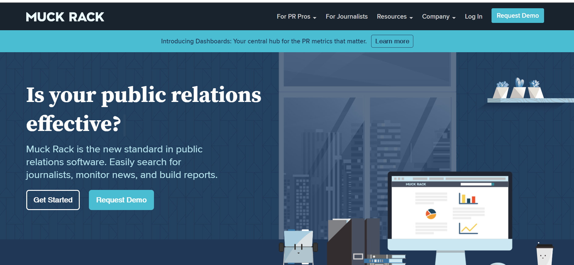
This landing page is unique in that it may appeal to both Muck Rack's audiences. The top of the page is divided into two sections, displaying their two services side by side. When a visitor hovers their mouse over the "find journalists" or "create free portfolio" CTAs, a straightforward form emerges — which is necessary so that the user doesn't get distracted from the work at hand.
#7 Anaplan
Anaplan's landing page is primarily made up of a few simple but powerful features. Good wording, a simple form that appears as soon as you click the sample request button, and a brief explanation of how and why Anaplan works. The additional pages, on the other hand, contribute to the flywheel's strength.
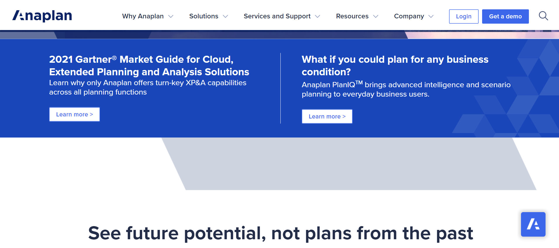
Scrolling through these two sections, in particular, will take you to a well-designed area of social proof where you can click through to see or read case studies of people who have also had success with their solutions. But the two buttons that follow you at the bottom of your browser window are just as important: Request a demo and get in touch with us.
This allows the user to browse the site, contact the proof and explanations they need to evaluate if it's a good fit, and then proceed to the next step right away. You can even switch between clients without losing those two buttons—or, in Anaplan's opinion, focusing on transitioning from theory to practice.
What can we take away from this?
Color use: You can't miss the bright pink CTAs that direct you to the next step in the process, whether you're on the main landing page or not.
Individual websites seldom, if ever, link readers to any parts other than social proof/success stories, limiting distractions when absorbing content or going onto the demo stage.
#8 DocuSign
DocuSign goes above and above with their social proof by integrating video material alongside the testimonial. Video is considerably more entertaining for consumers than text content, and seeing actual people discuss the product will almost certainly increase the user's trust in purchasing it.
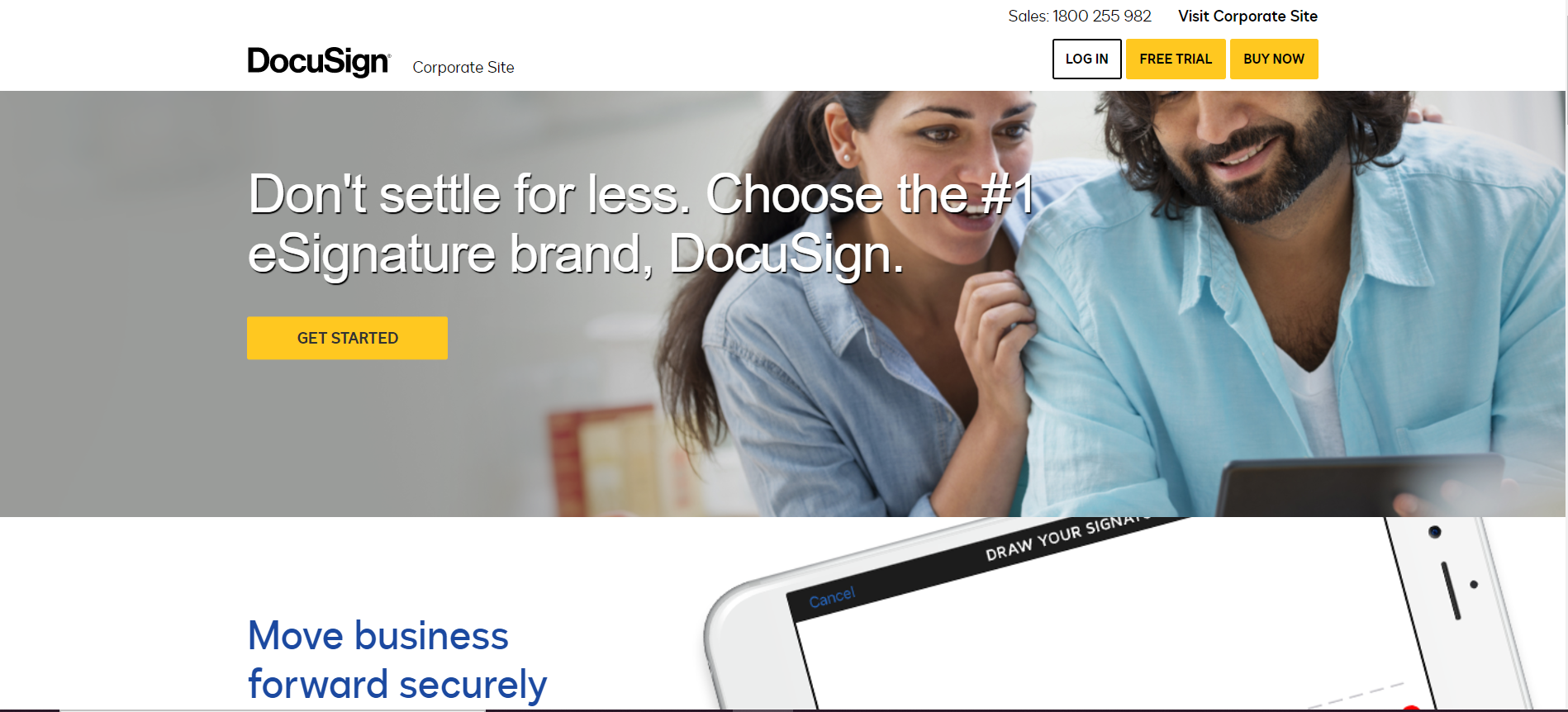
In a world where some corporations manufacture bogus social proof, showing genuine people with real profiles has become critical.
Connect your social evidence to more in-depth case studies or videos. Users will have even more faith in the product as a result of this.
People want to see commendation from people they can identify with; otherwise, they won't believe they can obtain your product's same outcomes and value. Placing social proof helps the user decide whether or not to buy (or register). It is an excellent way to give them the final reassurance they need to commit.
DocuSign's landing page reiterates the following:
- It's plausible. It's sometimes even better to include some amateur movies or interviews instead of text on the landing page because they're more credible (which is also easier to miss while scrolling through the page).
- It's all about the result. Nobody cares if someone on Twitter thinks your product is fantastic. You should write testimonials based on results and emphasize the benefits from the remainder of the material (for example, "This gave me 340 percent more leads in two months").
#9 Animoto
Animoto has made it a point to use statistics that prove brands employing video witness a 49 percent increase in revenue compared to brands that don't. Watching a brand's video convinces 84% of consumers to purchase, thus increasing the landing page conversion rate by 80% or more.
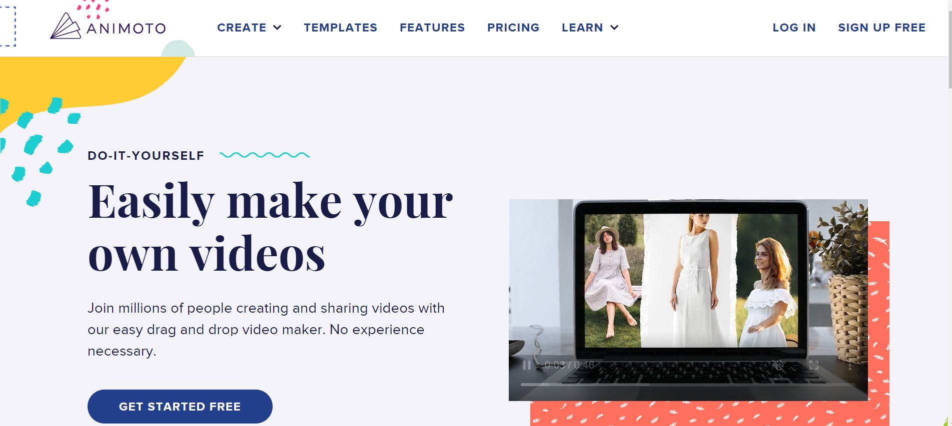
The headline conveys a benefit: "Create professional video slideshows," but it could be improved. What can prospects accomplish with the help of professional video slideshows? "Wow' your audience with professional video slideshows," for example.
The video samples demonstrate the software's adaptability without causing visitors to leave the page. The advantages of utilizing Animoto are rapidly conveyed through bulleted language.
The wording "No credit card required" reassures potential customers that the trial is indeed free.
The term "free" appears several times on the page, which builds trust as promoting a fee can be dicey while converting first-time visitors.
The most important lesson here is the sneak peek at the video explanation they made, which piques everyone's interest in watching it.
It is sometimes 100 times simpler to convey the value of your product with a video, but it is still challenging to get most people to watch it; having a preview is a terrific method to achieve it!
#10 Shopify
The title of Shopify sums up the e-commerce platform's value proposition in a single statement. Furthermore, the font size complements the header properly, giving the entire page a pleasing appearance.
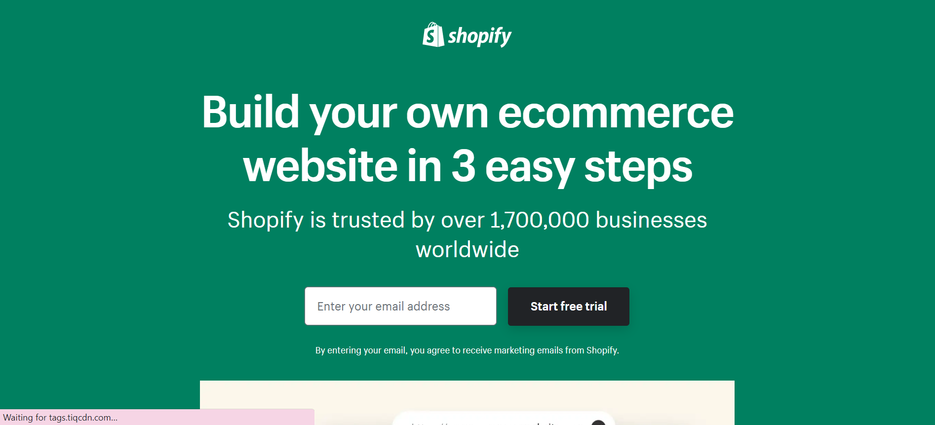
This will be people's initial impression of your product, and if you don't get it right, they'll abandon the page in a matter of seconds, never giving you the chance to explain it.
What can we take away from this?
To summarise, the first step in increasing conversion is to create a clear and informative headline.
- The headline explains what it does and what problem it might be able to solve.
- Because you can only include so much information at the top of the page, it piques visitors' interest in learning more about the product.
- High bounce rates are avoided (people leaving without go beyond your Landing page)
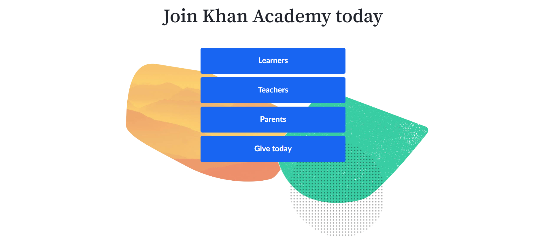
#11 Khan Academy
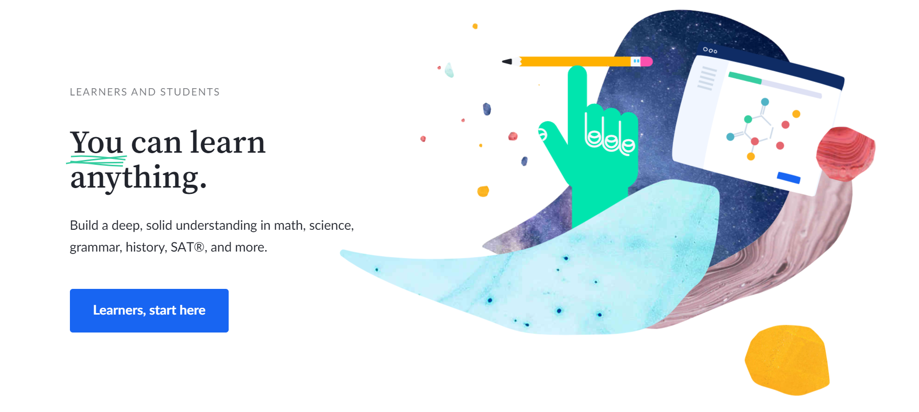
The challenge with using your homepage as a landing page is that you must cater to various audiences. Khan Academy's homepage, on the other hand, does a fantastic job with this. This page is intended for three categories of visitors: those who want to learn something new, those who want to teach something new, and parents who want to use Khan Academy with their children. Plus, how inspiring is the text "You can learn anything" printed across the top?
The remainder of this page is intended for viewers who are unfamiliar with Khan Academy. It vividly and briefly explains the significant advantages of using the learning platform, which is simple to read and comprehend. There's also a recurrent call to action: "Begin learning right now." When visitors are satisfied that they have received sufficient information, they may click the CTA to return to the form at the top of the page without scrolling.
#12 Breather
Here's another example of an excellent, pleasant design. There's an immediate call to action when you visit Breather.com: identify where you wish to locate a space. It also uses location services to figure out where you are and present you with immediate alternatives in your immediate vicinity.
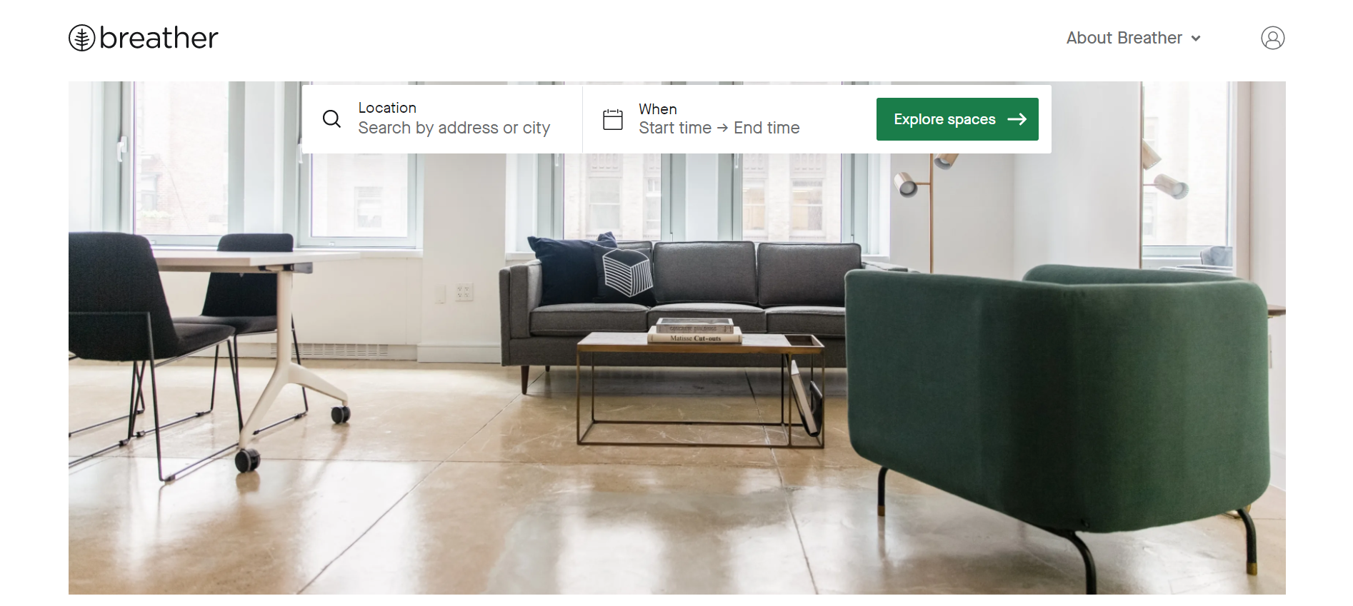
We like how Breather used primary, to-the-point language to inform visitors about the company's services, followed by a CTA to choose a city. If you scroll down for additional details, you'll notice that Breather added personality to the microcopy ("no commitment, ever"), reminding us that actual people make the design. As a result, we're getting a little closer to the brand. The product is also matched with the negative space and relaxing color palette — essentially, breathing room.
#13 Webflow
Webflow is a web developer's design tool. Their landing pages should be clean, beautiful, and convertible. Fortunately for the company, they are precisely that. The landing page below showcases Webflow's product in a powerful way.
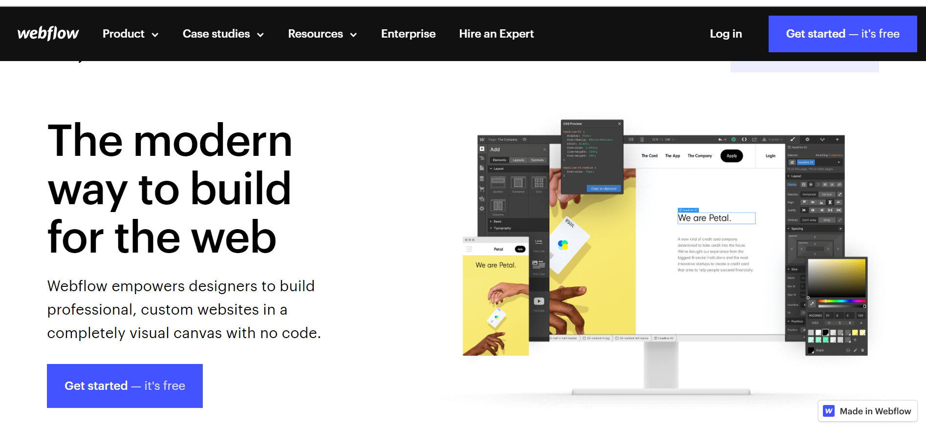
On the long(ish) page, there is a surprisingly minimal quantity of text. Webflow uses smart copywriting and animations to explain its platform's features rather than lengthy prose. Graphics and gifs are used across the page to demonstrate how the tool works.
One of the page's primary assets is its unique yet clear design. Another factor is the content's shape in the upper part. It appears to be a capital 'F' if you look at the text to the right of the page's first image. That isn't by chance. People scan content in an F-shaped pattern, according to research. Webflow ensures that visitors to their page take in the content they want them to by directing them into that.
#14. Wix
Wix's landing page is an excellent example of a visually appealing, modern landing page. Unlike other landing sites that try to sell themselves with images of their products or services, Wix uses its landing page to demonstrate to people how simple yet effective its platform is. It just has one CTA for visitors to start developing a site. It foregoes the sales pitch in favor of persuading people to use the forum, allowing it to speak for itself.
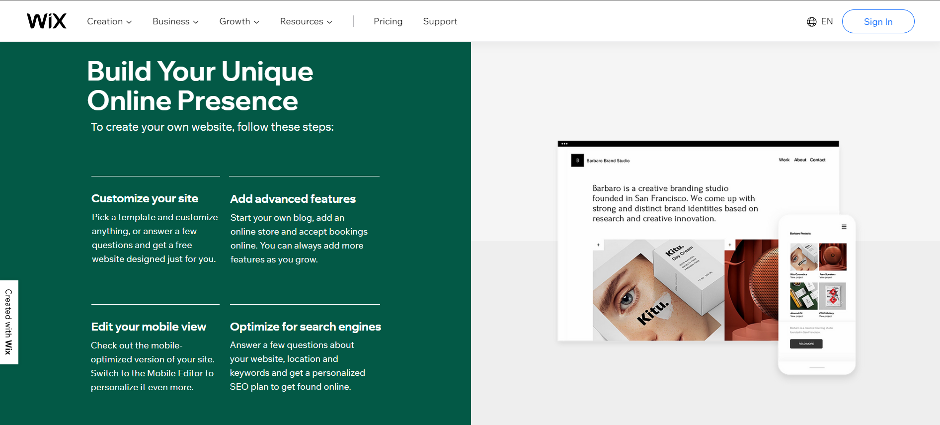
The following are some takeaways from Wix's landing page:
Include a good CTA: One of the most crucial landing page best practices is to include a strong CTA. Don't be scared to use straightforward language and vivid colors in your design. The slogan 'Start Now' clearly communicates urgency, and the blue hue contrasts nicely with the light orange background.
Here are a few additional pointers for building effective CTAs:
- Keep it short and sweet, no more than two to four words.
- Use action verbs such as "get" and "subscribe."
- Incorporate a faint suggestion of urgency and persuasion.
- Use terminology that is consistent with your brand's identity.
- Be as straightforward as possible. After clicking on your CTA, users should know exactly what to expect.
- Use eye-catching visuals: Wix's landing page is enhanced by a compelling and dynamic digital illustration that runs the length of the page. The top fold has a mountain whose summit points directly at the CTA, calling tourists' attention to it.
The viewer can see the logo, headline, CTA, and graphics above the fold in this example. You can use directional visual cues like arrows to entice people to scroll down if your landing page demands more content and thus more space. The water motif keeps visitors scrolling in this case, bringing together the many aspects of the landing page.
#15 Domo
If there's one thing Domo excels at with this landing page, it's emphasizing the importance of the client. Domo not only explains that their free trial incorporates the user's data from the start. Rather than a hokey, generic presentation that highlights all of its -neatest- or most helpful features, they also detail exactly what you'll be able to take away after your 60-minute onboarding experience.

The wording on the page communicates directly to the user, emphasizing the 'you' perspective and describing what you can accomplish in a short period. It's a terrific approach to demonstrate their Proof of Concept and frame their free trial and overall offering. They also urge trial customers to continue exploring later to ensure that they obtain first-hand experience finding out how and why Domo can address many of their current problems.
Domo leaves a lasting impact since they don't provide a blanket demo and instead show trial users how to exploit their data right away, regardless of whether or not they convert. Even if they don't, they'll walk away with new insights and a procedure that has already been outlined for them to repeat in the future, making the potential of purchasing that much more appealing. And this album is the ideal home for all of that promise.
Have you ever seen a more diverse group of successful clients than eBay, DHL, The Honest Co., and Univision? Versatility: This may be an exaggeration, but have you ever seen a more diverse group of successful clients than eBay, DHL, The Honest Co., and Univision? This creates the quick impression that industry isn't a barrier, meaning that no matter who the visitor is, they can expect to receive equal outcomes regardless of their line of work.
#16 Marketo
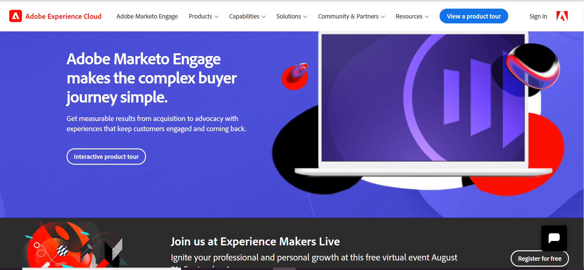
Marketo's landing page spread does not require several images to demonstrate its effectiveness. It's crucial to note that we don't think this album is flawless; instead, we believe they are utilizing an essential factor that extends beyond the product itself: support.
Whether or not users are familiar with the Adobe family of products is debatable. Anyone who visits this landing page will believe they're getting a two-for-one deal when they sign up. Not only will they receive a 4-minute introduction video, but they will also have access to an entire video library.
While most people don't need immediate and direct hands-on assistance from an expert, they do want an easy way to learn about a potential solution at their leisure, and not having to commit to a meeting may be the best option.
What can we take away from this?
- To the point: Upon the first arrival, everything the visitor needs to see is displayed on-screen, except for the other successful customers mentioned below. There's no need to scroll, so you're less likely to become distracted.
- Subtle Design: It is attractive, straightforward, and incorporates many other design principles that Adobe regularly uses, which should come as no surprise considering their industry.
#17 Wistia
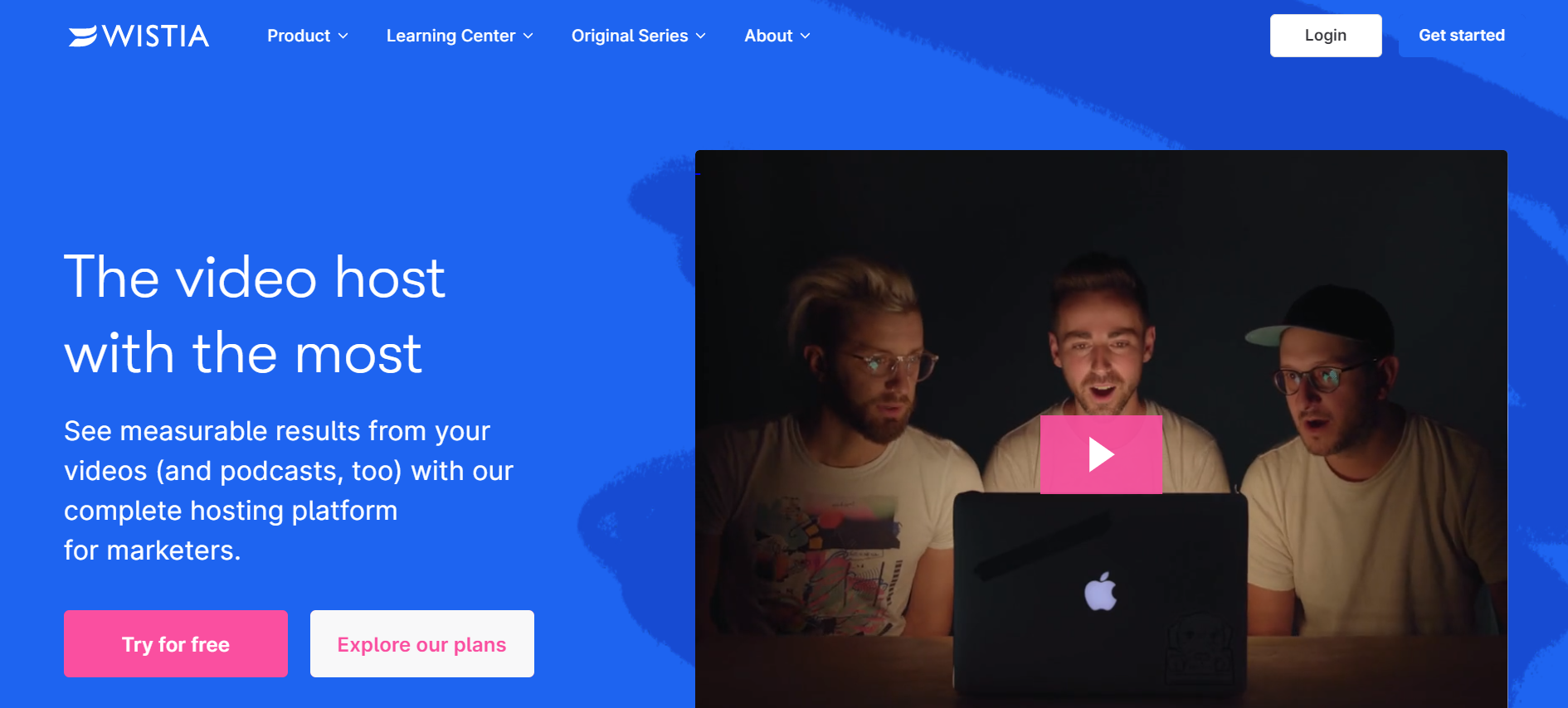
Wistia, a popular video-hosting service, blends the look and feel of a lead-generation website into its click-through page.
This is one of the most specific landing pages in the guide: a clear USP and terrific subheadline that builds on their offer, an image, a few "trusted by" prior customers, and the form - clean, minimalist, and prosperous.
The focus is on lead generation, hence the lead magnet model.
The form's title, "Try out all of Wistia's features for free," is particularly helpful in informing visitors. It does not imply that they will have access to a limited freemium version of the Wistia platform but rather all its capabilities. This appeals to people who like to go shopping. The "Not sure yet?" the question in the corner allows users to browse the entire website and better understand the product before signing up for a free trial, which is a plus.
Typically, it is not advised to have a second CTA on a landing page, but it works since this is half-click-through and half-lead-gen. Mailchimp is known by all marketers regardless of industry.
#18 Uberflip
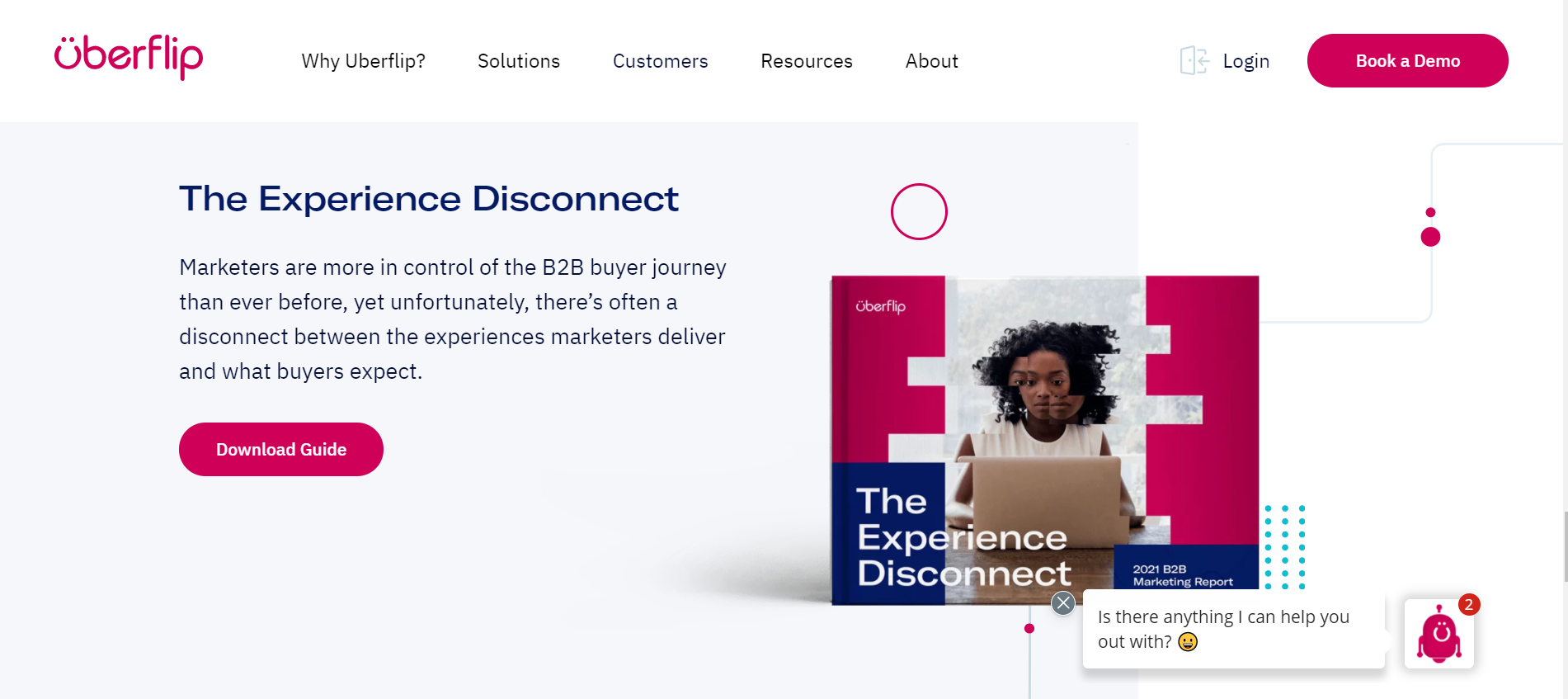
Uberflip, a content marketing management tool, employs a fictitious blog entry as a landing page, with the form field only appearing in the third stage of the engagement.
Prospective leads first read the ebook summary in paragraph form, similar to a blog post, then go to the "click here to download" CTA, which launches a new tab in their browser. Then users click on the first form field (work email), which functions as an expand chevron, revealing the form's remaining fields.
The second stage, which displays as a website popup over the top of what appears to be the ebook itself, with the copy "you're one step away from the whole guide to email marketing," is something visitors enjoy about such landing pages. This provides the visitor the impression that they are on the verge of grabbing the ebook and taps into the concept of "sampling" (an influential psychological factor in marketing).
The three-stage conversion, on the other hand, might be aggravating, as prospective leads may feel a sense of "More?!?" Please, please, please.
#19 Dropbox
What will a customer get if they join up for your service? A list is frequently helpful in this situation. NOTE: The temptation here is to enumerate the features that your product has to offer, such as "20GB cloud storage." This is neither an advantage nor a compelling argument. What about "access all of your files from any location"? This is a benefit, and the visitor can relate to it and see how it benefits their life.
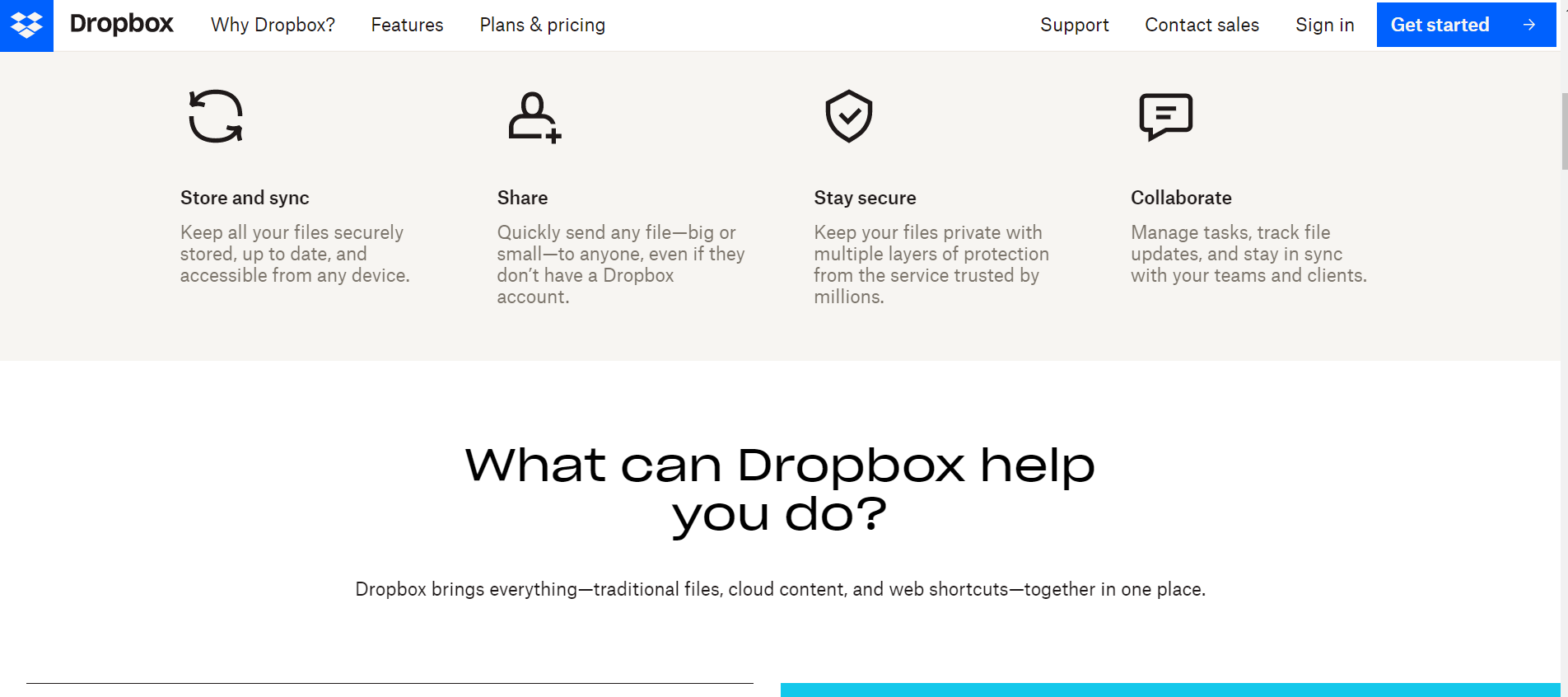
Although descriptions should still be concise, connecting to a product page for a more in-depth look at the features can be helpful.
Dropbox provides a compelling set of benefits for utilizing their service, demonstrating how having an account improves the user's everyday life.
This SaaS landing page demonstrates the following pointers:
- Show advantages rather than features. Feature lists have a place on your site, especially with more enterprise-focused businesses. Those clients often evaluate the product with their list of required elements, but not on your landing page — try the Pricing page instead.
- Icons may be an excellent complement to the features, and they can help customers get a better sense of the benefits you're providing them.
#20 HelloSign
In today's layout design trends, split screens are omnipresent. Split screens are, arguably, the simplest way to cram more information onto the main screen without making it too cluttered.
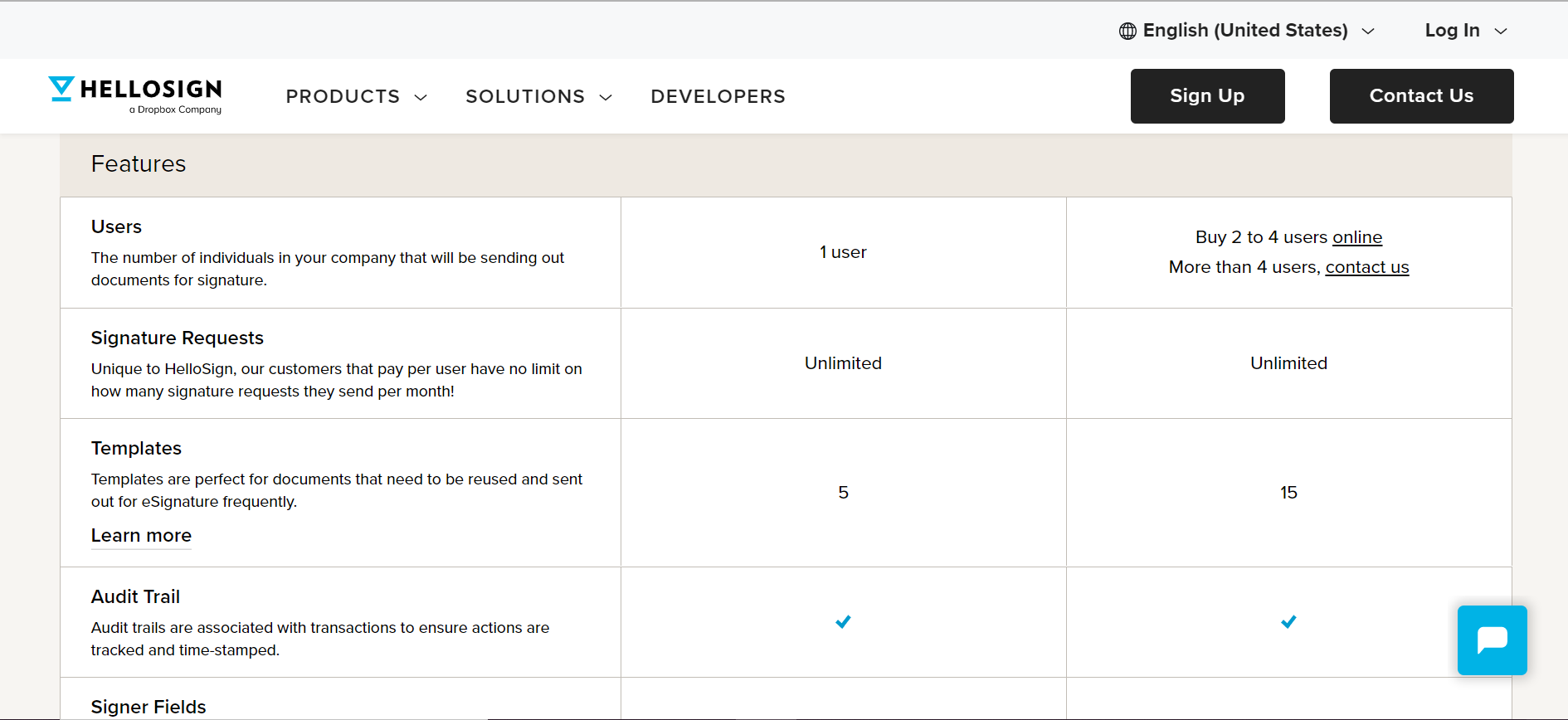
HelloSign divides their homepage and uses motion to reinforce their crucial pitch: you can drag and drop a legal document and sign it in a beat with just a few clicks. They employ fun and memorable visuals to dispel the stereotype that law is dull.
The landing page of Hellosign stands out because it includes:
The necessary initial step in all of the marketing initiatives. That is, to identify the exact demand or problem that your product is satisfying/solving for your users.
This way, you'll be better able to tap into the demands of your target audience if you have this information since you'll be able to isolate and target their specific pain areas, wants, and needs.
#21 Unbounce
Unbounce specializes in assisting clients with the creation of landing pages. Taking a look at the pages they utilize will provide you with some great ideas. Unbounce's top area of a landing page for one of their online education courses is shown below:
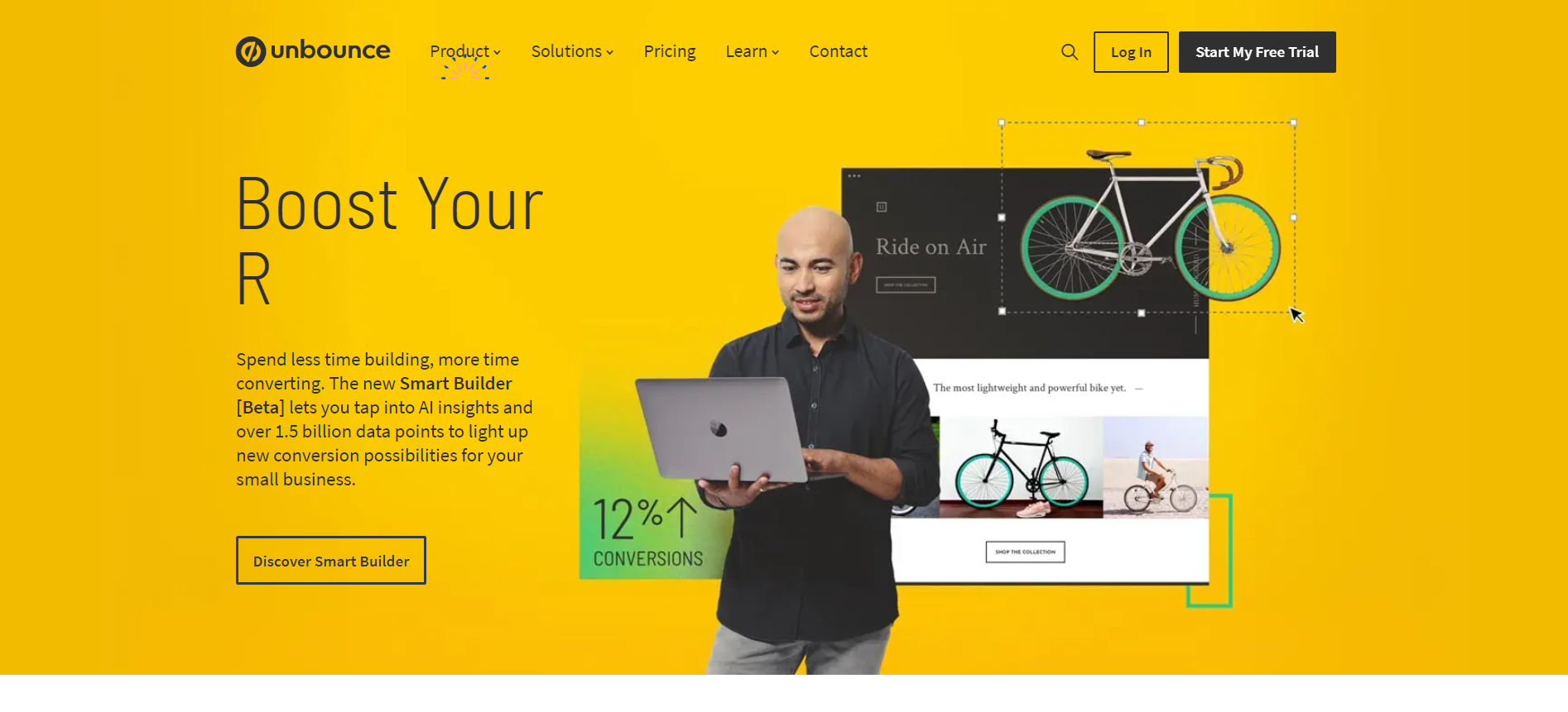
There are a few things to keep in mind concerning the page. The first is a large photo of the company's co-founder, who also wrote the carrier's course. That snapshot gives the company a human face. Marketers use this strategy to develop trust and rapport with site visitors, and it works! As a result, those users are more likely to complete the course.
Another striking element is the volume of content crammed onto the page. There are links to industry-specific statistics as well as menus to help you explore the course. Even if the FAQs appear near the bottom of the page, the overall style is never impacted.
#22 MailChimp
The design of a SaaS website should be straightforward. MailChimp is an excellent example of how to communicate a message swiftly. Users should be able to tell who the service is for right away. MailChimp has it down pat.
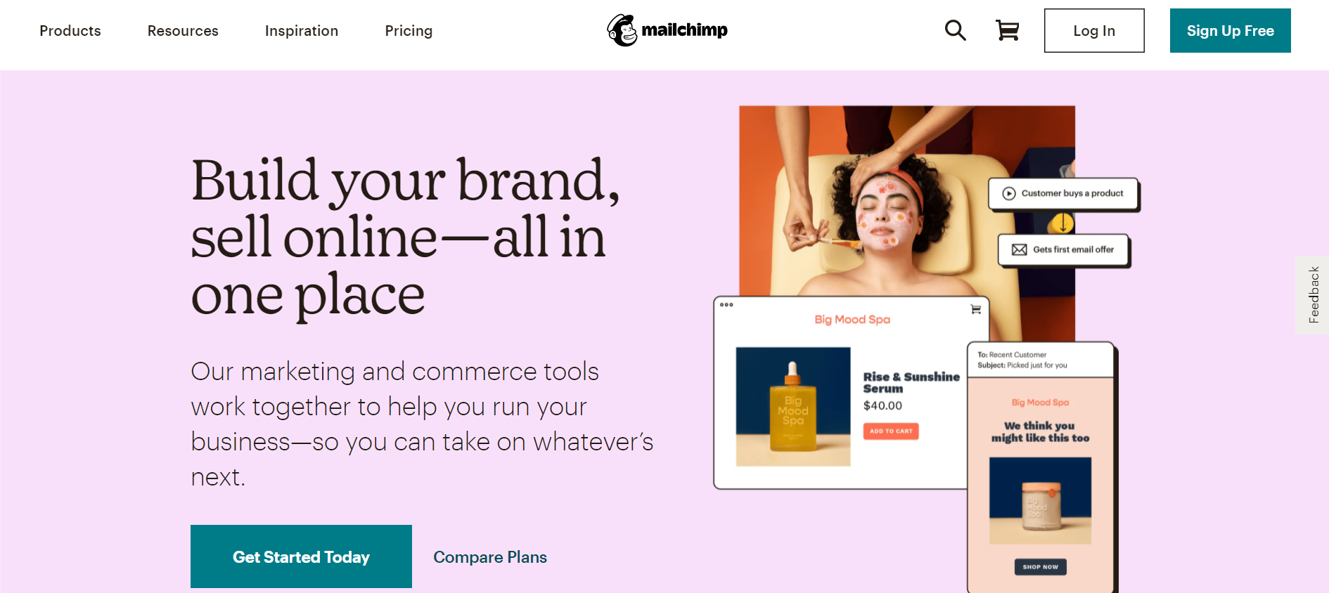
Mailchimp excels at:
- With a vast, clear message and a direct call to action, this landing page gets right to the point quickly and efficiently.
- Following the call to action, there is clear and straightforward information on what the service provides.
- At the top of the website, there is a simple, clean navigation menu.
- There are no flashy animations or visuals in this design.
- Unnecessary information and visuals have been removed from the landing page.
#23 Evernote
Evernote's landing page is one of the best in the SaaS industry. A headline on the landing page tackles a user pain point. The following sentence explains how Evernote can help solve that problem, followed by a clear call to action to "join up for free."
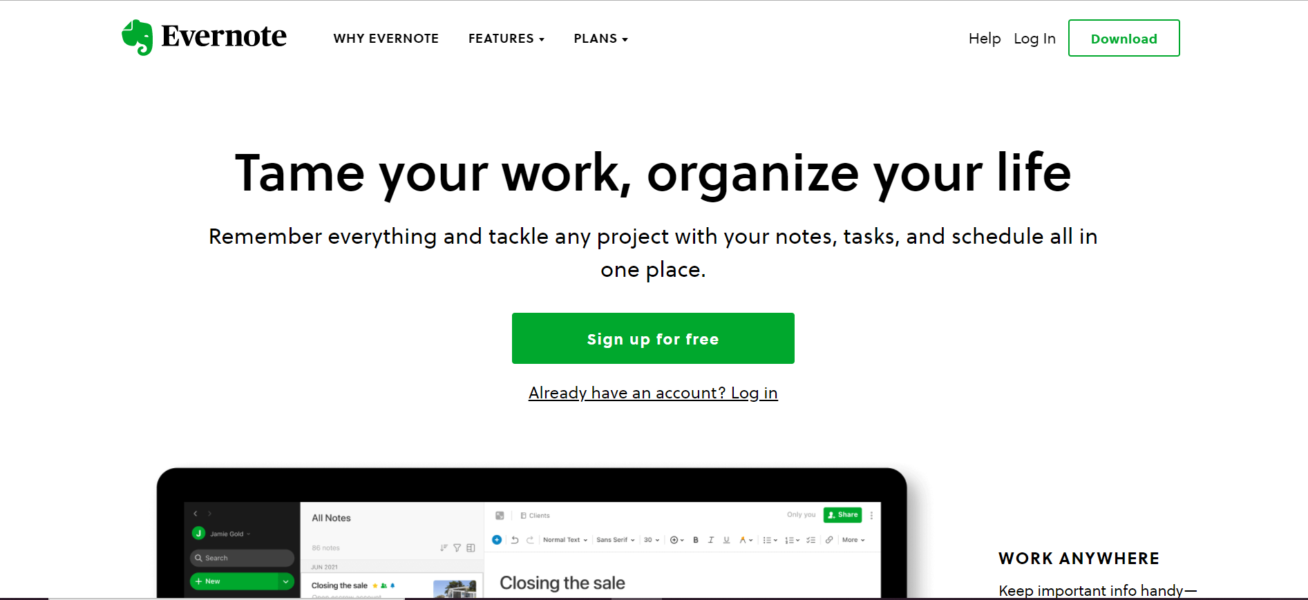
The straightforward message and call to action are positioned above the fold, similar to most instances, allowing visitors to grasp the message before browsing the rest of the site. Users will find further data and information, such as user tales, news, and testimonials, as they scroll down.
The page's purpose is to get people to sign up. If visitors do not execute this step right away, the website offers more information about the features and benefits of Evernote.
#24 HootSuite
Hootsuite is an excellent example of how a landing page can be designed to include a lot of visual data without being cluttered. It leverages computer and phone screens to demonstrate how its product works, allowing users to see what they'll get if they click the CTA to get started. It also has a small amount of text, with only one introductory sentence containing a powerful message. It provides social proof for this statement by stating that it has millions of users.
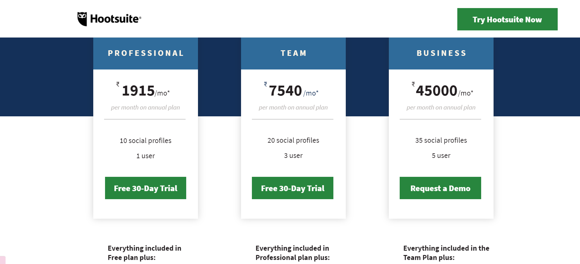
Their landing page humorously shows precisely what they offer with colorful screenshots and on-point content. The page combines a professional approach with the fun and digestible mood of social media. As a method to establish credibility with new users, Hootsuite includes reviews from reliable consumers. Each page fold is used to describe and detail the numerous options accessible.
The following are some takeaways from Hootsuite's landing page:
Emphasize your initial fold: Your landing page's top fold is by far the most significant feature (alongside your CTA). It'll be the first thing readers see, and it could be the deciding factor in whether they stay or go. With this one, Hootsuite nails the nail on the head. It's simple, direct, and to the point. Users are immediately aware of what they are providing and how they might profit from it. We recommend keeping your first fold to 11 words or less for maximum effect.
Repeat your CTA: Because your CTA is the key to converting visitors, make sure it's visible across the page. Hootsuite accomplishes this by including a call to action in several places, including their static navigation menu, the top fold of their landing page, and the package picker.
#25 Vimeo
Vimeo is a video hosting platform founded by a group of filmmakers and targeted towards a professional audience. Creators can use the company's tools and technologies to host, distribute, and monetize their films. This style of a landing page is designed for users who require video solutions for their company. It's no surprise that each function is demonstrated using video, as well as a brief description and testimonial. The mission statement is powerful and direct, with a simple call to action: 'Get Vimeo Business.'
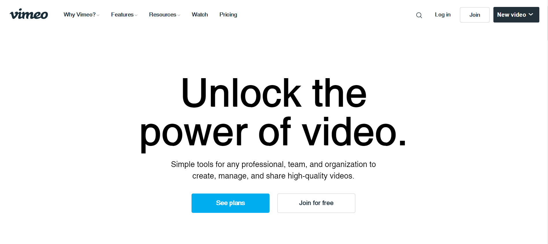
What can we take away from this?
Recognize your target market: Because landing pages aren't one-size-fits-all, it's crucial to know who you're writing for when creating website content. The language on this page is extensively customized to significant businesses in terms of tone and messaging. This is evident in the headline, which reads, "More involvement, cooperation, and growth for your organization," as well as various areas throughout the page. They've figured out what businesses want to accomplish and laid it out for them.
Remove all other navigation modes: The purpose of your landing page should be to convert visitors into leads. As a result, get rid of any connections that can put you off.
All other navigation should be eliminated: A clear goal for your landing page should be to convert visitors into leads. As a result, get rid of any links that can put your visitors off. A website menu that links to several pages isn't necessary. Vimeo uses only one CTA throughout the page to reinforce the same message: 'Get Vimeo Business.'
#26 Moderne
Moderne is a collaborative digital workspace for creatives. The goal is to assist teams in maximizing their marketing efforts, successfully collaborating, and saving time on research. For their commercials and campaigns, Moderne gives customized concepts, references, and insights.
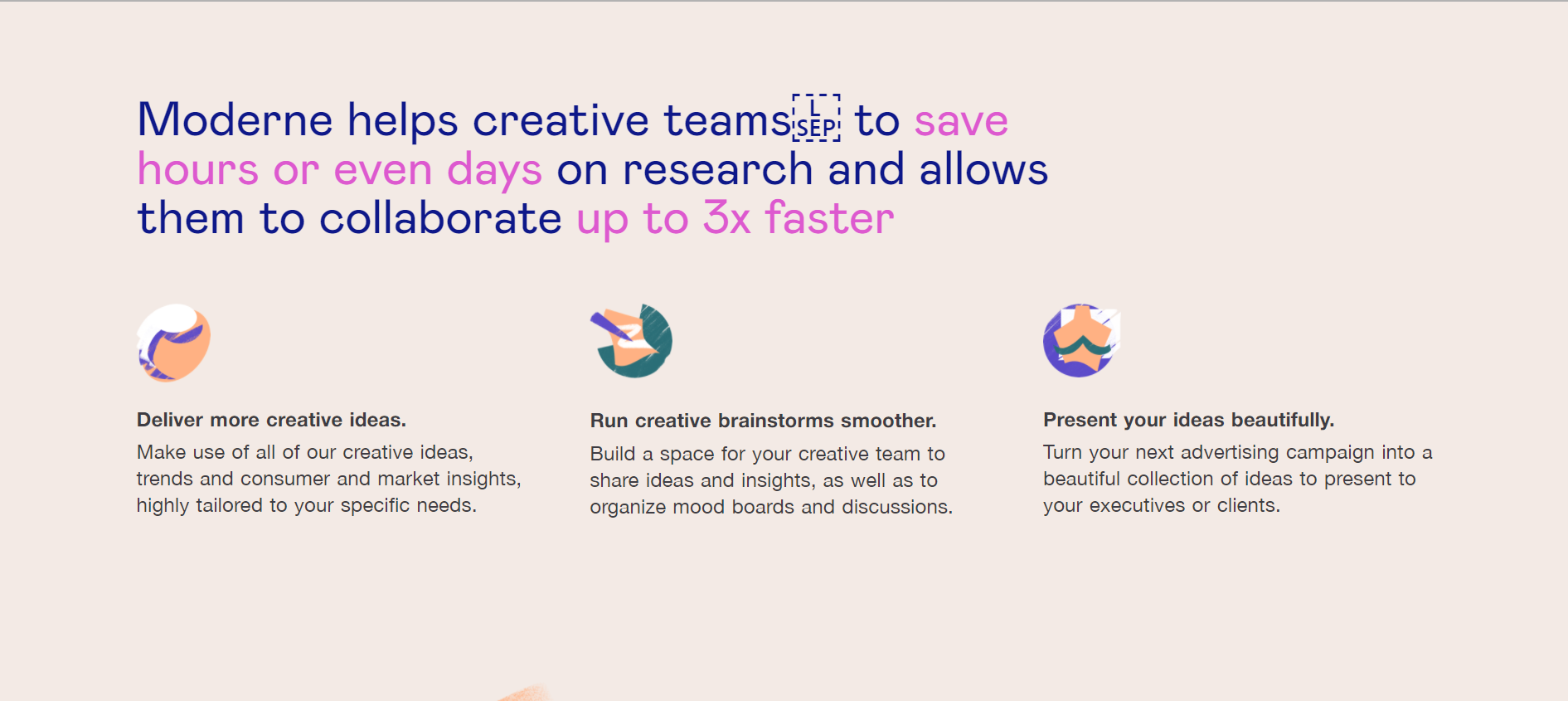
Everything about this landing page's design, from the images to the typography choices, suggests that it's geared at creative people. The custom images are vibrant and dynamic, in contrast to digital firms' often-used accurate vector illustrations. Moderne has chosen a wide variety of colors rather than sticking to a limited color pallet, which improves the sensation of freedom and inventiveness.
These out-of-the-box gestures aid Moderne's message of creativity and collaboration. Despite the distinctive design, they've kept the traditional aspects of a landing page in place: a strong banner, many CTAs, and content divided into digestible sections.
#27 Edupath
Who is the intended audience for your landing page? While most of the content on Edupath's website is geared toward students, parts are dedicated to counseling parents to aid their teenagers with college applications and SAT preparation. One of these divisions is represented by the landing page below.
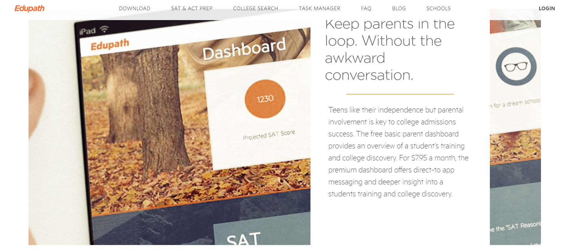
When parents provide their teen's name, email address, and phone number, they will receive an email with a link to download the Edupath app. Students are more inclined to do something if their parents ask them to, especially if it means they won't have to give up their phones, according to Edupath.
It's also a simple one-click operation. This entire conversion process is a brilliant and valuable technique to get the apps onto the phones of more students through their parents.
#28 Kissmetrics
Kissmetrics, a renowned customer intelligence, and site analytics provider, has an appealing lead generation landing page for their webinar replays.
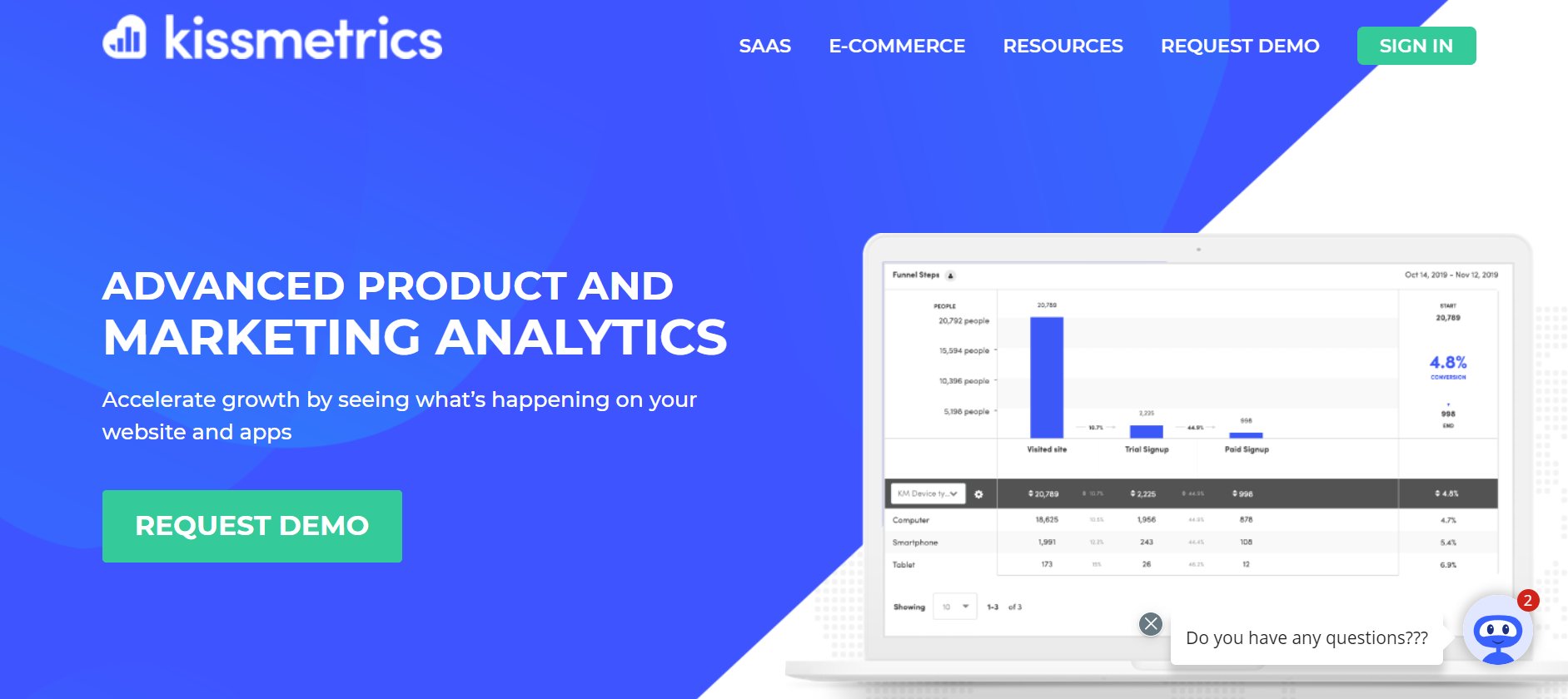
A SaaS company with an all-around highly-optimized lead-gen landing page with a beautiful color palette, eye-catching CTA button, great intro, benefit list, and a classic layout (with a few bonuses).
What can we take away from this?
- This lead generation landing page is simple and to the point, with a sizeable centered headline that ensures no doubt about which webinar you will receive when you download.
- The webinar hosts' faces, names, and job titles are visible, which is a terrific concept (especially for webinars) because it personalizes participation.
- The phrase at the bottom of the landing page also serves as a good teaser for the webinar.
#29 Crazy Egg
Crazy Egg is a heatmap software application that helps you figure out which parts of your landing page customers interact with the most, so you can improve them. The essential subscription starts at $29 per month and includes up to 30,000 recorded page visits.
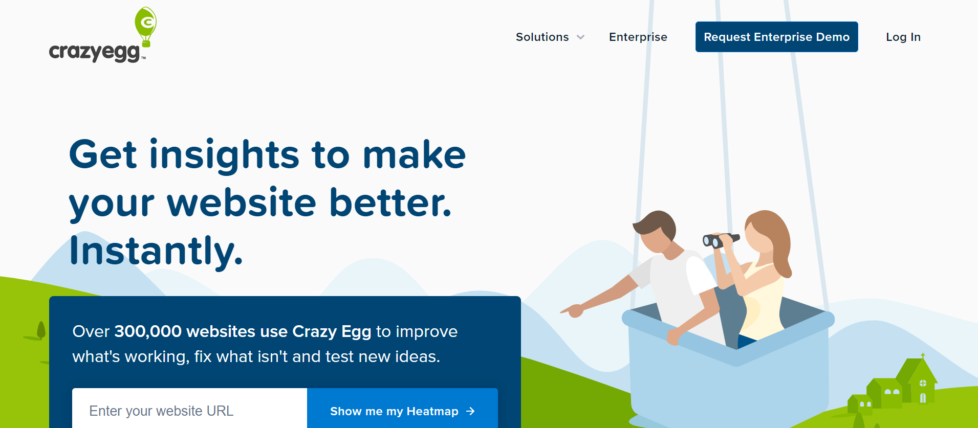
Crazy Egg includes customer testimonials across their landing page, along with the tools that the customer utilized, as well as the tool's results and benefits.
This header appeals to me because it does not immediately describe what CrazyEgg is but instead focuses on the problem it solves!
It also piques your interest by not showing you anything additional about the product unless you click the link at the bottom.
This can work well, but because CrazyEgg's landing page is an article (and they do a lot of content marketing), they can be more confident in delivering some value first and then relating their product as the solution in their articles.
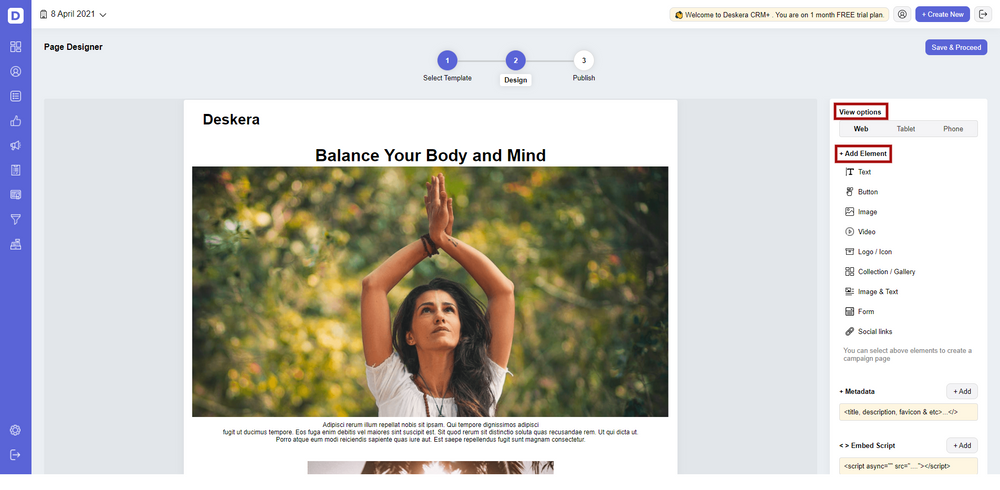
#30 Deskera
Deskera is a one-of-a-kind piece of software that allows you to develop and manage landing pages using your CRM software. Deskera CRM+ is the solution you're looking for. Deskera CRM+ features a module dedicated to landing pages in its software. This section is meant to assist you with designing, deploying, tracking, and optimizing your landing pages.
Deskera is one of the best softwares that facilitates the designing and management of your marketing materials. It allows you to automate your marketing campaigns like, for example, email marketing campaigns. Deskera in fact comes with email marketing templates, which ensures that your marketing campaign is optimized along with your CTA included in it.
In fact, for optimizing landing pages and their CTAs, you can use Deskera CRM+ which allows customized designing of your landing pages if you do not want to use the already provided templates.
The Deskera dashboard provides all the insights you will need to optimize your CTAs. Whether it is insights on the number of audience visiting the page, number of CTA clicks, number of CTA abandonments or number of conversions, Deskera has it all sorted out for you. Hence, Deskera will help you keep a track of all your business KPIs and your marketing KPIs, hence enabling you to figure out your marketing attribution.
Additionally, Deskera CRM+ also lets you customize your CTAs and take them through A/B testing to find out what works best for you and your business. It is here that you can incorporate the understanding from the insights gained earlier.
Deskera CRM+ includes some pre-installed landing page designs that you may utilize, or you can start from scratch and design your own. The landing page module in Deskera CRM+ supports both of these choices. As a result, you will be able to produce beautiful and professional work. This ensures that you can construct attractive and professional-looking landing pages that generate leads without the assistance of designers or IT experts.
Deskera CRM+ gives you the tools and templates you need to create unique landing pages for your company. It allows you to customize photos, text, customer sign-up forms, integrate custom HTML, and track the behavior of your website visitors. You can better understand your customers' psychology and increase sales by using website and landing page analytics.
With a well-targeted sign-up landing page, your company will be able to grow its customer database, retarget existing clients, and better manage customer deals and sales funnels. Using an intelligent CRM system to manage your clients will save your company time and money.
Plus, there's more. By automating your email marketing campaigns with Deskera CRM, you may increase your business efficiency. Deskera is a cloud-based technology that can help you meet all of your company's demands. Deskera can assist you in every element, whether it's data integration or real-time analytics.
Deskera CRM is the most incredible platform for managing contacts and deals, sales pipelines, and email marketing campaigns, to name a few things. Apart from that, it may assist you in generating leads for your company by creating email campaigns and tracking performance with comprehensive open and click-through rates (CTR).
Key Takeaways
As you can see, while few landing pages are ideal, several come close, and others take advantage of their branding, assets, or deliberate design aspects. Making these kinds of selections isn't always easy, especially when considering how much psychology, experience, and time it takes to get it right and make your landing page a functioning part of your site or marketing efforts. But, if you're like the many others who aren't sure where to begin, what aspects to include, or what else to do, don't hesitate to contact us, as our team is well-versed in putting together aesthetic and conceptual efforts that produce results.
Don't stop just because you've mastered the recipe for landing page building. There's always an opportunity for development, which could result in more leads or clients for you. While there are some strategies for making the most of your landing page, there is no one-size-fits-all solution that will work for everyone. It takes time to perfect the art and discover what your audience responds to.
All examples have one thing in common: they're exciting and tailored to their intended viewers. Hopefully, whether you're a tiny business or a large corporation, these case studies have provided you with plenty of ideas for your website's landing pages. You'll be sure to develop pages that will increase your SEO by twinning some of the elements you enjoy with your creative twists.
Our SaaS landing page examples should have taught you one thing: landing pages don't have to follow a strict framework to be successful. The examples we've given so far couldn't be more dissimilar. Some people like simplicity and directness, while others value originality and wit. They each have their distinct styles and tones.
Related Articles