Landing pages have become one of the most preferred forms of digital marketing as they bring the highest returns on investment while also bringing about brand awareness. Optimized landing pages are those that follow the best practices of landing pages including how to optimize their CTAs.

CTAs are a big part of landing pages and how they perform becomes a measure for performance marketing, content marketing, email marketing and many such forms of marketing that use CTAs. To ensure that you have the perfect combination of CTA and landing pages, they undergo A/B testing. Hence, by going through call-to-action examples you will get an idea of what works and what does not work when it comes to CTAs.
This article will take you a step further by acting as a guide for CTA focused landing pages, also known as click-through landing pages.
What is a Click-Through Landing Page?
Click-through landing pages are those pages that are focused on the objective of convincing visitors to click through another page where the actual conversion will take place. The click-through landing page is hence to warm up your visitors, win their trust and hence direct quality traffic further down your sales funnel and marketing funnel.
Such traffic will be more likely to act on your sales pages than leads that are of poor quality. These pages are more likely to warm up your visitors for high-scrutiny offers by allowing them to read them about the offer without distracting them with a “buy” button.
The entire process of warming them up begins from:
- Intriguing them with your headline
- Promising to solve their problems
- Help them imagine themselves as heroes with the images used by you on your click-through landing page.
A click-through landing page is hence a web-page that your visitors first land on while trying to access your site. It is a landing page without a form. This page will have only one clickable element which is the call to action button. However, for the conversion to actually take place, you need to have an optimized click-through landing page that follows all the best practices of landing pages.
Difference Between Click-Through Landing Pages and Lead Generation Landing Pages
Click-through landing pages aim to get visitors to click through another page. On the other hand, lead generation landing pages are those that are used to capture leads via a form.
Click-through landing pages are most often used by eCommerce models as visitors are unlikely to purchase if they land directly on the checkout page. Click-through landing pages hence offer product details in the hope that it will make your visitors click and purchase. In contrast, lead generation landing pages typically describe an offer and ask the visitors to submit an email address and more such data to complete a non-financial transaction.
Examples of Click-Through Landing Pages
In this section of the article, we will be going through some of the click-through landing pages’ examples and assessing their good as well as improvement areas. What however needs to be kept in mind, that some of these pages might be A/B testing their click-through landing pages and hence might have finalized on a different design.
Example 1: Google Cloud Platform
This is one of those click-through landing page examples, which has done a good job in making sure it stays focused. It's good highlighting points are:
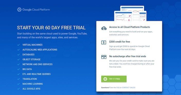
- The headline and the CTA include the word “free,” which will hence grab your visitor’s attention.
- Right above the CTA, they have mentioned the benefits that the visitors will get by converting.
- They have mentioned “questions? See FAQs or contact sales” right below the CTA which ensures that in case of queries, your visitors will be able to get them answered. This will reduce page abandonment.
- By mentioning that big platforms like Google, YouTube is powered from the same cloud system, it will serve to win customer loyalty and increase sales.
Possible areas of improvement are:
- A large amount of text makes the page seem overwhelming at first glance and can hence deter the visitor from converting.
- The color contrast of the text on blue is so low that neither does it grab attention nor is it easily readable.
- The headline could have been made more indicative of what the CTA offers.
- The headline could also have been more attractive.
Example 2: Moz Pro
This click-through landing page example has the following key highlighted points that should be followed:
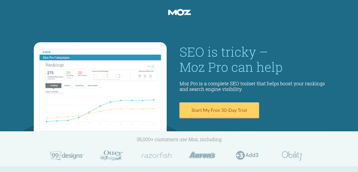
- The headline is enough insight into what services it offers and which problem it will be solving. This will ensure that the visitors do not abandon the page.
- The image used gives an insight into what the Moz Pro dashboard will look like. This will assure the visitors that they will be getting what they are looking for.
- The contrasting yellow CTA button stands out from the dark blue background.
- The CTA button is written in the first person “my” which instantly bonds with the visitors and will increase your conversions.
- Right above the CTA, 2 of the main ways in which it will boost the visitors has been mentioned.
- By mentioning, “35000 customers” use Moz Pro, it has established a brand value, while winning the trust of the visitors.
Possible area of improvement is:
- The MOZ logo is clickable, which makes it very easy for visitors to exit this click-through landing page.
Example 3: Atlassian
This click-through landing page is one of its kind for the following reasons:
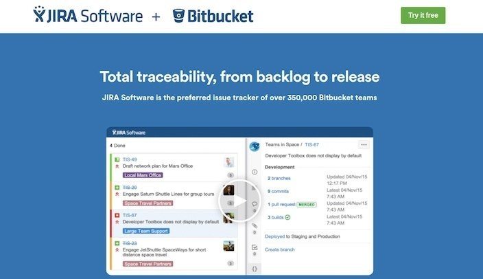
- The headline mentions the range of functions offered by the software.
- The usability of the software as mentioned in the headline is backed by “350,000 bitbucket teams” which increases the trust that would be placed by the visitor on you.
- The video explains the benefits that the visitor will get by using the software.
- The CTA button is placed at the top against a white background in a green contrasting color.
- The CTA button includes the word “free” which attracts the visitor to stay longer on the page.
Possible areas of improvement are:
- The logo is clickable which serves as a means of exit for the visitor.
Example 4: Animoto
This click-through landing page example is aesthetically pleasing, attractive and something that will keep your visitors coming back, which after conversion will lead to higher customer retention and more returning customers. The highlights of this click-through landing page example are:
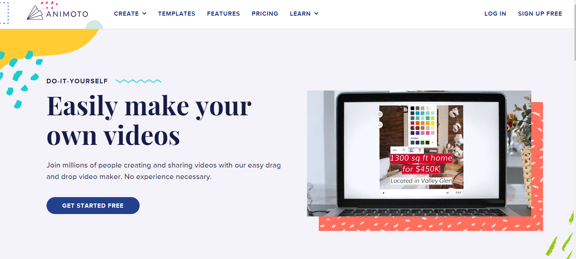
- The headline shows the benefit clearly to your visitors.
- The colour theme, as well as design, matches the service you are offering.
- The CTA button in dark blue is of a contrasting color from the background colour.
- The CTA button also uses the word “free” which will decrease page abandonment.
- Right beside the CTA button is a short video that takes you through the services they offer. A video is worth 1000 words and as the format of sharing is the same as the services you are offering, the relevance increases the conversions.
- The short video also serves as a sample of Animoto and its professional video slideshows.
- The mention of “do-it-yourself” right above the headline is also a very apt placement as it shows that their users will have complete freedom of designing.
- There are 2 CTA buttons on the page, which will hence ensure that the visitors use at least one. Both these buttons complement each other.
Example 5: Lumosity
Lumosity has one of the most soothing, yet attractive click-through landing page designs. The highlights of this example are:
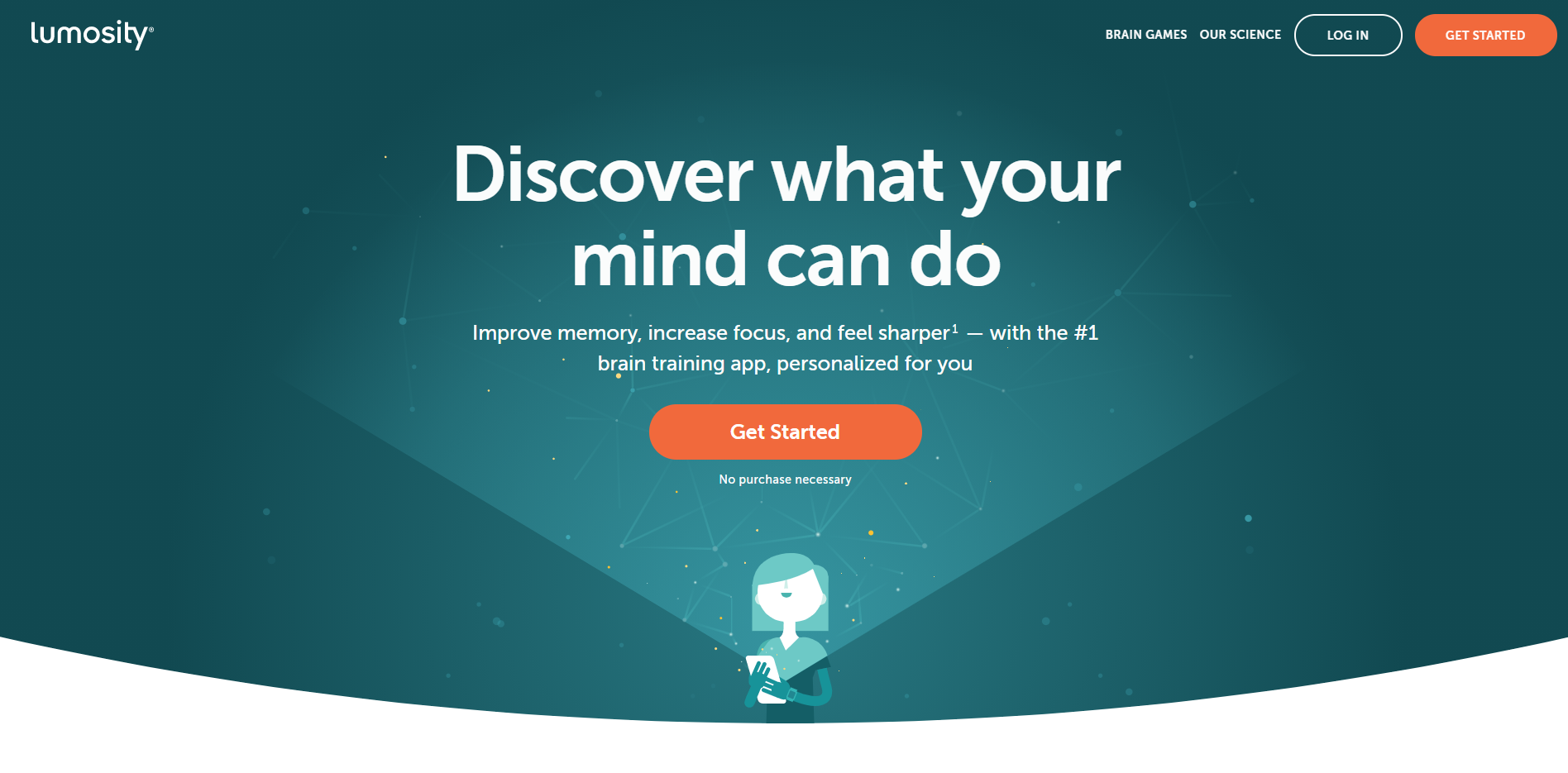
- The entire design of the landing page is in accordance with their brand positioning statement.
- The colors used are very soothing, calming and positive.
- Though it touches a sensitive topic, the colors and the language used have an assurance giving tone throughout.
- It has 2 CTA buttons, of the same contrasting color of orange and with the same text. This will make sure that there is no paradox of choice that is confusing your visitors.
- Right below the CTA is the line “no purchase necessary” which is a more polite and elegant word usage as compared to “free.” It hence serves the same purpose as the word “Free” does but in a better way.
- The headline is very attractive, with its big font size ensuring all attention is on it. It is curiosity building too, which will ensure that your visitors stay on the landing page longer and find out about lumosity more. This increases their chances of converting.
- Right below the headline, they have mentioned how lumosity will benefit them.
- The sequencing of the information on this click-through landing page is done so perfectly that it helps the next step that they want the visitor to take.
- By mentioning it is the “#1 brain training app,” it is again winning the trust of its visitors and making itself a credible brand.
Possible areas of improvement are:
- The text on CTA “get started” could be made more interesting. For example, “start my training now.” This will have a direct effect on whether your visitor converts or not.
- While the background design is beautiful, it could be made a little less distracting so that due attention can be given to other elements of the page.
Example 6: Nationwide Pet Insurance
This click-through landing page is a balance between strong and weak points. The strong points are:
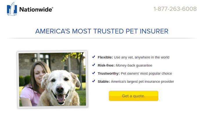
- The headline, “America’s most trusted pet insurer” though does not mention the benefit, serves as social proof which will ensure that the visitors do not exit from the page without knowing more about the firm.
- Supporting the headline, are bulleted points to show why it is the most trusted pet insurer.
- Additionally, the keywords of the bullet points are highlighted through bold font which makes this page more skimmable and hence more convenient, less abandonment and more conversions.
- The CTA button is of a contrasting yellow color, making sure it is not missed.
- The text of the CTA button, “get a quote” gives direction on what the visitor should now do.
- The phone number at the top of the page clicks to call number, making it easier for everyone to call the firm for any queries, or any purchases.
Possible areas of improvement are:
- The models are looking straight at the camera. Research has shown that the visitors tend to look where the model is looking. Hence, if the model is made to look at important page elements like the CTA button, for example, the landing page will perform better.
- The aesthetics of this click-through landing page are too low and can be worked upon to make the landing page more convincing as well as engaging. Connecting with your visitors through the design of your landing page is important, but something that they have failed at given due justice to.
Example 7: Sallie Mae
Sallie Mae is another click-through landing page example that I would like to take you through. The highlights of this example are:
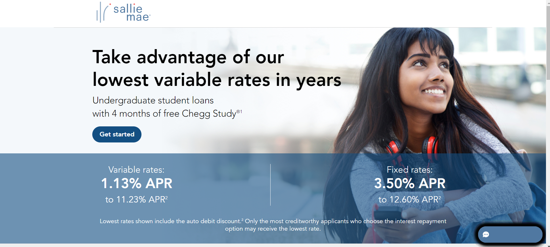
- The headline is clear and focuses on the immediate benefit that they are offering and hence keeps the visitors hooked to the landing page.
- The headline is creating a sense of urgency and FOMO by saying, “lowest variable rates in years”
- The headline is clear in telling the visitors what they should do- “take advantage”
- The headline is followed by the services it offers, along with the added benefit in the form of “4 months of free Chegg Study”
- This is then followed by the CTA button in a contrasting color of blue.
- Right below the CTA button is the interest rates highlighted which ensures that even if someone is about to abandon the page, the interest rates will get them hooked again.
- The page also uses a model, so as to keep the visitors engaged.
- They have a live chat button for answering the queries of the visitors immediately. This too leads to more conversions. This button moves with you as you scroll downwards and is hence always accessible.
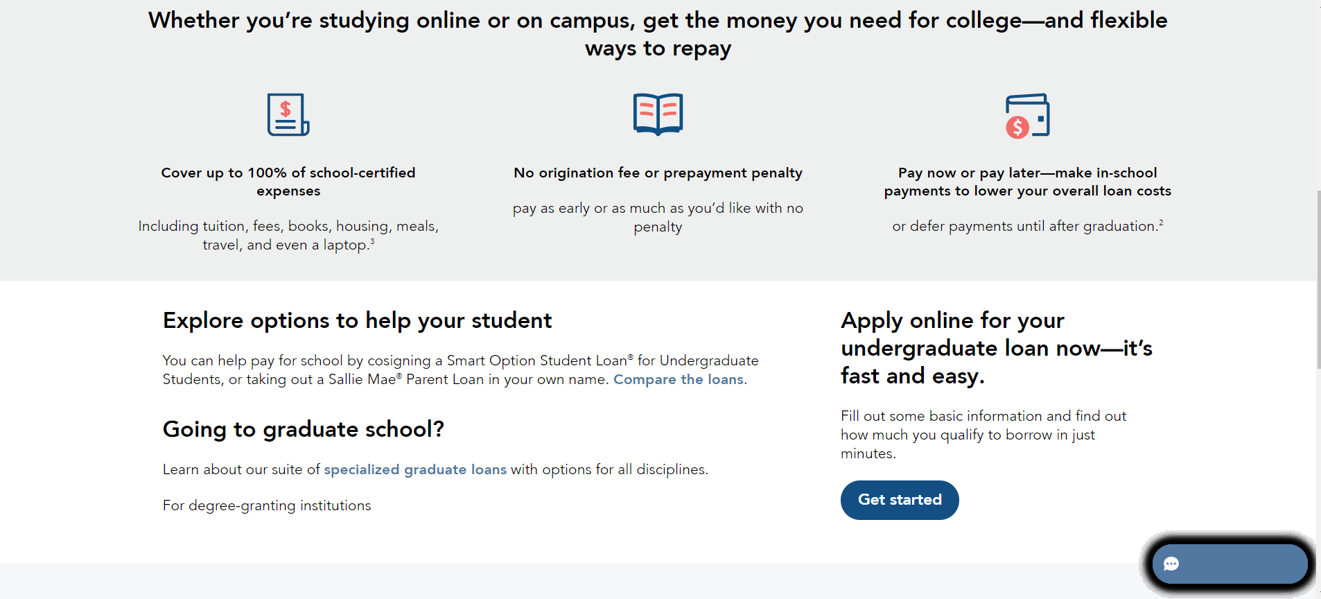
- When you scroll down further, you will see 3 main points or features about the loan which is being offered. This hence provides further information on their product which aids in increasing conversions.
- A second CTA button is added to this part of the page, considering that the earlier one is not visible and can be accessed only by scrolling up, which might lead to abandonment or delay in conversions- which will most likely be forgotten.
- The CTA button used is of the same color and text as the first one.
- Right above the CTA, are the directions to convert as well as assure- “fast and easy”
Possible areas of improvement are:
- This click-through landing page looks cluttered and messy and can hence drive away from the visitors.
- While having a model on the page makes it more engaging, the correct usage is they should look in the direction of some important element of the page as this is where the visitors will then look. On their page, the model is looking out of the page which can become distracting.
- The CTA button could have been bigger to make it highlight more amidst so many blocks of text.
Example 8: Norton Antivirus
Norton antivirus follows a very interesting color scheme in its click-through landing page. Other than its attractive color scheme its other highlights are:
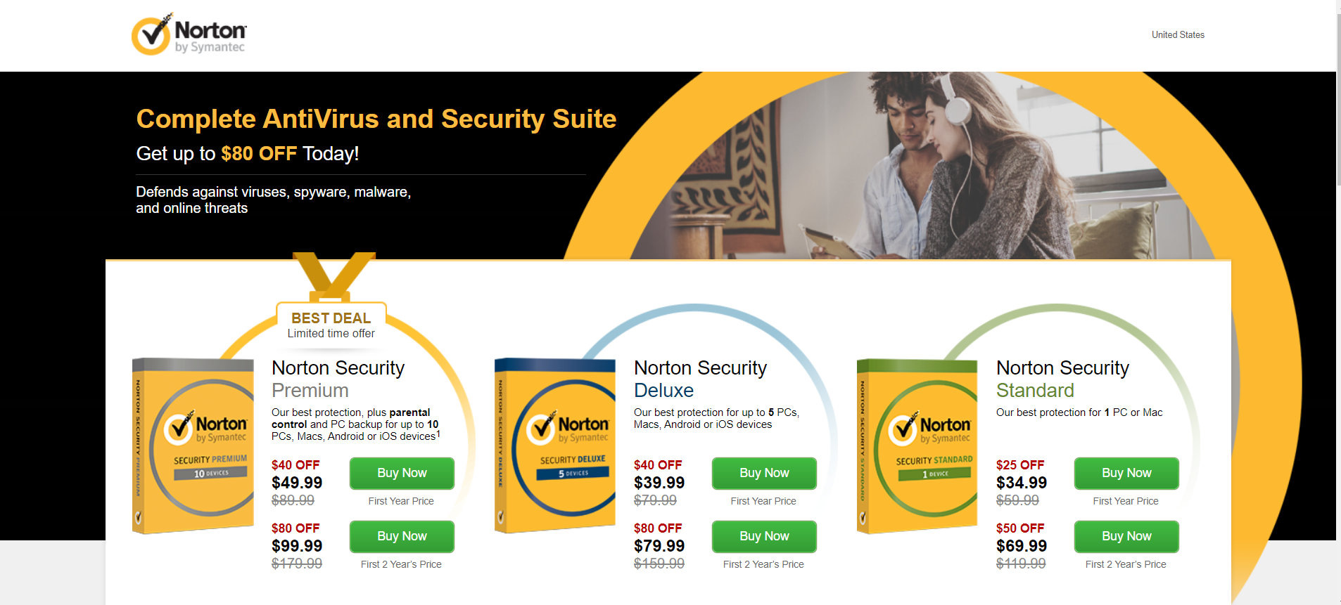
- The headline is followed by an offer “get up to $80 off today” which keeps the visitors hooked, while the word “today” also creates a sense of urgency.
- They have shown the product images which helps in increasing trust.
- For its premium security offer, they have created a specific sense of urgency by writing, “limited time offer” along with creating FOMO by writing “best deal”
- They have mentioned the distinctive features of each of the antivirus offered.
- With each antivirus, they also have 2 CTAs each in contrasting green color, with the text “buy now” which will make the visitors purchase their product/services immediately.
Possible areas of improvement are:
- They have written the benefit of Norton in small font. These fonts are not highlighted and can be easily missed out from reading them entirely. They need to be highlighted.
- The logo is clickable, which makes it easy to escape to the homepage.
Example 9: McAfee
McAfee has a very well-designed click-through landing page whose highlights are as follows:
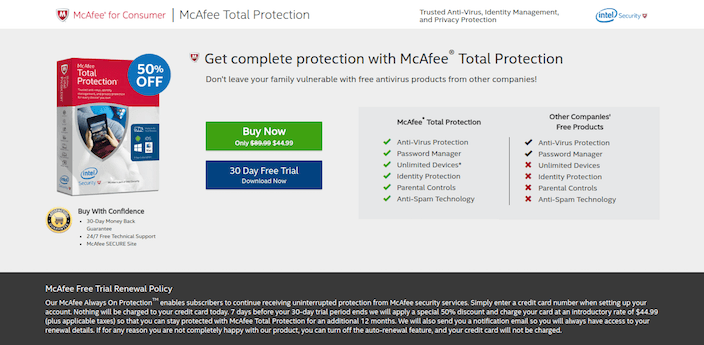
- The headline conveys a strong benefit.
- The line following the headline has a personalized note to it, “your family” and highlights the threats that they might be exposed to and how McAfee can help the visitors protect their own families.
- The short paragraphs with bulleted points are highlighting all the key benefits of the product. These are skimmable and ensure the visitors go through them which increases the chances of conversion.
- The offer is highlighted as “50% off” which retains your customers.
- The product image is shown which builds trust and instills confidence.
- A money-back guarantee and 24/7 support strengthen this offer.
- There are 2 CTA buttons, both in contrasting colors and having text which gives directions on what needs to be done next.
- The blue CTA button also includes the word “free trial” which is the key to increased net sales.
Example 10: Home Chef
Home Chef’s click-through landing page is very appealing. Here’s why:
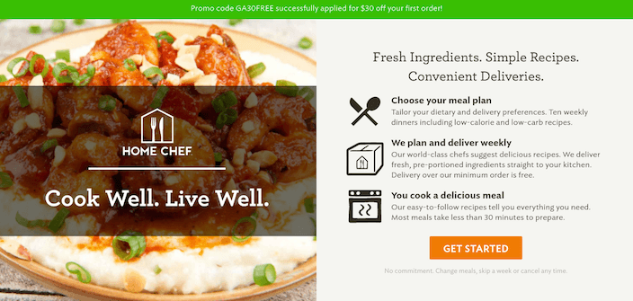
- The image used will directly trigger your hunger and make you want to cook that recipe for yourself.
- The headline conveys why Home Chef is so good.
- The bulleted points quickly convey all the benefits of signing up to Home Chef.
- The orange CTA button stands out from the grey background, making sure it is not missed.
- Following the CTA button is a small line, which highlights how you have all the freedom of skipping a meal, skipping a week as signing up to Home Chef does not make you forcefully committed to it. This is an assurance that will make sure that the visitors do not end up procrastinating about it.
- The green bar, contrasting color from the rest of the page advertises an offer that is available on the product.
Possible area of improvement is:
- The CTA text can be improved and made more interesting, engaging and activity-oriented.
Example 11: Strong Made Simple
This click-through landing page is well designed because of the following reasons:
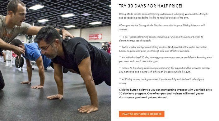
- The headline conveys a benefit as well as an offer. This is a sure-shot way of getting more leads and then sales.
- The orange CTA button pops out from the grey background.
- The CTA text, “I want to start getting stronger” is written in the first person.
- The hero image used makes the page more engaging, while also serving as a motivation to sign up for their services.
- The bulleted points quickly highlight the benefits that can be gained by joining the Strong Made Simple community.
Possible areas of improvement are:
- The image could be better. Considering that this community is about fitness, they could have included a before and after picture. This would have helped in winning the trust of their page’s visitors and urged them to convert quickly.
- The CTA button could have been larger.
Example 12: Ruzzo
Ruzzo has a differently designed click-through landing page whose highlights are:
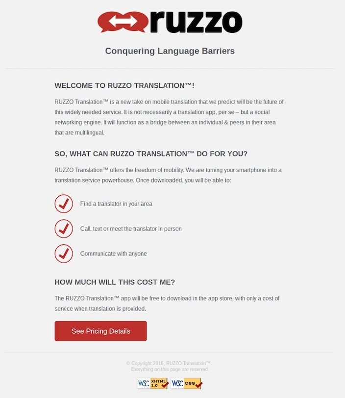
- It introduces its visitors to the company.
- A bulleted copy explains how Ruzzo can be useful to its potential customers.
- The contrasting color red CTA button stands out from the dull grey background.
- The CTA text is directional “see pricing details” and hence informs the visitors what to expect next while also keeping them engaged.
- Right above the CTA button, they have clarified how the app is free for downloading, and you would be charged only on requesting services.
Possible areas of improvement:
- The headline is “me” focused. Rather it should be focused on how it can help its visitors. For example, “we help in conquering your language barriers.”
- While it is good that they have introduced the company, it could have been done while discussing their product, without dedicating a whole section to it.
- The “How much will this cost me?” section is unnecessary, as this should be mentioned right below the headline and near the CTA button.
- The entire design and layout of this click-through landing page could have been made more interesting, appealing and engaging.
How Can Deskera Help You With Your Click-Through Landing Pages?
Deskera CRM+ has a special section dedicated to landing page creation. With Deskera CRM+ you can design fast, responsive landing pages in minutes without writing a single line of code.
Just choose one of the available templates, edit it as per your needs and publish the page on Deskera for free or connect your domain. Or, let your creativity guide you through designing the whole page from the beginning such that the final design is a very appealing, attractive and optimized landing page.
The available templates are ideal for lead generation or for guiding the customer further into your sales funnel. Find out how you can create a landing page in minutes using Deskera CRM+ or watch the video below.
From the landing page dashboard, you will be able to get insights on your landing page performance by tracking the total number of visitors, number of clicks and leads generated. These insights when acted upon will help in increasing your gross profits, operating income and in reducing your operating expenses.
The form data captured on landing pages is sent automatically to Deskera CRM+ where it is neatly organized into segments.
The segmented data can be used for running automated drip campaigns, email marketing broadcasts, or can be passed as leads to your sales team to follow up and close.
In addition to powerful landing page builders, funnels, contact, and deal management, Deskera offers integrated Accounting, CRM & HR Software for driving business growth.
Key Takeaways
When creating your click-through landing page to warm up your visitors before they move further down the sales funnel, the elements that should be considered are:
- No Distractions
- Attention-Grabbing Headline
- Social Proof and Testimonials
- Hero Image/Video
- Product Features
- Contrasting Color CTA Button
- Writing Better CTA Text
- More of 1st Person Tone
- Attractive Design
- Resolution Savvy Landing Page
- Heighten Your Lead Capture Form
- Avoid Overloading
- Create Separate Landing Pages
Keeping these elements in mind, you will be able to make a successful and optimized click-through landing page.
Related Articles
