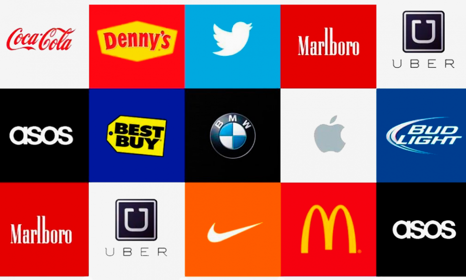

Can you identify these famous brands just by looking at their logos? Let’s find out!


How many did you get right? No cheating!
All these logos above have a story behind them, some with deeper meanings while some as simple as deriving from the title of the CEO of the company. But how did you identify these logos? Is it the story or the color of the logos? Latter is the answer. Color in logos play an essential role.
Yes, they are definitely put together to make a logo look and feel pretty, but there is more than what meets the eye. Every color or the combination of the colors in the logo derives from a story. In this article, we have explained how important the choice of the right color is in a logo and as an entrepreneur what you must keep in mind as an entrepreneur. So let’s give your brand identity with a smart logo!
This article covers the following:
- What is a logo?
- What is the importance of the logo?
- Importance of colors in the logo?
- How to choose the colors for your logo?
- Tools to help you pick your color palette
- How can Deskera assist you?
What is a Logo?
“A logo doesn’t sell (directly); it identifies”- Paul Rand, aka the father of Graphic Design.
A logo is a symbol comprised of words, images, and colors that are used to identify a brand or product. Specific types of logos come in all different shapes and sizes that run the gamut, from simple text logotypes to abstract logo marks. And if you think that logos are anything new age, then let us tell you, it’s been there since the stone age. When the first man-made a tool for the first time, he needs recognition. To recognize who made that particular tool and where.
What is the Importance of a logo?
Be it when you are walking your dog at night, or you are out for a ride yourself, you encounter hundreds of logos every day. These logos stand as an image for a company/brand, no matter how big or small. Every entrepreneur tries to give their business a face with the help of the logo. Here are a few reasons why a logo is important for your brand.
First Impression
As we discussed, logo is one of the first things that your consumer encounters. It is your first prologue to your buyers. Assuming planned well, it can ignite some curiosity in them and welcome them to learn more about your company. If you don’t plan your logo well, you may have estranged a potential client base and failed your business. This first impression is how you immediately communicate ownership over the product(s) you sell or the niche you dominate.
Brand Identity
Effective marking is tied in with recounting a story that will impact clients' feelings easily. While it’s true that logos just make for a part of the brand’s identity, it fills in as the foundation for the whole idea on which the brand is constructed.
Be it- Colors, tones, text styles, everything in its entirety makes for your brand identity for starters. Later these logos go on your letterheads, visiting cards, billboards, and so on. All contribute to developing an interesting character of your brand/business.
Memorable
Logos are a point of identification; they’re the symbol that customers use to recognize your brand. Ideally, you’ll want people to instantly connect the sight of your logo with the memory of what your company does and, more importantly, how it makes them feel. Since logos have the capability to trigger a positive recall of your brand and company, it must be a good logo that is visually appealing.
Helps You Stand Out From Your Competitors
The world of business and the world in general, is all about making the difference and being different. So, a logo can make for the first step towards that differentiator you are trying to be. Your logo must convey why your business is unique as compared to the others in the market. By saying less, the logo will do your job for you as soon as your consumer gets the first glance at it.
Increased Loyalty
As we discussed, a logo works like the face of your brand, which should convey all that you offer to your consumers as a brand. A logo, along with other things, helps you show the loyalty that you bring in and that your consumers want from a brand.
As your brand grows, your logo is going to become more familiar to a wide range of consumers, and this familiarity creates the perception that you’re trustworthy and accessible. Once they like you, your customers are going to seek you out again and again, and your logo is the thing they’ll look for first.
Grabs Customer Attention
A logo can quickly grab viewers’ attention and communicate a company’s core values in an interesting way. That short attention span, you know, the one that causes consumers to judge your business by its appearance, can work to your advantage if you have a solid logo to speak for your company.
Audience Wants It
Your logo is the first thing that your audience will look for when they see any communications from your brand. It should be front and center of all your marketing materials such as business cards, flyers, advertisements, and so on. If you don’t have a logo, you are missing out on a big opportunity to impress your customers with the minimum on the first go.
Importance of Colors in Your Logo
You are right if you think that colors make your logos look lively and aesthetic. But what if colors could send a message to your consumers or tell your consumers a little more about you? Yes, colors in your logos have the power to do that if you pick the right colors or the right combination of colors. Here are a few ways that make colors in your logos helpful.
More Attention With Colors in Logos
80% of the memories the logo creates for individuals are based on the colors presented.
While you are not so minimal as to keep a transparent logo for your company, picking the right colors for it can make a world of difference. The color you choose for your logo should enable the brand to create impressive visuals for consumers.
Brands advertise on different platforms; social media, Tv adverts, Newspapers, and Billboards. According to research done on marketing strategies, the first thing people notice about brands’ logos is the colors used.
Easy to Connect With Your Target Audience
Every company has its target audience, but your customers may not know who you are targeting. With the help of the use of the right colors in your logo, you might just be able to do that. Wondering how?
There are colors that people of different ages, sectors, regions relate to. Imagine you knew exactly the colors that your target audience relates to and you could inculcate the same in your logos. This will help you convey to your target easily, and this is the power of colors in logo.
Establishes Brand Identity
When a company starts, the main focus is to develop an eye-catching logo, combined with its color. Before it gains popularity, the brand uses both the logo and its name. After becoming successful in the market, the brand name is no longer concerned. Consumers can recognize the brand based on the logo and the colors used.
For instance, colors and the symbols associated with sports brands such as Adidas and Nike have become so popular that they are identifiable even without the brand names being written anywhere.
Triggers Emotions
Customers are more likely to remember a brand and its product based on the initial emotional reactions. Therefore, a brand must decide the kind of message they would like a specific color to convey. The main concern should always be to make the colors in your logo as easy to connect as possible.
Now that you have understood the power of colors in your logos let us understand what do the various colors mean for you as an entrepreneur for your logo.
Understanding Colors for Your Logo
In the sequence of visual perception, our brain sees color after it registers a shape and before it reads the content. Choosing the right color for a company logo is about as important as choosing the right font and design.
When we look at logos, the brain acknowledges and remembers shapes first. Then the color comes second, and then lastly, we decode words as it takes a bit more time to process the language.
Therefore, the logo color (besides its shape) helps people remember and then identify brands just by the color alone. Like when you enter a store and look at the refrigerator at a store you can spot the coke bottle even from afar because of its red label. Let us understand the psychology of colors.
Psychology of Colors
Every color has its own meaning that is unknown to many. To familiarize you with these colors, we have the following guide.
Yellow
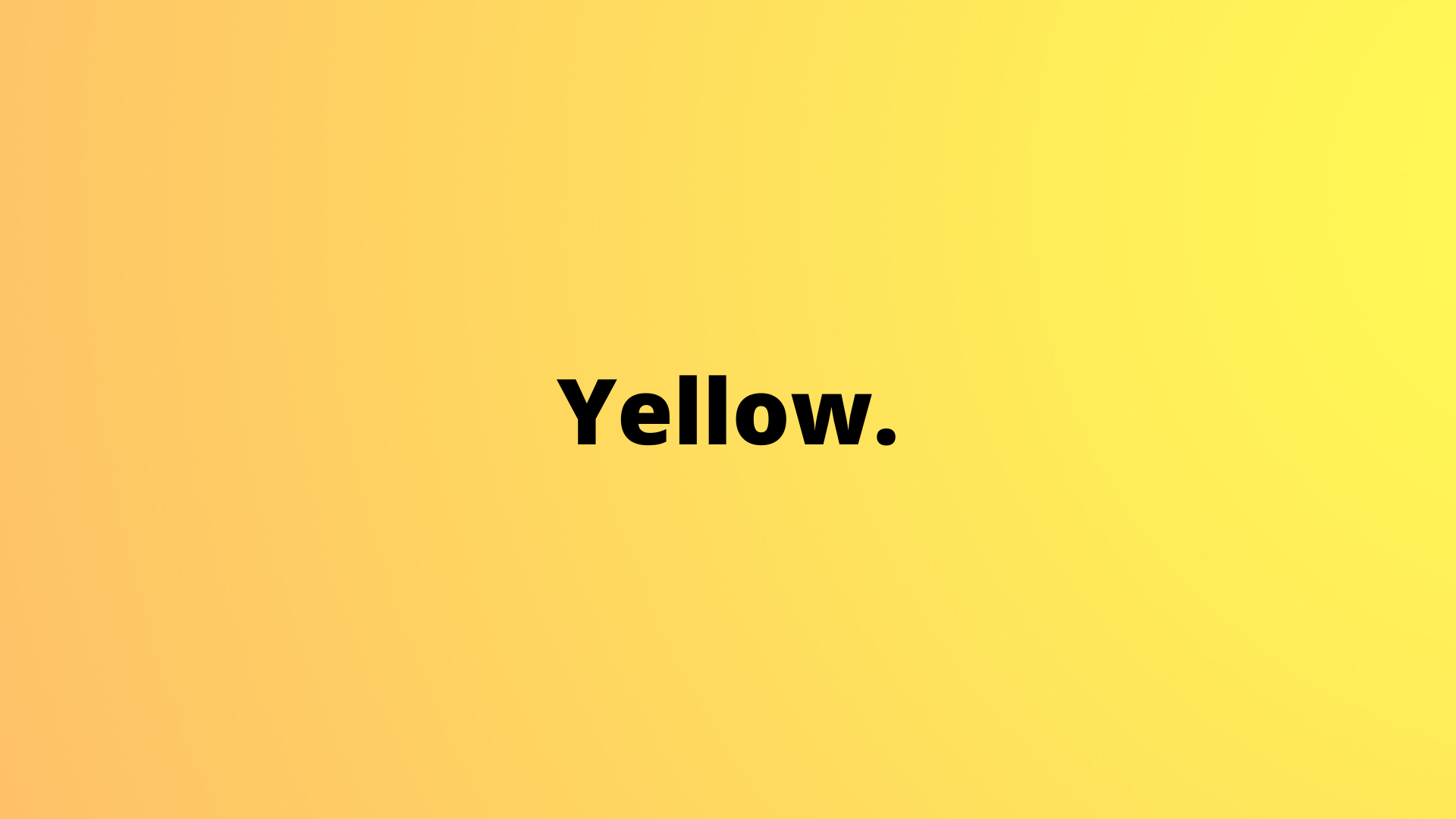
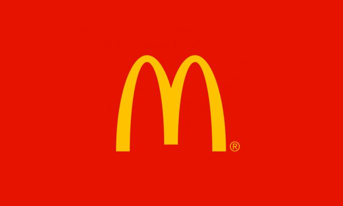
Yellow is a cheerful and energetic color; it generally evokes positive emotions like happiness or optimism. That’s why yellow color is commonly used in branding for kids—think of McDonald’s (the fast-food for kids) or Snapchat (the social media for the youth). However, yellow can also be associated with safety and caution think of construction signs.
Common associations for yellow include:
- Friendly
- Cheerful
- Youthful
- Energy
- Positivity
- Happiness
Green
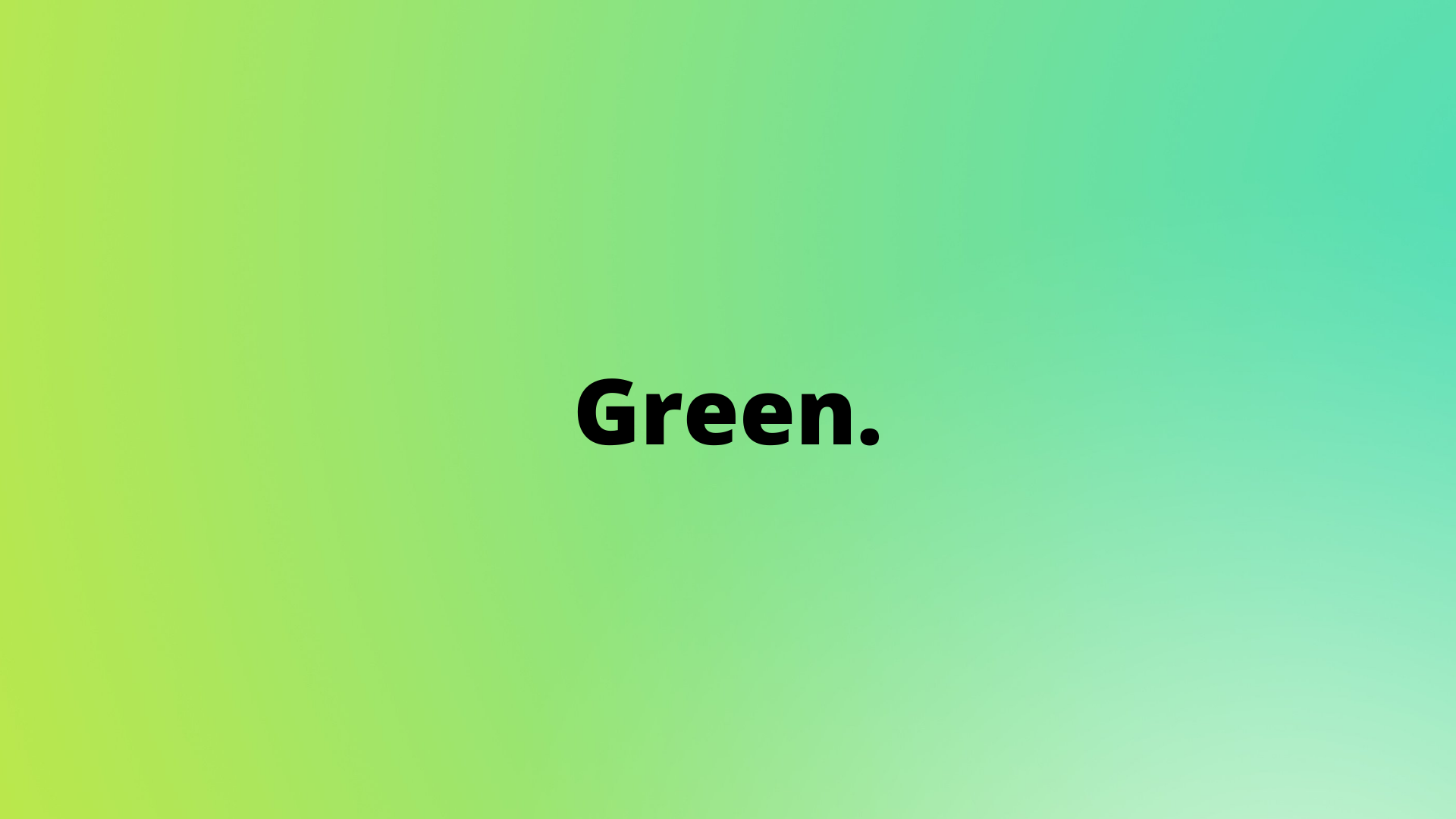
Green is a very fresh and natural color; it often communicates ideas of growth, health, and all-natural qualities. And the “natural” and “organic” aspects explain why green is commonly used in the logos of brands like Starbucks or Whole Foods. However, green can also stand for good luck and financial stability, and wealth.
Common associations for green include:
- Nature
- Health
- Wealth
- Tranquility
- Harmony
- Fertility
Blue
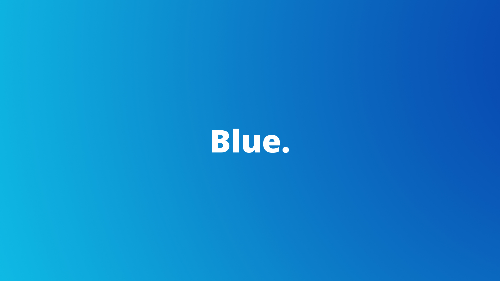
Blue is all about qualities like cleanliness and purity, and that’s why we can see so much blue being used in the packaging of the majority of bottled water brands. Besides water, blue is also associated with the sky and fresh air, so therefore it connects to the idea of cleanliness. That's why so many brands use blue for a pure, almost medical feel.
Blue has also become a very safe, predictable, and somewhat conservative color choice for corporate brands because it communicates honesty and loyalty.
Common associations for blue include:
- Wisdom
- Loyalty
- Spirituality
- Mystery
- Sophistication
- Respectability
Purple
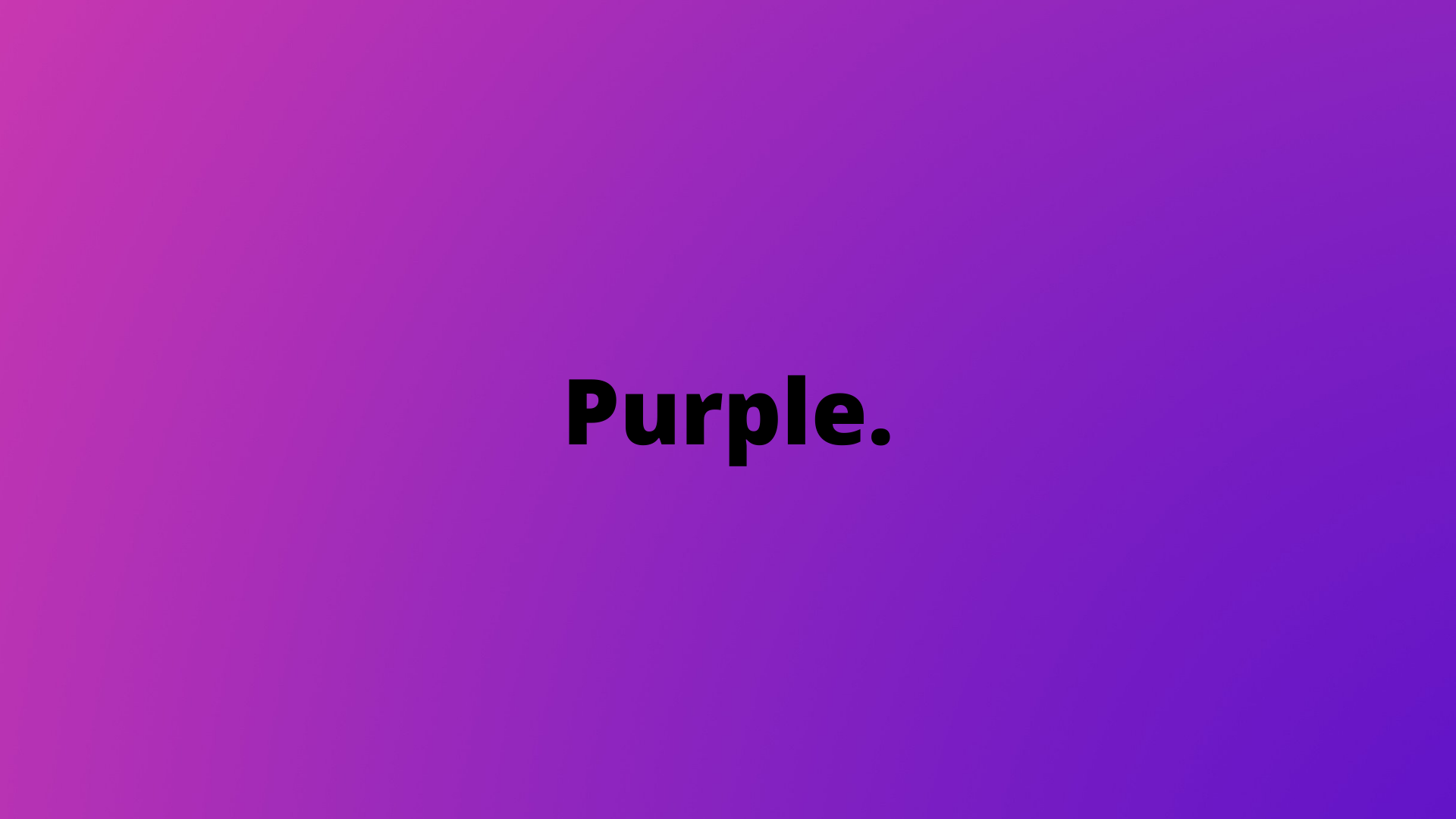
Purple is often associated with royalty, fantasy, and flowers. Purple color has also been adapted recently as a new trend among media and tech companies. It’s also a great choice for those attempting to display their creativity and soothing identity. Purple is a top choice by brands like cosmetics and high-end retail companies.
Common associations for purple include:
- Spiritual awareness
- Luxury
- Authenticity
- Truthfulness
- High quality
- Introspection
Red
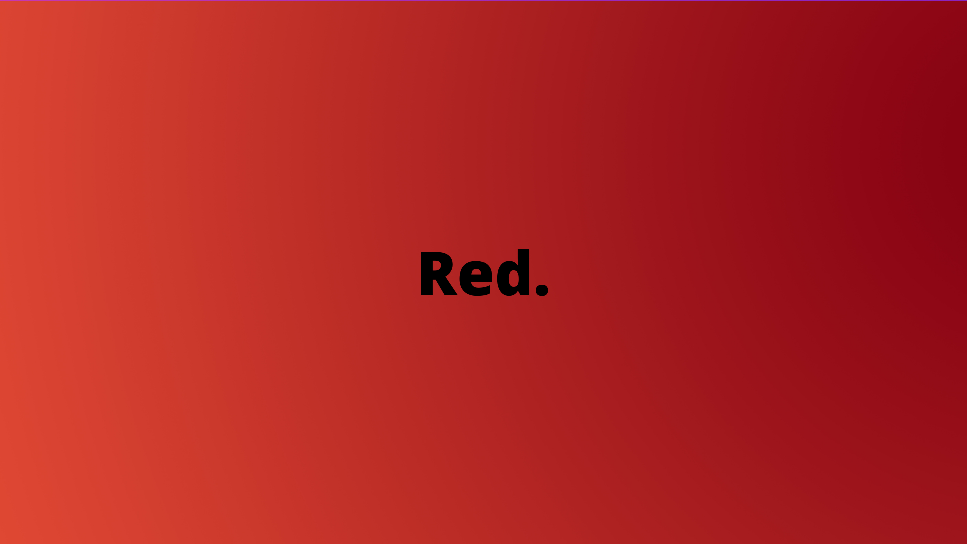
Red is often connected to the human body think of heart, lips, tongue, but also emotions like love and romance. In branding, red is often used by healthcare-related companies. Red is also often used by food companies like Pizza Hut and KFC because red suggests heat or something being hot, and it also doubles here as a reference to tomatoes and red sauce.
Common associations for red include:
- Gentleness
- Energy
- Romance
- Warmth
- Love
- Comfort
Orange
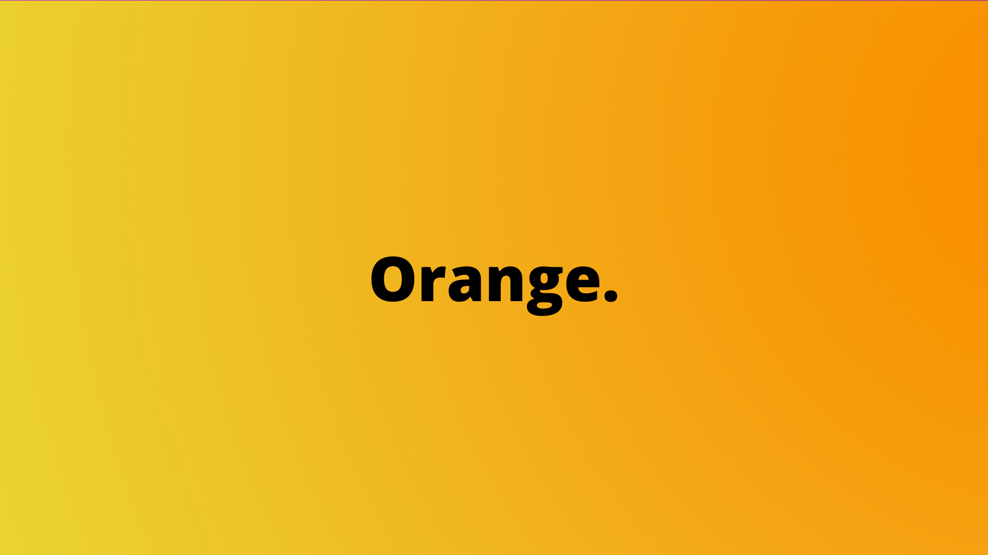
Orange, as the name suggests, is the color of orange (the fruit). That’s why juice brands generally use orange in their packaging. Because the orange color is so bright, it makes it ideal for traffic barrels, reflective vests, and other safety equipment, aggressiveness tempered by friendliness presents a great color for calls to action.
Common associations for orange include:
- Energy
- Excitement
- Prosperity
- Warmth
- Playfulness
- Change
Brown
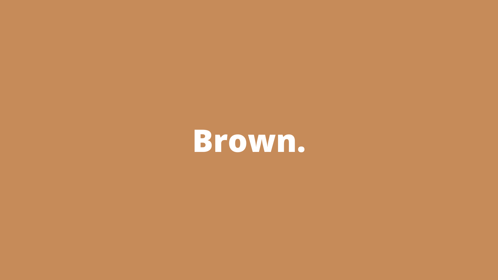
The deep hues of brown inspire a sense of seriousness without black’s stronger overtones. It remains softer, and its connection to natural tones makes it a more grounded choice. Brands looking to portray a sense of quiet supportiveness and reliability could do well with brown. Its connection to nature also offers a sense of rugged yet warm feel.
Common associations for brown include:
- Nature
- Reliability
- Seriousness
- Confidence
- Security
- Friendship
Pink
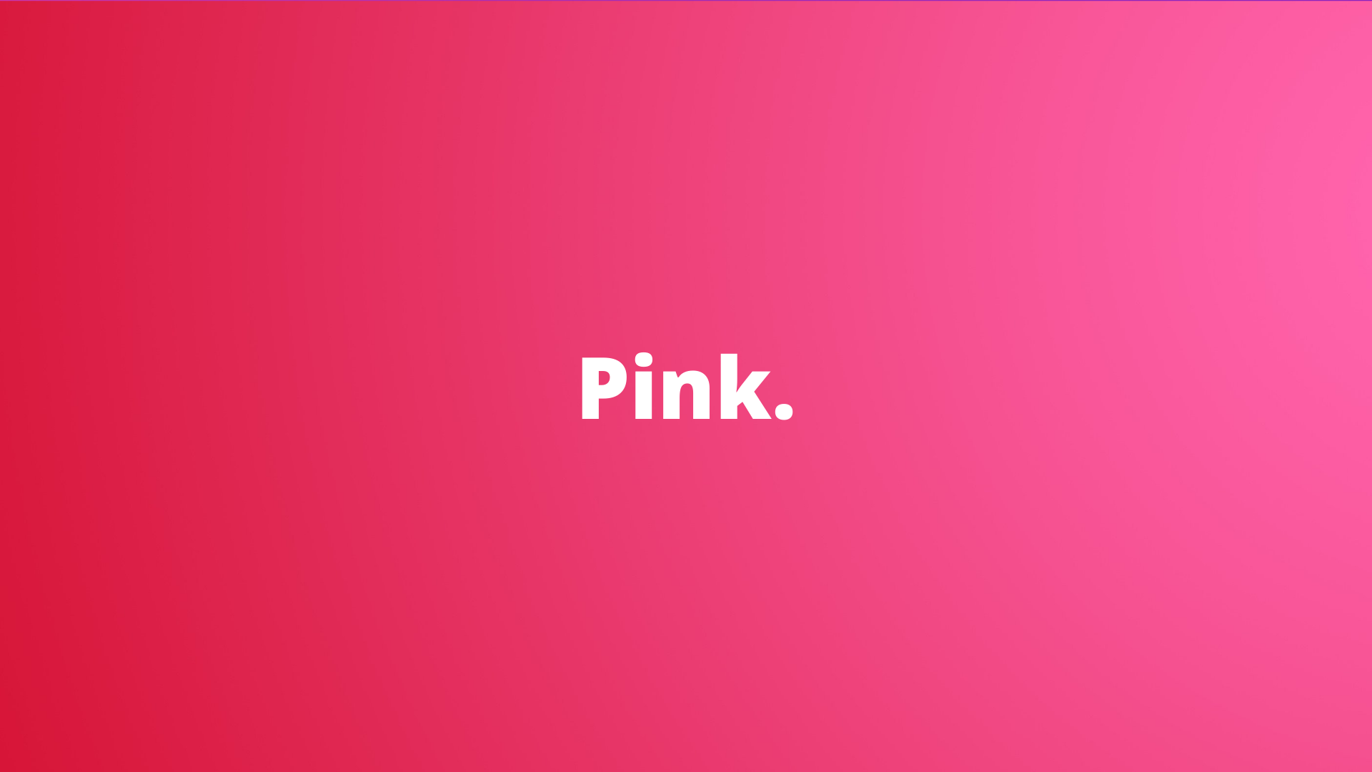
Often considered the most feminine color, pink shades are nonetheless versatile. Being a lighter shade of red, brands that employ pink can retain a sense of energy and cheer blended whit a perception of soothing calm.
This is a feeling sometimes associated with sex and sexuality. It also shines a nurturing light that soothes and reminds us of the feminine principle.
Common associations for pink include:
- Physical tranquility
- Warmth
- Love
- Sexuality
- Romance
- Femininity
Black
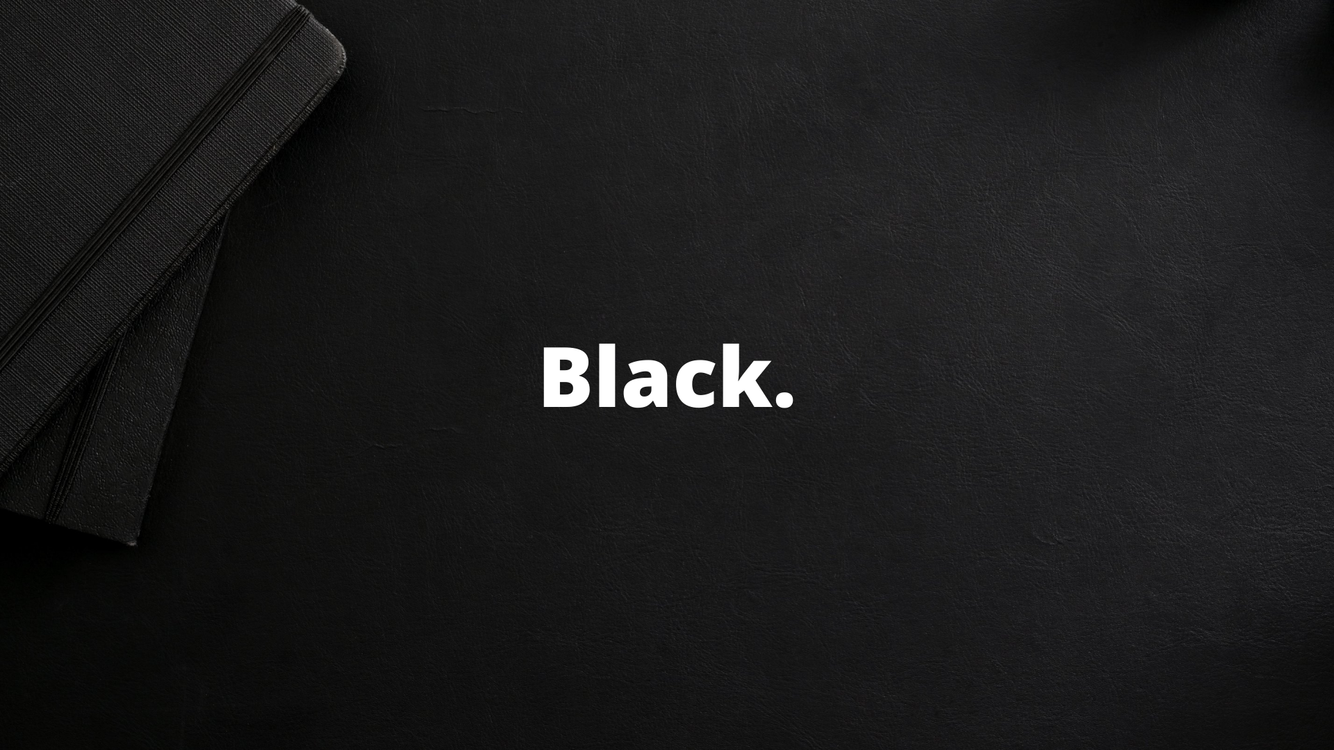
Considered the absence of colors, black can still be a powerful color to include in branding. Black is traditionally seen as a symbol of professionalism and seriousness. However, it can also be used to elicit feelings of elegance, substance, and power. Brands that pick black are looking to make a powerful statement and convey a sense of authority and respectability.
Common associations for black include:
- Power
- Strength
- Intelligence
- Glamour
- Luxury
- Modern
Gray
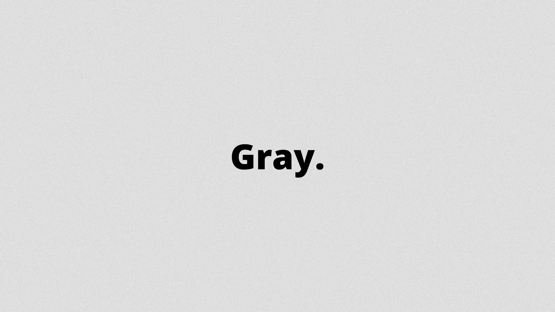
Unlike many other colors, gray is one of the most neutral shades available. Brands often choose it for its timeless, practical, and unbiased feeling. It’s ideally used as a secondary color to provide a calmer and more neutral background to bold colors, though some companies use it with resounding success.
Common associations for gray include:
- Practicality
- Efficiency
- Timelessness
- Classic
- Serious
- Mystery
White
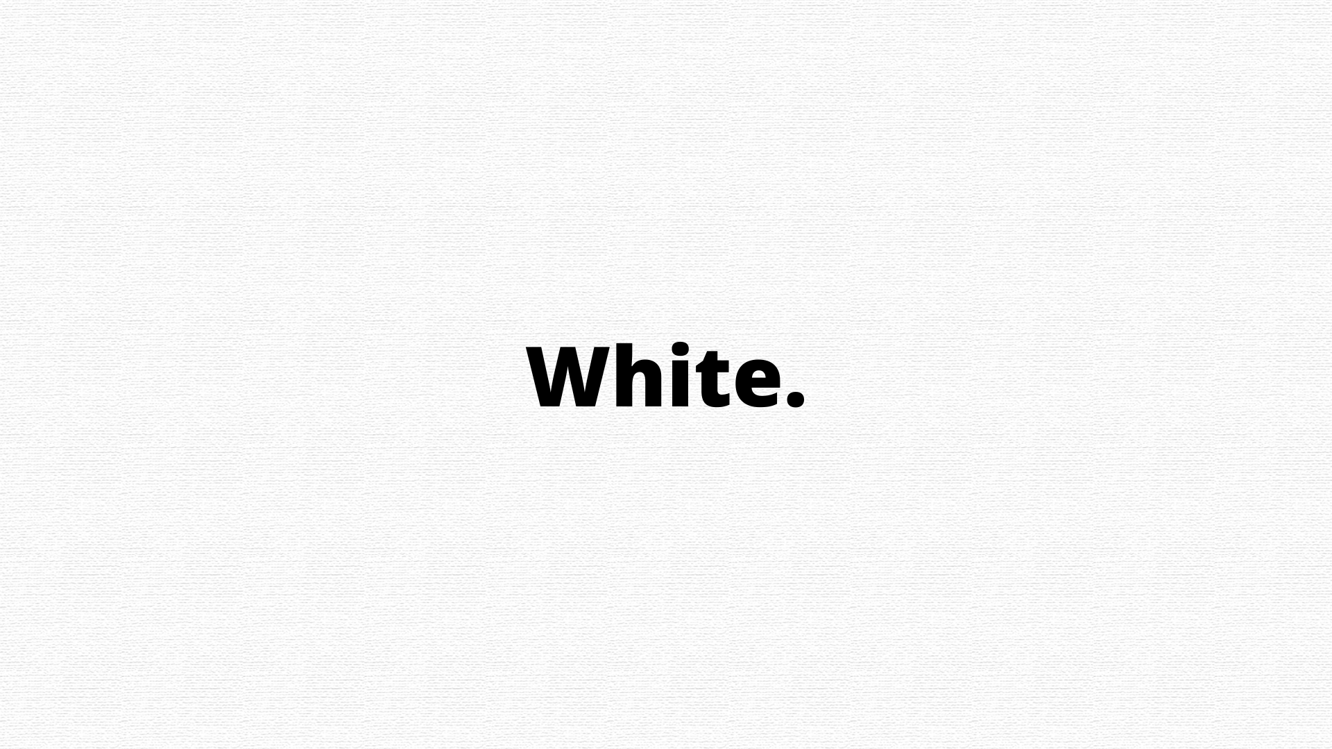
White tends to be ignored or relegated to the background, but this neutral color is important. It can work as a secondary color to provide contrast and can deliver a clean, simple background for a logo.
White is a reflective color that represents purity, sophistication, and efficiency. Brands trying to convey exclusivity and luxury can use white to resounding success.
Common associations for white include:
- Hygiene
- Purity
- Cleanness
- Clarity
- Youth
- Innocence
Despite Color Theory- Dare to be Different
In the sea of brands that may be selling products similar to yours and brands with the same values, you have to stand out. Now we are not just talking about improving your products, but how about you start by standing out with your brand logo?
Besides understanding color theory, you also need to have a clear vision of how the brand can be differentiated from competitors. What you can do is you can use color to facilitate recognition and build brand equity.
Building Brand Architecture
It’s also important to know that while sometimes colors are used to unify an identity, other times the color can be used for different business lines within a company.
- Color to differentiate products
- Color to identify business lines
- Color to categorize information
Now it’s finally time to help you pick the colors for your logo to bring the best to your consumers, starting with some colors.
Guide to Pick Color for Your Logos
Color can often be subjective so it can be tricky for designers to work with color. Hence, we have prepared a small guide to pick colors for your logo. While this is not exhaustive, we have tried to give you a little perspective and direction.
What is Your Brand Associated With?
No one knows your brand (the strong sides and goals) better than you. While choosing your color palette, think about the message that your business needs to communicate. First of all, think about the individual characteristics of your brand.
Which advantages do you want to emphasize? Speed, bold innovations, efficiency, compassion, intuition? Some researches show that, for example, shades of blue emphasize competence, and red – courage and energy. It’s therefore obvious that a company that helps the elderly and a manufacturing company for automobile parts will choose different color palettes for their logo. To choose the right color, here’s a way for you to get familiar with the value and meaning of every color.
Understand the Meaning of Colors
There are so many colors in the world, and you must know what all the colors mean. When you use certain colors in your logo it should be able to convey what your business is all about. So, pick your colors wisely and refer to the guide above on what every color means.
Is Only One Color Allowed In Your Logo?
Remember that your choice isn’t limited to just one color. Using several colors is an excellent way to emphasize the wide range of your products or services. Using 2 or 3 colors, you can point out the unique qualities of your brand.
Don’t be afraid to experiment when choosing your color palette. Check which combinations work for you and which don’t. “It’s about the feeling, mood, and image that your brand creates.
Do You Want to Be Stand Out in the Market?
The essence of a quality logo lies in brand recognition. If you want to stand out from other companies, do make sure that your chosen color palette is obviously very different from the color palettes of your main competitors. Even though Ford’s well-known blue oval is more than a hundred years old, it remains a symbol of reliability and is instantly recognized by an audience.
Use Different Visuals With Double Meanings
There are logos that make you think, and they are so smartly done that they will definitely make your consumers go to step of the customer converting process.
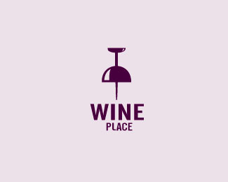
What you see?
While this logo above may look like a locator but inverted it looks like a wine glass too. This conveys that The Wine Place is the go to place for wines.
Don't Use Clichés
Every few years, there are new trends in business logo design. I like to investigate all the new trends and even advise my readers to stick to certain trends to ‘keep with the times. But what I personally dislike is when the same idea is repeated in many different logos.
Simpler the Better
Remember the golden rule: the simpler, the better. It’s simple logos that are also interesting that end up the boldest and stand the hands of time. Therefore using one color can sometimes be a winning decision. Besides, remember that if your logo has several colors, it might not look as good in a smaller size (as on a business card, for example).
List of Tools to Pick Color Palette
Luckily, you don’t need to manually pick colors for your logo because there are many special tools that will help you make the choice in a matter of minutes. We chose 10 of the most useful (in our opinion) services.
Logomak
Choose colors and fonts for a logo in just a few minutes! Choose your branch and specify what associations your logo has to create! According to developers, Logomak has analyzed logos that are used by leading companies in various fields.
On the basis of results from Logomak, it has some of the most clever algorithms which help you pick the perfect combination of colors and fonts for a very accurate representation of your brand’s character.
COLOURlovers
COLOURlovers is not just a service for creating color palettes. It’s a platform where users can discuss relevant topics and read interesting articles about color.
ColoRotate
The ColoRotate service can boast about its interesting interface, and working with it is a sheer pleasure. The color palettes are available as a 3D image and in real-time.
Color Scheme Designer
Color Scheme Designer has only recently switched to a new interface and new algorithms for creating color schemes.
Copaso
Capasso is an instrument for creating palettes from COLOURlovers. Thanks to the wide choice of functions, you can save colors in a notepad, use colors from photographs and even share your palette with other users.
Color Blender
Pick a color, and Color Blender will generate six color palettes based on your choice. Choose any shade from the palette and alter it as you’d like.
Color Wizard
Pick the main color, and Color Wizard will create color schemes based on the supplementing color, find supplementing colors, similar colors, and other variations.
Color Explorer
Color Explorer is a new instrument for creating color palettes with a well-organized collection of useful functions.
How Can Deskera Assist You?
Marketing is not a one-man’s job; it takes a lot of work. To ace your marketing, you need a team in place to come up with out-of-the-box ideas and software like Deskera that can help you execute it right—wondering why Deskera would make the best pick for you?
Deskera CRM and Deskera CRM Plus are the tools you need to make that world of a difference from the way you process your sales, customers, and orders. The cherry on the top, Deskera, also has a set of some amazing landing page templates that will help you create yours. To learn more, take a look at this quick walkthrough.
Key Takeaways:
- A logo is a symbol comprised of words, images, and colors that is used to identify a brand or product.
- Specific types of logos come in all different shapes and sizes that run the gamut, from simple text logotypes to abstract logo marks.
- Logos stand as an image for a company/brand, no matter how big or small.
- Be it- Colors, tones, text styles, everything in its entirety makes for your brand identity for starters.
- Good logos can ignite some curiosity in them and welcome them to learn more about your company.
- Logos are a point of identification; they’re the symbol that customers use to recognize your brand.
- A logo can make for the first step towards that differentiator you are trying to be.
- A logo can quickly grab viewers’ attention and communicate a company’s core values in an interesting way.
- If you don’t have a logo, you are missing out on a big opportunity to impress your customers.
- The color you choose for your logo should enable the brand to create impressive visuals for consumers.
- Imagine you knew exactly the colors that your target audience relates to and you could inculcate the same in your logos. Understand the colors to the core.
Related Articles: