
Like all other landing pages, eCommerce landing pages are designed to boost conversion. However, for an eCommerce landing page to convert, it must comprise the essential elements that work like magic for the customers coming in.
With a product category page, the customer tends to acquire the entire information about the product. When a customer is presented with comprehensive information and increased brand awareness, it becomes easier for them to make a decision of purchasing.
This implies that the core information becomes essential in converting and increasing sales. This also indicates that the same information must be included on the landing page, too. If your landing page lacks that information, it will not help the cause of conversion. Therefore, it is a must that your landing page includes the essential elements, like social proof, right images for example.
This article takes you through some of the most successful eCommerce landing page examples and the reasons why they are successful.
What is the eCommerce Landing Page?
eCommerce portals, as we all know, sell products over services. The landing pages of eCommerce carry the objective of appealing to the customers to work on action (CTA). Online retailers create them with the ultimate goal of selling physical products.
There are numerous components of a landing page the companies use to persuade the visitors to click the action button:
- Trust Indicators
- Optimized Conversion Ratio
- Catchy Headline and impressive text in the subheadline
- Social Proof, Testimonials
On the whole, an eCommerce landing page consists of all the information about the product it aims to sell and presents it to the visitor so that they could come one step towards making a purchase.
25 eCommerce Landing Page Examples
Let’s see what some of the best landing pages look like and grab a few key points from them to create a successful eCommerce landing page.
- Blue Apron
- LIV Watches
- Verizon
- Home Chef
- The Farmer’s Dog
- Xenith
- Winc
- GoPro
- Infinite Moon
- Fabfitfun
- Waterdrop
- Quip
- AllTrue
- Sephora
- Meowbox
- Casper
- Savile Row Company
- John Henric
- Sports Direct
- Tabio USA
- StudyLink
- Flaviar
- Mr. Draper
- Hemel
- The Wellness Shop
Let’s explore the details encapsulated by the landing pages of these brands one by one.
Blue Apron
Industry: Food and Beverage
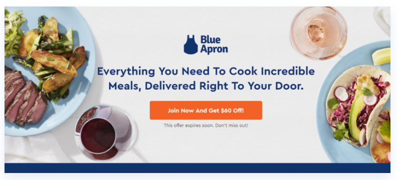
Why is it a good landing page?
- It has a bright and clear CTA button, which accompanies the discount they are offering.
- The images of food are appealing and attractive.
- The photos also inform about the variety of food options available.
- Testimonials add to the trust factor.
LIV Watches
Industry: Accessories and Watches
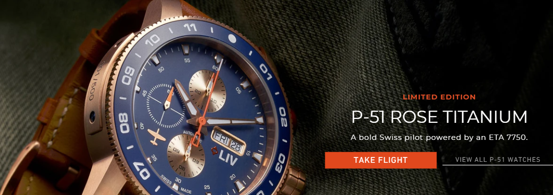
Why is it a good landing page?
- ‘Limited Edition’ indicates scarcity; a nice way to create a backdrop for purchasing.
- The main headline consists of the name of the product, which is why most people will come to the page.
- The subheadline explains the qualities of the watch.
- The CTA is clearly detectable in red color.
Verizon
Industry: Electronic Goods (Laptops)

Why is it a good landing page?
- The white space has been effectively used to enhance each element on the page.
- The page comprises the recent and upgraded information that helps instill trust in the customers.
- The page talks about the latest brand and the latest offer from its end. The name of the product is highlighted in Bold and big fonts along with the photo of the product. This gives a glimpse of what product is the page talking about.
- In the subheadline, it also gives details of the discount with ‘Get up to $1,000 off’.
- The pre-order tab is clear and sets the customer on the right path to take the next step.
Home Chef
Industry: Food
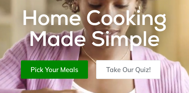

Why is it a good landing page?
- The color scheme complements the promised freshness of the meals by the brand.
- ‘Made Simple’ in big fonts highlights to the customers that it is simple to make meals with the plans they offer.
- The two CTAs, ‘Pick Your Meals’ and ‘Take Our Quiz!’ are a great way to keep the customers engaged. The ones who would not order or pick now can take the quiz and get more interesting insights about cooking.
- The 30+ weekly choices guarantee the customers of ample choices.
- #1 in customer service is again assurance of competent customer service.
- With 4M+ 5-star reviews are eye-catching and provide a sense of relief with regards to the quality of the food.
The Farmer’s Dog
Industry: Pet Food

Why is it a good landing page?
- Images on the page are very well merged with the theme and the product.
- The page clearly describes the benefits of the product.
- Details included in the copy such as ‘real food’ and ‘made fresh’ ensure the freshness of the food product and make it easier for the user to arrive at purchasing decision.
- The landing page also includes testimonials that act as social proof and offers a sense of trust and security to the new buyers.
Xenith
Industry: Sports Gear


Why is it a good landing page?
- Has Catchy and lively colors and photos that augment the sportsmanship.
- The words ‘Your Game’ are encouraging for the sportspersons who come to shop and the words also go well with the theme.
- With ‘earn free gear’ as strategic CTA, the page leads to another landing page that urges you to join the Xenith program.
Winc
Industry: Wine and Beverages
Why is it a good landing page?
- A clutter-free layout adds to the page’s aesthetics and offers a quick glimpse of the products and their benefits.
- The page includes the picture of the real product which gives clarity to the prospect of what they will receive at the end of the transaction. It also helps set the right expectation.
- There are logos of other well-known stores which helps the brand to derive its credibility.
- It also includes positive testimonials from its happy customers which helps to convince the new visitors.
- Images of the products also convey the wide variety of wine available with the company.
- The page also comprises the significant achievements in form of numbers:
- It also mentions a ‘limited time deal’ which creates urgency among customers and boosts purchasing.
Thistle
Industry: Food and Beverage

Why is it a good landing page?
- It comprises comprehensive details for booking.
- ‘Book now’ at the top tends to guide and persuade the visitor to take the next steps.
- The next steps are defined clearly with the various dropdown boxes for selecting the check-in and check-out dates.
- Finally, it asks the user to sign in or register to receive exclusive benefits and discounts.
GoPro
Industry: Photography
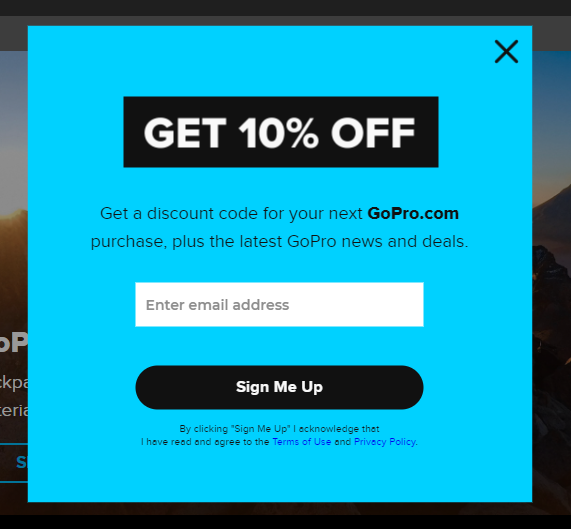
Why is it a good landing page?
- On the page, the headline grabs the attention with ‘Get 10% OFF’.
- The color schemes are good and well-coordinated.
- CTA button stands out.
- The subheadline suggests there is a discount code once the visitor signs up.
Infinite Moon
Industry: Mattress
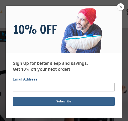
Why is it a good landing page?
- Being a mattress brand, the white color offers a soothing effect and is pleasing to the eyes. The use of blue color is contrasting the white background yet complements the theme.
- The photo with a pillow depicts the comfort the brand tries to offer.
- The page then pushes to signup with an email address for a 10% discount.
- The ‘Subscribe’ CTA button is easy to catch with a blue over white combination.
Fabfitfun
Industry: Wellness Products
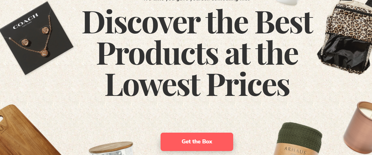
Why is it a good landing page?
- Speaking of the box, the page aptly speaks about the contents of the pack, giving an idea to the users of what to expect.
- The various logos of renowned publications are indicative of the credibility of the offer.
- The CTA button is catchy and is in a beautiful pink color.
- ‘Limited quantities available’ can help trigger purchases.
- The positive reviews are a big positive on the page.
Waterdrop
Industry: Beverages and Microdrink
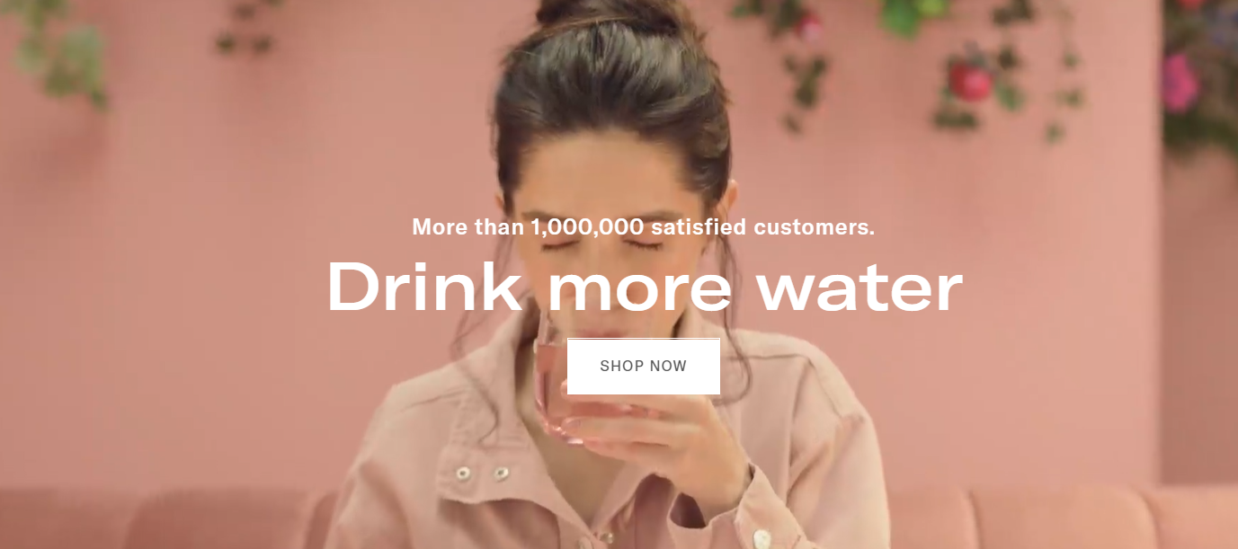
Why is it a good landing page?
- The landing page has a video running in the background, emphasizing the advantages of sipping more water on a dry hot day. However, the colors used are appealing to the eyes and do not go overboard.
- ‘More than 1,000,000 satisfied customers’ is an assurance to the new visitors that the brand has been well-accepted.
- The CTA is well-placed and stands out in white.
Quip
Industry: Dental Care
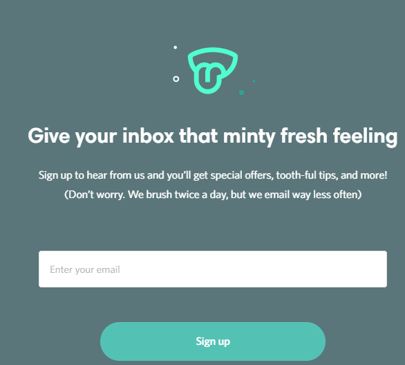
Why is it a good landing page?
- Attractive and creative headline.
- The subhead, ‘we brush twice a day, but we email less often’, conveys to the uses that they won’t be spammed with too many emails.
- The page has a clear design and a clear CTA.
- It has a clutter-free layout devoid of any forced text or too many boxes.
AllTrue
Industry: General Well-being
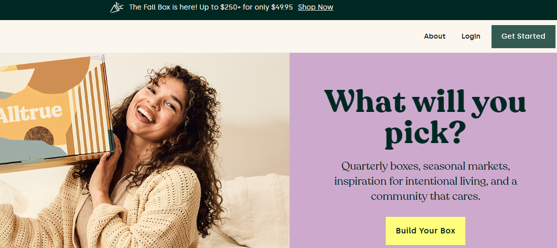
Why is it a good landing page?
- The page has boxes held in hands which gives away the size and shape of the box to the customers; so they know what to anticipate.
- Color schemes are contrasting as the CTA stands out in yellow against purple.
- There are 3 CTAs on the page. One at the top which offers value proposition and ‘Shop Now’. The other is at the right upper corner which again stands out against the white backdrop. And the third one is ‘Build your Box’.
- The subhead also showcases what kind of boxes are available to the customers.
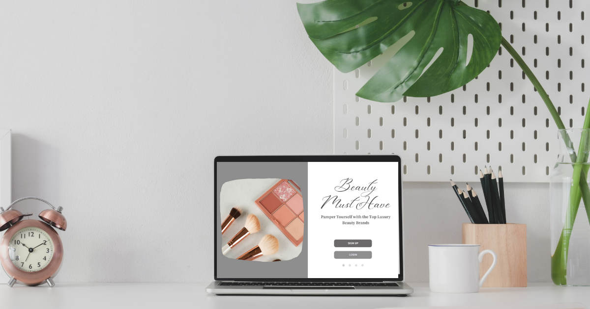
Sephora
Industry: Cosmetics

Why is it a good landing page?
- The brand aspires to hit the target with the soft color choices across the page.
- ‘Up To 50% Off’ is very catchy and stands apart from the rest of the text.
- ‘Shop Now’ is the CTA which is a shade darker than the background pink.
- The photos of the cosmetics at the side give a clear idea of the products one can purchase.
Meowbox
Industry: Pet Food
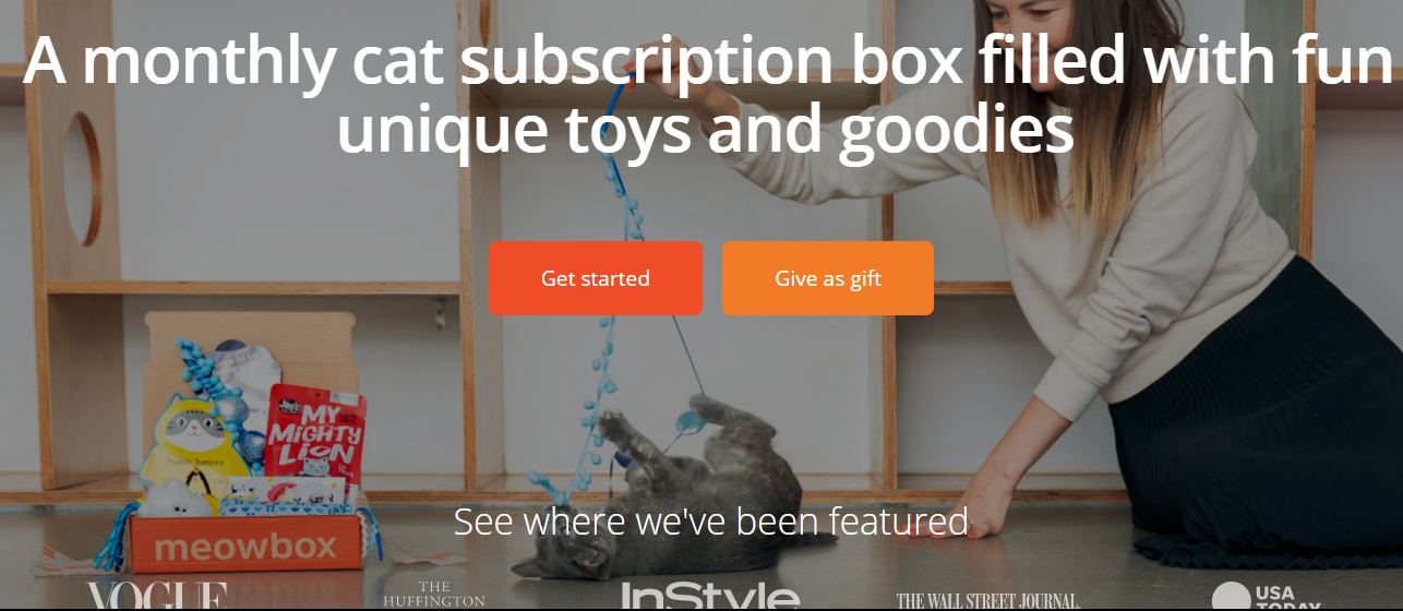
Why is it a good landing page?
- Catchy and bigger text of the headline.
- Had two CTAs, ‘Get started’ and ‘Give as gift’ which provide options to the users of getting started or gift it to someone.
- The various names of magazines and publications help build trust.
- CTAs stand out in orange amidst the darker background.
- The picture of the cat playing with the product placed nearby gives a pleasant feel to the page and represents the good times the pet can enjoy because of the product.
Casper
Industry: Mattress Manufacturing
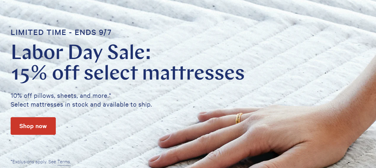
Why is it a good landing page?
- The landing page has used soft colors and for a mattress campaign, it works well.
- The headline states the offer clearly with the numbers indicating the exact amount of benefit people can avail.
- The subhead also describes the other products that are on offer and the discount attached with them.
- The CTA is remarkably seen in the bright red color.
- ’Limited Time’ is a good way to create urgency and nudge people toward making a quick purchase.
Savile Row Company
Industry: Men’s Apparel

Why is it a good landing page?
- This is a page created with the summer season in mind and the photos of models with white shirts correspond to it.
- ‘20% Off’ conveniently grabs eyeballs and stands out in white-colored font against the darker background.
- Providing the code ‘Sun20’ makes it easier for the customers to know what can be done next.
- Shop Now is the CTA which is placed at the bottom and is underlined. It is also placed at a distance from the text above and therefore, despite being smaller in font, it is clearly seen.
John Henric
Industry: Apparel
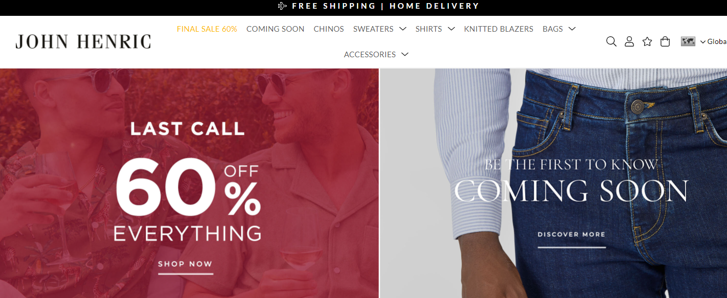
Why is it a good landing page?
- The page is divided into various segments which let the people decide where they want to shop.
- Each box is well-separated from others with contrasting colors.
- ‘Last call’ shows scarcity and pushes people to make hurried purchases.
- 60% off is a great way to represent the benefits the buyers can get.
Sports Direct
Industry: Sports products
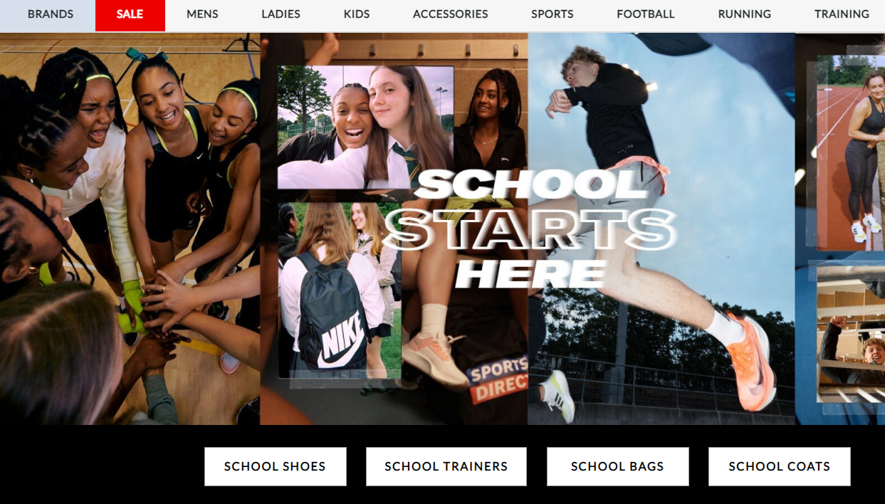
Why is it a good landing page?
- The page includes the names of all the brands that it covers and brings together the products under its roof.
- An A-Z list lets people click and arrive at the page of their brand directly.
- The landing page aims at the school and academic accessories. It is targeting the seasonal times when the schools resume.
- The various buttons at the bottom lead the buyers directly to the page of the product they want to buy.
- The images used a=depict a lot of energy and youngsters which matches with the idea of a sports brand catering for school needs.
- The ‘SALE’ tab is highlighted in red color and therefore, makes it easier for people to know which page they are on.
Tabio USA
Industry: Socks Fashion

Why is it a good landing page?
- The page very well spotlights its product- socks in the photos used.
- With the two CTAs: Shop men and Shop Women, the brand segregates the shopping for men and women, simplifying it for all to shop.
- ‘Engineered with Craftsmanship’ shows the efforts and expertise the brand holds in manufacturing socks.
StudyLink
Industry: Education
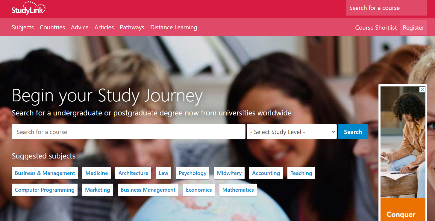
Why is it a good landing page?
- As it is a page that aims at providing guidance for education, the page aptly has a form the student can fill in for the course they seek.
- It has a clear-cut presentation of information and has the suggested subjects at the bottom.
- With the subhead, the page reiterates that the student can seek admissions at universities across the world.
- Images in the background are blurred but appropriately match the message of the studies.
Flaviar
Industry: Beverages
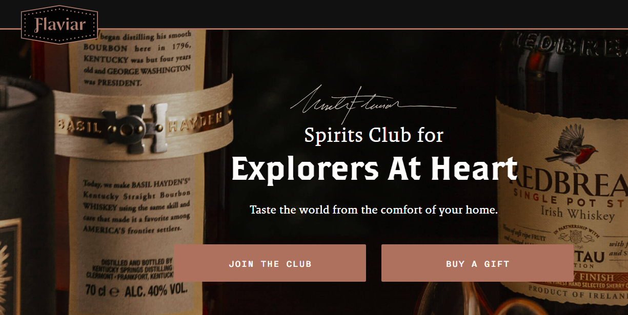
Why is it a good landing page?
- The headline is engaging and offers a feel-good experience.
- The subhead underlines the idea of ordering and enjoying the beverages from the comfort of one’s home.
- The CTAs are noticeable and guide toward the appropriate step the customer would desire.
Mr. Draper
Industry: Apparel
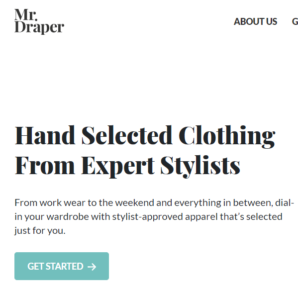
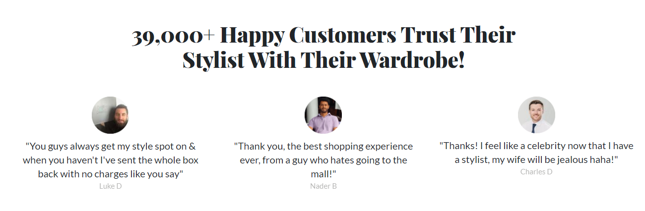
Why is it a good landing page?
- The page is simple, with white background, and provides an elegant feel to the customers.
- With ‘39,000+ Happy Customers..’ it reiterates the fact that it is a renowned and conversant brand.
- At the bottom, it consists of testimonials from previous customers, which adds as social proof of its credibility and acceptance.
- Has a simple, yet highlighted CTA ‘Get Started’.
Hemel
Industry: Luxury accessories

Why is it a good landing page?
- All the lovely watches compiled in one single page make for a tempting purchase. ‘Join the Hemel Army’ further encourages the customer to go for the purchase.
- The ‘Subscribe’ button guides the visitor to sign up for new updates and insights.
- The impeccable photos of the watches make for a great customer experience.
The Wellness Shop
Industry: Wellness

Why is it a good landing page?
- The layout is clean and clear, devoid of any unnecessary text, images, or boxes.
- The photos of the products set the expectations right for the customers.
- The headline in bold and black, against the white background, catches attention.
- The code has been given in a different color, yet matches with the theme and the color of the product bottles.
- CTA is marked out and easily noticeable.
How can Deskera Help with CRM?
Have you been striving to find the right marketing management platform? Deskera can help. With Deskera, you'll find a cloud-based system that can fill all your business needs. Using Deskera CRM, you can automate your email marketing strategies and enhance your business productivity. The Deskera platform can help you with every aspect of data integration and real-time analytics.
Deskera can help you facilitate the process of designing and managing landing pages through your CRM software. Thinking how? Deskera CRM+ has the solution.
Deskera CRM+ is a software that has a special section dedicated to landing pages. This section is designed in such a manner that it will provide you complete assistance throughout the process of designing, launching, tracking, and optimizing your landing pages.
Deskera CRM+ comes equipped with some pre -installed landing page templates that you can use. You can even create the landing page from the beginning according to your special requirements. Both of these options are supported in the Deskera CRM+’s landing page module. This will help you in creating professional landing pages that will help in generating leads without any professional help.

CRM software from the house of Deskera helps you manage customer relationships, sales pipelines, and marketing campaigns, among others. In addition to this, you can create email campaigns for your business and view the results with click-through rates (CTR) and detailed analytics on open rates. In addition to enhancing productivity, it reduces administrative costs.
Your company can increase its customer database through a dedicated sign-up landing page. Your existing customers will be retargeted, and you will be able to better manage customer deals and the sales funnel. If you have a focused sign-up landing page, your business will be able to increase its customer database which will further help you to retarget your existing customers and also manage customer deals and sales funnel better. If you have a good CRM, managing your customers becomes easier. It will save a lot of time and money in the long run.
Key Takeaways
With the extensive list of some of the very successful landing pages, we have a fair idea of what a good landing page needs to be made up of. Here are the most important elements of a remarkable landing page:
- A catchy and attractive headline which not only has a stylish font but also has the right color.
- The subheadline is equally important and must possess the right choice of words to enhance the offer and persuade the customers.
- The offer or discount coupon or code can be best described by a number. For example, 10% Off, Get 15% Discount, and so on.
- The clutter-free layout has the right color schemes and is well-coordinated with the theme (or industry) the product belongs to.
- Images, especially those including human faces have a greater impact. Photos of the actual products are also a great way to earn credibility points.
- Any inclusions of renowned publications in which the brand has found mentions contribute to the trust factor.
- Adding quizzes or short games can help keep the customer engagement high and can assist them with contemplating the decision to make a purchase.
- Finally, be it any industry, the landing pages play a critical role in building the future of the brand.
Related Links