
“The road to learning by perception is long, but by example short and effective." -Seneca
In any and every sector today, a landing page is a company’s bread and butter. Without a landing page, your company is almost nonexistent. For all those who struggle to understand what a landing page is, we have a simple definition for you.
A landing page is any web page that your customer can land on. No, we are not talking about your homepage, but in the marketing realm, it’s usually a standalone page, distinct from your homepage or any other page, but a page that serves one focused purpose.
Your landing page works as a follow up to the services that you have mentioned anywhere. This is one of the most powerful steps in turning your visitors into your customers.
With your landing page you can finalize your deals, offer any special deals to your clients you want, share a piece of information or a deal that you think your customers must know about, in return for providing contact information.
In this article we have some great examples of landing pages of various brands, companies that will help you understand what makes for an excellent landing page. This article will also help you incorporate some solid ideas into your already existing landing pages.
So, let us take a look at 101 great examples of landing pages.
All the examples have been divided into sections, one is what they did well in their landing page and second is the A/B test. For all those who are not sure what A/B test is- A/B tests allow you to compare 2 versions of anything to conclude which one makes for more effective than the other. For example, in a landing page this would work as, version A of the landing page works better.
1. Paypal

Key Takeaways
- The bulleted format of the content rapidly imparts the advantages of the offer.
- The picture on the landing page fills in as a visual portrayal of the offer, showing customers what they'll get if they adopt Paypal or make a shift to Paypal.
- The blue button which is CTA pops off the page.
- The “free” in the heading sends a clear message to the visitor. Since the free factor is one of their selling points they made it clear in the landing page.
A/B Testing
- The text in the image used is not legible for the customers.
- The download button is not placed right and even the size could have been bigger. This would have helped to make the action more impactful.
2. Uber
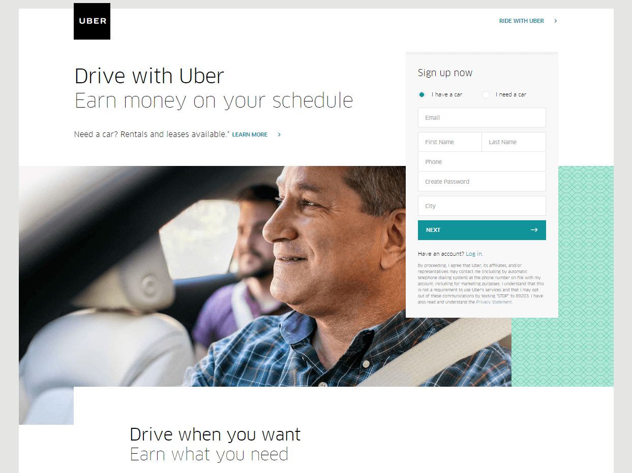
Key Takeaways
- The headline is to the point, conveys clear benefit to the customers.
A/B Testing
- If you see at the top of the page, there is a "Ride with Uber" interface. This is not as useful as the designers/makers thought it would be. All it will do is drive possibilities off the page.
- The page overall is clean and to the point.
3. Hubspot + Canva

Key Takeaways
- The image on the page has made sure to convey exactly what customers are offered by Hubspot.
- The bite sized content which is separated in two halves not only makes content easy to digest for the customers but understand the offerings clearly.
- The headlines are also on point, making it clear what hubspot definitely does.
- The centre alignment of all the text/content on the page makes it easy for customers to catch all the information without leaving out anything.
A/B Testing
- This long structure may prevent possibilities on the page from changing over.
- The background image does not very well collide with what the page intends to say. Mountain in the background image does not convey anything.
- More blank areas could assist with letting the page components "relax" more and be significantly more powerful than their present arrangement.
4. LinkedIn

Key Takeaways
- Content on the page is split into small bite sized content which is easy to digest for the customers.
- The bulleted format of the content conveys the advantages very clearly.
- The "autofill with LinkedIn" button permits customers to finish the structure with a basic snap as opposed to finishing this extensive structure.
- The picture gives an inside investigation of what utilizing the item is really similar to.
A/B Testing
- Various outbound connections, including the LinkedIn logo and online media catches, give such a large number of alternatives to customers to forsake the page without changing over first.
- The feature doesn't pass on a reasonable advantage. It likewise utilizes language, who precisely are "complex advertisers?"
- Submit- as a CTA button is just about as lethargic and average as CTAs get.
5. Midas Media
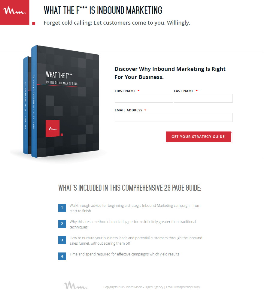
Key Takeaways
- The headline is unconventional and catchy
- Bulleted duplicate rapidly imparts the advantages of the offer.
- The CTA button tone draws in the eyes.
- The picture fills in as a visual portrayal of the offer, showing customers what they'll get subsequent to changing over.
A/B Testing
- The structure fields could be improved to add to the visual progression of the page and focus the CTA button.
6. Simply Measured
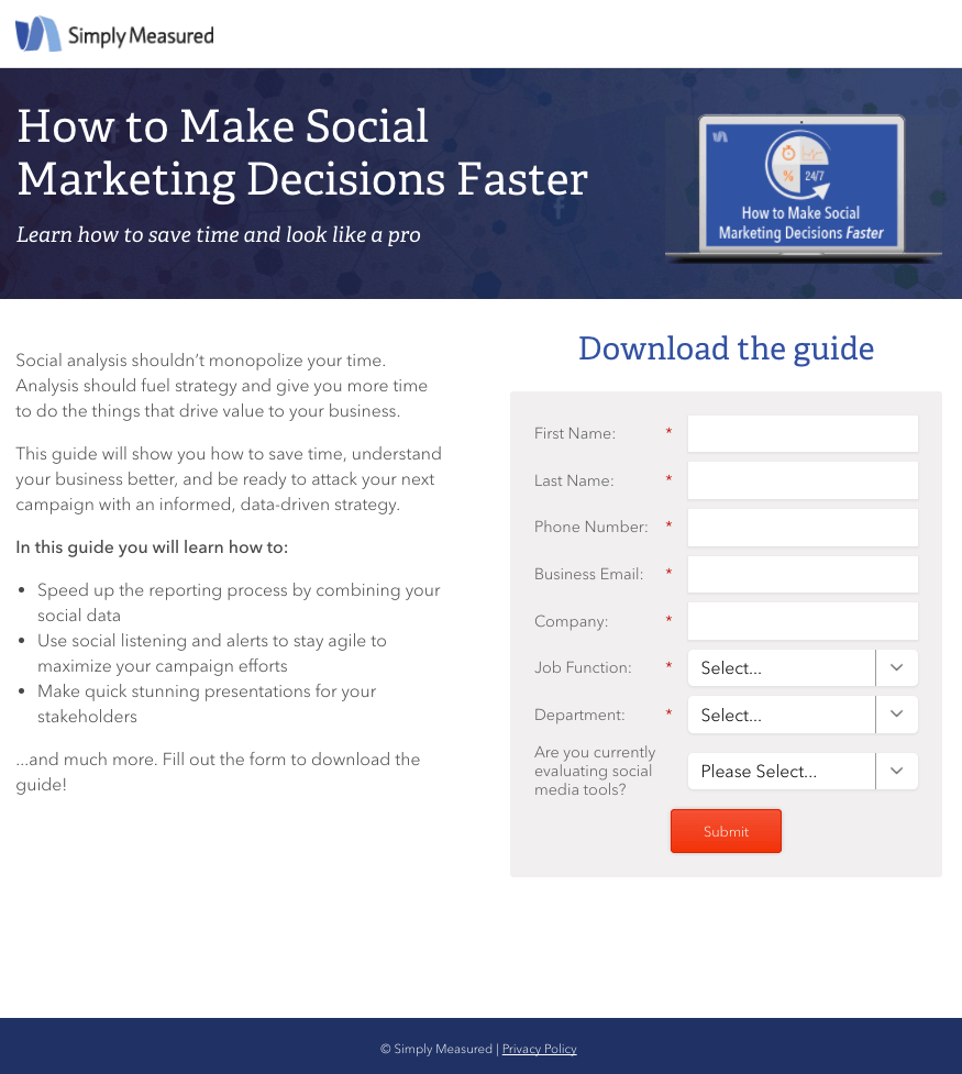
Key Takeaways
- The feature offers a significant asset: forecasts from specialists that will permit you to begin making arrangements for 2027.
- Bulleted format of content conveys the advantages of downloading the aide.
- The CTA button shading isn't utilized elsewhere on this page, and it draws consideration against a white foundation.
A/B Testing
- The feature offers a significant asset: forecasts from specialists that will permit you to begin making arrangements for 2027.
- Bulleted duplicate rapidly conveys the advantages of downloading the aide.
- The CTA button shading isn't utilized elsewhere on this page, and it draws consideration against a white foundation.
7. Klient Boost

Key Takeaways
- The headline conveys all the values the company offers.
- The CTA button shading draws prospect consideration.
- These CTAs profit by our longing to get something to no end by utilizing "Free" directly in it.
- More pictures give a sneak look into the aide
- Tributes fill in as friendly evidence, adding believability to the offer.
- The entirety of the CTAs are written in the first individual.
- The picture fills in as a visual portrayal of the offer.
A/B Testing:
- The outbound links in Johnathan Dane's profile might drive traffic off the page.
8. Zurple
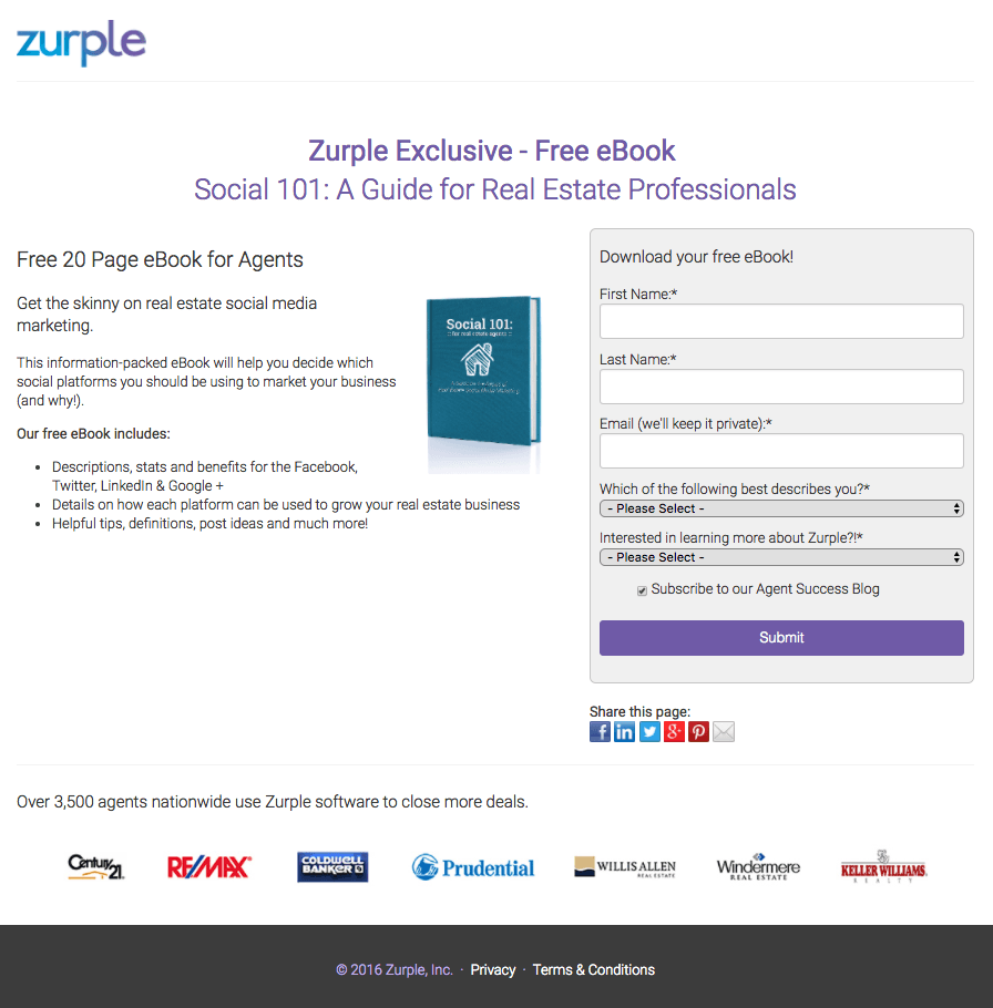
Key Takeaways
- Negligible duplicate makes this page simple to peruse.
- A photograph shows what the digital book resembles.
- The content of the book that's mentioned may make customers drawn to buy it.
- The page has used the words "exclusive" and "free" to tempt perusers.
- Organization logos grandstand the notable organizations that utilize Zurple from one side of the country to the other.
A/B Testing
- A logo connected to the landing page permits clients to exit prior to changing over.
- The catch in the content "Submit" could be supplanted with something really convincing.
9. Inkling
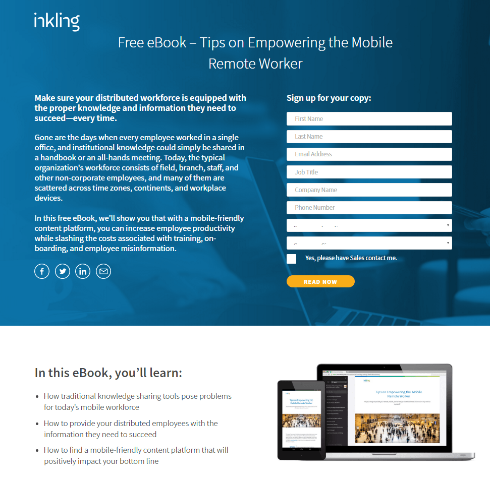
Key Takeaways
- The feature presents a significant asset.
- Bulleted format of the content conveys the advantages clearly.
- The CTA button shading flies on this current page's experience.
- "Now" in the CTA profits by our inborn craving for moment satisfaction.
A/B Testing
- The drop-down structure fields are not named which can be befuddling.
- Online media joins permit possibilities to get away from the page without changing over.
10. Urban Airship
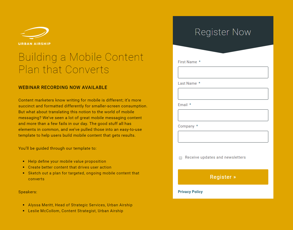
Key Takeaways
- A short structure makes changing over on this page simple.
- Bulleted format of the content conveys the advantages clearly.
A/B Testing
- This CTA button shading mixes in with most of the page.
- Head shots of the speakers would give the page greater validity and increment human allure.
- The CTA "Register" could be changed to something really convincing.
11. Shopify

Key Takeaways
- This CTA button shading contrasts the remainder of the page well.
- Numerous CTAs cooperate to persuade the possibility to change over.
- "Today" in the CTA accentuates the prompt advantage of tapping the catch.
A/B Testing
- Since the logo is linked with the homepage it may lead prospects to return.
12. Marketo

Key Takeaways
- This CTA button shading contrasts the remainder of the page well.
- A moderate footer doesn't occupy from the offer.
A/B Testing
- The CTA "Download" is probably more or less dull.
- The feature could be phrased to pass on a more grounded advantage.
13. Capital One

Key Takeaways
- The headline is to the point and clearly highlights the benefits.
- The bulleted format of the content makes all the messages easy to register and understand.
- Agreeable CTAs help to change over the possibility in two better places on the page.
A/B Testing
- A bustling footer loaded up with connections and web-based media symbols divert possibilities from asserting the offer.
- The CTA "Join presently" could be more custom-made to the offer. Indeed "Give Me Unlimited Checking With No Monthly Fees" would probably perform better.
14. Indeed Crowd

Key Takeaways
- The feature passes on an unmistakable advantage to the guest: get paid for alluding a competitor that gets employed.
- Negligible, skimmable content makes getting past this page simple.
- The content underscores adaptability and convenience. Registrants can bring in additional cash at whatever point they need.
- A one-field structure makes changing over basic for the possibility.
- Agreeable suggestions to take action to cooperate to change over the guest.
- A screen capture showing four-digit prizes for alluding possibilities captivates them to change over.
A/B Testing
- The blue CTA button at the highest point of the page doesn't draw as much consideration as possible.
- Rather than the conventional left-arrangement, which makes it more hard to peruse than it should be.
15. Salesforce

Key Takeaways
- "NOW" in the CTA benefits from our longing for moment delight.
- The picture fills in as a visual portrayal of the offer, showing customers what they'll get in the wake of changing over.
- The headline clearly conveys the benefits that directly tempt the customer.
- Security identifications let possibilities realize their data is protected.
A/B Testing
- The CTA button should be more relatable to the customers so that they are compelled to hit it.
- This CTA is truly not entirely obvious, as it's just a marginally unique shade as the structure it's on.
- A bustling footer, complete with a sitemap and social catches, permits possibilities to leave the page without changing over.
16. Hired

Key Takeaways
- The "Free" nature of the help is stressed in the subheadline.
- The headline "Reach 4,000 Companies At Once" passes on an unmistakable advantage.
- The green CTA button flies on the white structure.
- A short structure makes joining simple.
- The bulleted format of the content makes it easy to convey the advantages/offers to the customers.
- The compensation range noted in the subheadline is better than expected, even on the low end.
A/B Testing
- The logo is linked to the homepage which may send the prospects away.
17. Alexa
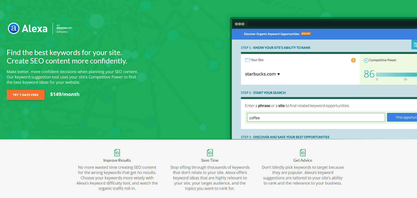
Key Takeaways
- The CTA button shading draws prospect consideration.
- The copy is isolated into absorbable chunks for better understanding.
- A non-hyperlinked logo doesn't permit possibilities to get away from the page through it.
- The headline conveys the advantages and offers clearly.
- Three helpful CTAs cooperate to change possibilities in various areas on the page.
- Elements of the item are accentuated, which is generally a no-no, yet so are their particular advantages.
- The Amazon logo adjusts Alexa to an incredible, notable brand.
- A moderate footer doesn't occupy possibilities from changing over with connections to different pages or social records.
A/B Testing
- The content is very cluttered which does not leave enough breathing space and might leave customers/prospects confused.
18. Geico
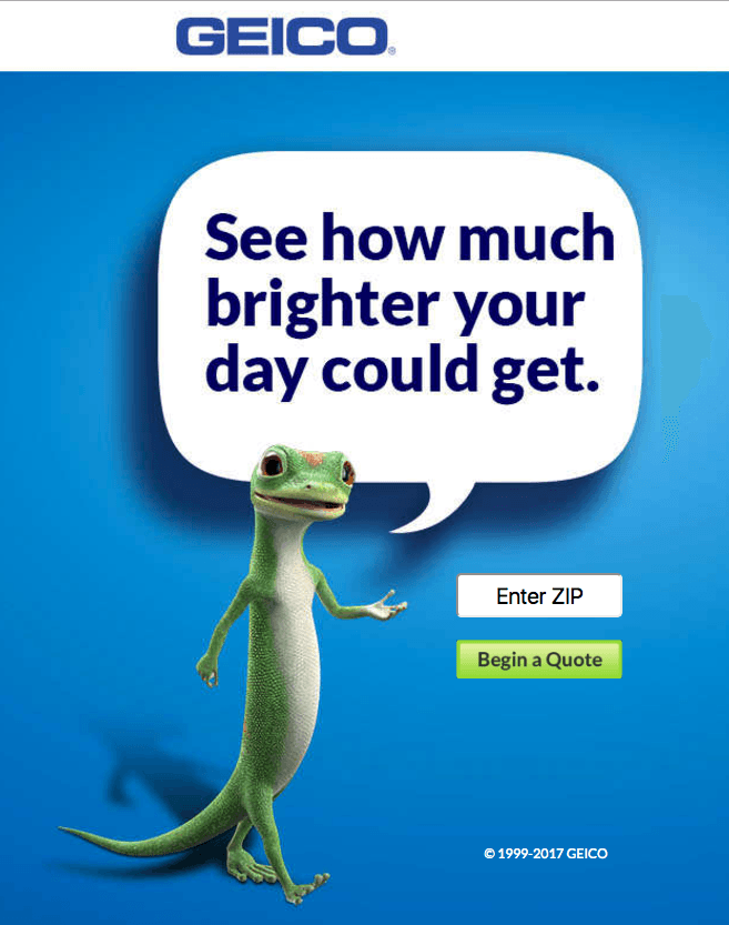
Key Takeaways
- An amazingly short, one-field structure just requests postal districts, and gathers more data later all the while.
- The CTA button is perfectly placed.
- A moderate footer doesn't divert possibilities from changing over with connections to different pages or social records.
- A non-hyperlinked logo will not permit customers to leave the page.
A/B Testing
- “See how much brighter your day could get” the phrase is not necessarily very impactful.
19. Microsoft

Key Takeaways
- The content is centric to advantages that customers will enjoy.
- The bite sized content makes it easy for customers to grasp what Microsoft is trying to convey to them.
- List items offer a skimmable review of the substance of the digital book.
- Text over the structure tells the guest precisely what they need to do to change over.
A/B Testing
- Evaporating dark names inside structure fields can possibly bother and confound possibilities, research shows.
- This logo, connected to the landing page, can possibly draw clients from the page before they get an opportunity to click its CTA button.
- This CTA button tone could be changed to call more consideration.
20. Moz

Key Takeaways
- The feature and subheadline cooperate to frame a solid offer.
- The CTA button shading draws prospect consideration.
- The picture gives an inside investigation of what utilizing the item is really similar to.
- Social verification at the lower part of the page helps prospect trust.
- A moderate footer doesn't divert possibilities from changing over with connections to different pages or social records.
- The content is split into digestible sizes so it is easy for the customers to understand.
A/B Testing
- Since the logo is linked to the homepage it might send the prospects away.
21. Slack
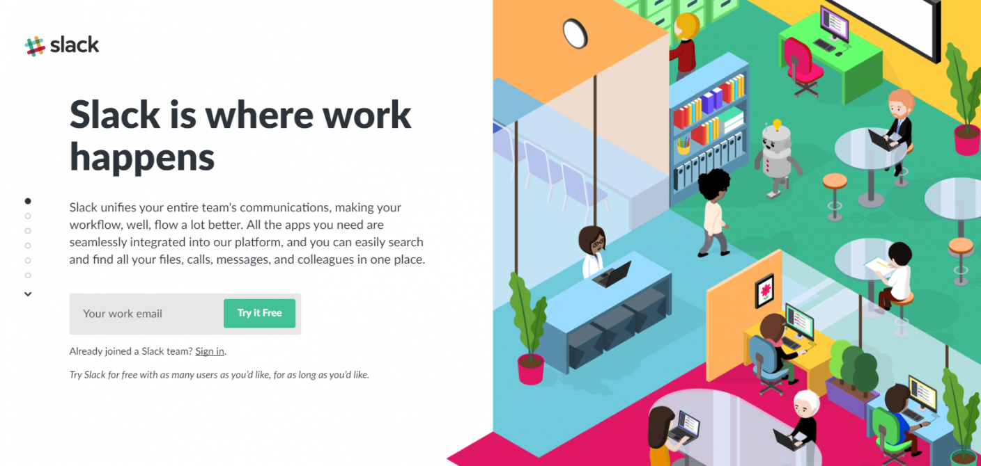
Key Takeaways
- Special looking over style permits all fundamental data to be shown permitting customers to get data without going here and there the page.
- The lead catch structure is reliably present as clients look through the substance.
- Utilization of social confirmation is probably going to cause customers to feel constrained to utilize Slack.
- The CTA button duplicate is convincing on the grounds that it's short, direct, and utilizes "free."
- The pictures are splendid, drawing in, use brand tones, and are applicable to each related segment.
A/B Testing
- There are several links that may lead the prospects out.
- No security strategy may stop possibilities from giving over their email address.
22. IBM

Key Takeaways
- The feature is particular and charming, convincing customers to proceed down the page to get familiar with the offer.
- Giving the alternative to switch languages is an extraordinary thought in principle. Sadly, when customers select another language, they're brought to the landing page rather than straightforwardly interpreting this post-click point of arrival.
- With content in a controlled limit customers takeaway what is exactly that will help them and not what is not required.
A/B Testing
- Header and footer routes could undoubtedly occupy customers from the current offer and send them away from the page without changing over.
- The CTA catch could be worked on as indicated by our post-click presentation page best practices. The tone could be really differentiating and eye catching, and the copy could be more client and advantage centric.
- Adjusting the page by adding a picture or client tribute on the left side would make it all the more outwardly engaging.
23. Lyft

Key Takeaways
- The subheadline fills in as friendly confirmation, telling customers that others have made extraordinary tips working with Lyft.
- Just one field structure mentioning a telephone number is speedy and simple to finish with the goal that it will not wind down many possibilities.
- Leaving the pick in box unchecked settles on up-and-comers feel that the decision is completely dependent upon them.
- "Get a $250 reward" is reasonably a convincing motivator for some possibilities.
- The "Apply Now" CTA button is an anchor label that carries possibilities to the highest point of the page to rapidly finish the structure.
- The adding machine permits customers to decide how much cash they could procure on the off chance that they decide to drive with Lyft.
- The "Why Lyft" segment utilizes iconography and negligible, basic copy to pass on the primary advantages of working for Lyft.
- The "How Lyft Driving Works" slider clarifies how Lyft works utilizing the versatile application.
- "Lyft Insurance Protection" and "Traveler Ratings" give drivers consolation with regards to driving for Lyft.
A/B Testing
- The feature is Lyft versus Uber, yet there's nothing else on the page that thinks about the two administrations.
- The white content doesn't appear against the white logo on the man's shirt.
- Diverting the man's eye stare to the lead catch structure may bring about more customers finishing it.
- The CTA button in the copy, "Next," is more or less exhausting. Transforming it to something really captivating like "Begin bringing in cash now!" would probably further develop change results.
- The pink CTA button doesn't stand apart as emphatically as it could in light of the fact that pink is utilized so somewhere else on the page.
24. Magento

Key Takeaways
- The 1-field lead catch structure is suitable for a free report and likely creates a great deal of transformations since customers don't need to surrender an excess of individual data.
- The CTA button in the copy is applicable to the offer and the red catch shading stands out from the page.
- Client identifications from Coca-Cola and Canon add social confirmation to the page.
- The Gartner quote gives the guest a sneak look of what the report will involve.
- The Magento by numbers segment gives the client a fast preview of the organization.
- Alluring iconography combined with supporting duplicate subtleties how the Magento stage functions.
A/B Testing
- The dark CTA button at the upper right goes unrecognized on the grounds that it doesn't diverge from the dim foundation.
- The feature is novel yet isn't exceptionally powerful. The supporting feature gives more subtleties however it actually talks about Magento. Had it zeroed in on the guest, it may create more changes.
- The included picture is somewhat aggravating. How does a cityscape translated onto a man's body urge individuals to download the report?
- Web-based media catches close to the base give individuals such a large number of approaches to leave the page without downloading the report first.
25. Zoho

Key Takeaways
- The feature quickly offers two advantages to pursuing a free Zoho CRM plan — better client relationship-building and ten free clients.
- "Free" is utilized in a few areas on the page — in the feature, on the CTA catches, and a few times all through the spellbinding copy.
- Different red CTA catches balance well with the remainder of the page, making them stick out and stand out. The primary catch is an anchor label that advantageously takes possibilities to the structure at the lower part of the page.
- The 3-field structure — just requiring name, email, and secret key — lessens rubbing.
- The mouse symbol demonstrates to customers that they should look down the page to see more data. It's likewise an anchor tag, so on the off chance that they click it, they're promptly moved down to the following segment without looking over.
- The not insignificant rundown of provisions passes on all that Zoho CRM offers.
- The 2-venture selected in plan implies less rubbing on this page in light of the fact that there is no structure apparent until possibilities click the base CTA button.
- Illustrating the structure in yellow aides causes you to notice it and likely builds transformation rates.
- The unchecked Zoho pamphlet checkbox implies just really intrigued; high-potential possibilities will get the substance.
A/B Testing
- The handshake picture is pertinent to the offer, however utilizing a photograph of two individuals grinning and shaking hands may be significantly more proficient.
- The CTA button duplicate on the structure, "Join," could be improved. It could even be changed to recreate the copy, the CTA button found at the highest point of the page: "Get started for free".
- The links in the landing page may lead customers/prospects to leave the page when they are close to registering themselves.
26. AWeber

Key Takeaways
- The feature quickly tells prospects that the online class is just 30 minutes in length.
- The CTA button is up front, so customers make certain to see it quickly after arriving on the page. Likewise, the duplicate is elucidating and invigorating, likely reassuring possibilities to click.
- The 2-venture select in plan eliminates the lead catch structure from this page, and prospects possibly see it when they click the CTA button. This implies less grinding and conceivably more transformations.
- Just 3 structure fields — asking essentially for occasion date/time, name, and email — is fast and simple to finish.
- The protection strategy connected at the lower part of the page is probably going to cause possibilities to feel more alright with giving over their own data.
- The emphasized copy tells prospects that regardless of whether they can't go to any of the planned occasions, they can in any case join to get a recording of it.
- The AI headshot and depiction of Tom Tate are pleasant considerations since possibilities can see and find out about who will introduce. Despite the fact that, broadening the picture would most likely build its adequacy.
A/B Testing
- The blue CTA catch ought to be tried in a shading that isn't utilized elsewhere on the page to make it more eye-catching.
- Diverse organizing applied to the "This is what we'll cover" area (indenting the rundown, consolidating iconography or bolts, utilizing intense text style, and so on) would make it stand apart more, uplifting more individuals to understand it.
- Two landing page joins at the lower part of the page might actually divert customers from this page without changing over.
- Counting social confirmation, similar to a client tribute or AWeber insights would probably expand trust in possibilities and transformation rates.
27. Mixpanel
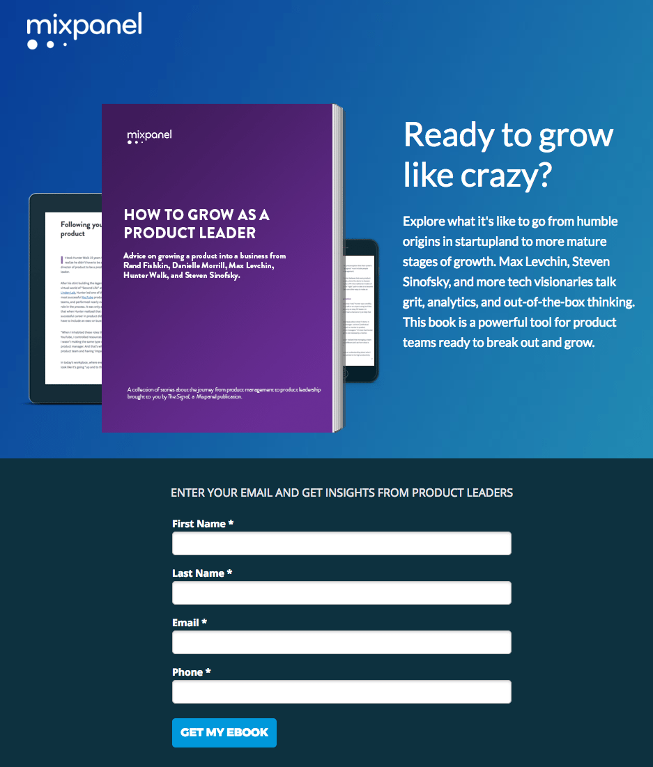
Key Takeaways
- The feature is customized and advantage situated, inquiring as to whether they're prepared to develop their business.
- The picture shows prospects that they can see the digital book on different gadgets.
- The short depiction of the digital book furnishes customers with a concise starting outline of the digital book being advertised.
- The 4-field structure is fast and simple to finish, expanding the odds of customers doing as such.
- The CTA button duplicate uses first-individual, which assists possibilities with feeling associated with the offer.
- The "What's Inside Your eBook" segment explains on the short portrayal referenced above, laying out significant focuses made in the digital book, just as what item pioneers examine them. Counting headshots is additionally a pleasant touch.
- No leave joins make it almost difficult to get away from the page without changing over. The best way to leave the page is by tapping the "X" in the program tab or finishing the structure.
A/B Testing
- The blue CTA button doesn't stand apart on the grounds that it mixes in with the remainder of the page's shading plan. Testing it in a shading that isn't utilized elsewhere on the page may create better change results.
- Adding trust signs to guarantee individuals that their own data will be secure like a protection strategy or security identifications could expand lead age.
- The structure feature is misdirecting. It infers that the possible snippet of data required is an email address when actually, three other structure fields are important to recover the digital book.
28. MailChimp

Key Takeaways
- "Free" in the feature is probably going to tempt customers' curiosity right away.
- The supporting subheadline tells prospects how they can profit from beginning with a free record.
- The 3-field structure is short and doesn't request exceptionally close to home data.
- The secret phrase field further develops client experience by permitting customers to see their entrance by tapping the "show" button. Additionally, the secret phrase necessities are plainly recorded at the lower part of the page.
- No header route and a moderate footer keeps possibilities zeroed in on the objective of the page pursuing a free record.
A/B Testing
- Adding social evidence, similar to a client tribute or a measurement about utilizing MailChimp, would probably produce more information exchanges.
- The CTA button duplicate could likewise be improved to incorporate more customized and tempting language, such as "Make my free record!"
- The straightforward CTA button doesn't stand apart however much it could. Making it more obscure and more differentiating would urge more individuals to click.
29. AirBnb

Key Takeaways
- The CTA button stands out well from the foundation and is solidly in the focal point of the page.
- The headshot adds a unique interaction to the companion who welcomed you to join the help.
- The connected terms give trust to any individual who may be reluctant to join.
- The captivating headline catches customers attention and offers a money impetus directly from the beginning.
A/B Testing
- Adding client tributes to this post-click presentation page would almost certainly convince more possibilities to change over.
30. Casper
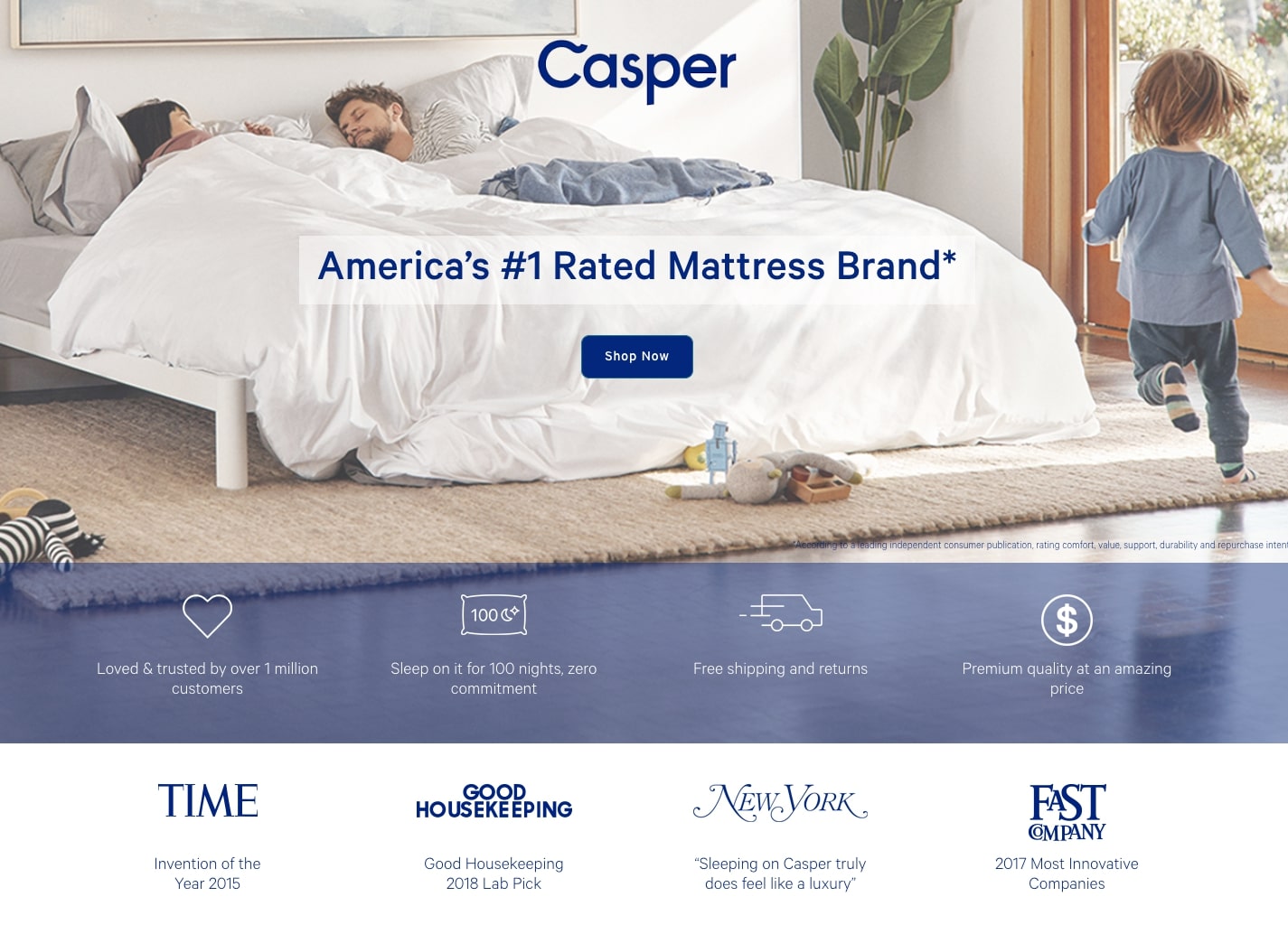
Key Takeaways
- The symbolism has an extremely familiar, family feel which is ideal for the brand.
- The tributes by compelling brands like Time and Good Housekeeping give social verification to the offer.
- Headline speaks to customers why they should purchase from Casper.
- List item duplicate makes it simple to peruse and records the reasons why Casper is the best decision for the customer.
- The client tributes from ordinary individuals promise the client that others like them have likewise appreciated dozing on a Casper sleeping cushion.
- The 100-night hazard free offer adds believability to the page.
- The valuing graph assists the guest with choosing whether they should tap the CTA button.
- The "Shop Now" CTA button stands out from the foundation picture and mentions to the guest what's in store when they click it.
- The telephone number alternative allows an opportunity to customers to get every one of their inquiries replied.
A/B Testing
- The optional CTA button "Discover a store close to you" is incredible for customers who aren't prepared to purchase the bedding on the web without testing it out face to face. In any case, having contending CTA catches on the page implies there are numerous objectives. Not zeroing in consideration on possibly one could restrict changes.
- With a somewhat long page, utilizing anchor labels or obvious signals could convince customers to focus on explicit components on the page.
31. Quip

Key Takeaways
- The feature is clear and to the point since it expresses Quip's UVP.
- The "Get Quip" CTA button duplicate is immediate and tells individuals that they will 'Get Quip' once they click it.
- The picture of the diverse estimated brushes shows the guest that Quip has a brush that is ideally suited for their mouth.
- The large brand surveys by GQ, Time, American Dental Association add believability to the offer.
- Joke's advantages are referenced in isolated page areas with pertinent pictures that add a pleasant visual appeal to the page while clarifying each advantage.
- The FAQ area answers the most well-known requests Quip gets so the guest can settle on a simpler choice.
A/B Testing
- The links on the page redirecting will lead to customers to leave the page.
- The 4.96 rating is amazing, however without referencing where the surveys are facilitated, possibilities might address if the audits are genuine and where they can understand them.
- The light green CTA catches don't diverge from the page however much they could. By planning them a similar shading as the blog pictures at the base, they may not get as many snaps.
32. Dataxu

Key Takeaways
- The client identifications show prospects of some large name brands who have as of now profited from dataxu.
- The 2-minute video is short and tells individuals how long the substance is before they hit play. When clicked, the video shows customers how clients can utilize the product.
- The headline makes sure to convey what exactly Dataxu does.
- The security seals advise customers it's protected to utilize the product.
A/B Testing
- The report offered on the post-click page gives customers an approach to leave the page.
- Adding more blank areas would space everything out better and permit possibilities to burn-through the page content better as they assess dataxu.
33. Upwork

Key Takeaways
- The how-to feature accentuates that by enlisting, the guest will get the advantage of figuring out how undertakings are utilizing the web ability.
- The enormous Upwork logo tells possibilities they're taking tips from a major brand.
- The bulleted format of the content conveys the advantages clearly.
A/B Testing
- The picture in the upper-right corner doesn't identify with the post-click presentation page content in any capacity.
- A 8-field structure might threaten individuals into leaving the page.
- The CTA button tone doesn't contrast a page that as of now utilizes a ton of purple.
- The CTA "Register" is mediocre and could be made bigger.
34. UserTesting
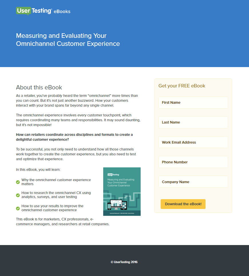
Key Takeaways
- "Free" underscores the no-cost offer.
- The splendid catch shading draws prospect consideration.
- The picture fills in as a visual portrayal of the offer, showing customers what they'll get in the wake of changing over.
- The bulleted format of the content helps to convey the message clearly to the customers.
A/B Testing
- A protection strategy or trust identifications might make customers more alright with changing over.
35. Act

Key Takeaways
- The content gives a review into the substance of the digital book.
- The logo isn't connected to the landing page, which implies customers can't escape before they convert.
A/B Testing
- Two battling suggestions to take action reduce the transformation pace of one another.
- Huge loads of text make this page scary to pursue.
36. WordStream

Key Takeaways
- "Free" appears in two changed post-click greeting pages, stressing the no-cost nature of the offer.
- The bulleted format of the content makes it easy for customers to understand all the advantages.
- The CTA button shading flies on this present page's experience.
- The “Now” in the CTA profits by our longing to get prompt answers for our issues.
A/B Testing
- Two diverse connected logos in the header fill in as outbound ways out off the page.
37. Percolate

Key Takeaways
- The CTA button shading contrasts the white page well.
- A few helpful CTA catches cooperate to change over the possibility.
- The source of inspiration is customized to the offer. It peruses "See Percolate" rather than something cutout like "see demo."
- Scaled down content makes perusing this page simpler than if it were canvassed in block text.
- Screen captures from inside Percolate give customers a thought of how it functions.
A/B Testing
- Various connections in the header and footer fill in as ways out from the page, permitting possibilities to leave before they convert.
- These tributes are given by anonymous clients. Without names and titles or photographs, they're less valid to perusers. Guests need to choose whether they accept these were really composed by Percolate clients, or by the Percolate group themselves.
38. Oribi

Key Takeaways
- The headline and the subheadline together pass on the advantage of changing over.
- The picture gives an inside investigation of how the dashboard really looks.
A/B Testing
- "Free" is truly underplayed here. In case you're offering something free of charge, let possibilities know in intense letters - in your feature, your copy, and your CTA.
- The Blog and About us joins allow guests an opportunity to leave the page.
- The CTA button is blue with Facebook marking, so the remainder of the page may profit from a shading update that isn't equivalent to the catch.
39. ThriveHive

Key Takeaways
- The feature presents an important asset.
- The bulleted format of the content makes it easy for customers to understand all the advantages.
- The CTA button shading isn't utilized elsewhere on the page.
- Grandstand grants acquired by the organization.
- The picture fills in as a visual portrayal of the offer, showing guests what they'll get subsequent to changing over.
- A short structure makes changing over on this page simple.
A/B Testing
- The CTA "Download" is nearly just about as exhausting as "Submit."
- The "Free Plans Here" CTA at the highest point of the structure is somewhat aggravating. No point to have two CTA on the same page.
40. Flywheel
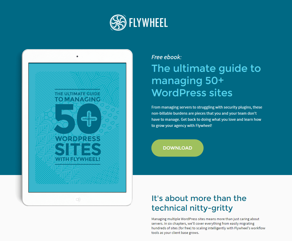
Key Takeaways
- The picture gives an inside investigation of what perusing the asset is really similar to.
- The CTA button shading flies off the blue foundation.
- Two helpful CTAs cooperate to change the possibility.
A/B Testing
- There could be a better CTA than “Download”.
41. Masterclass

Key Takeaways
- The headline uses the authority of notable screenwriter Aaron Sorkin to drive more customers.
- The CTA button in red is popping off the page.
- The "Take the Class" CTA is prepared to click.
A/B Testing
- Since the page has other links it might lead prospects to leave the page.
42. Propel Marketing
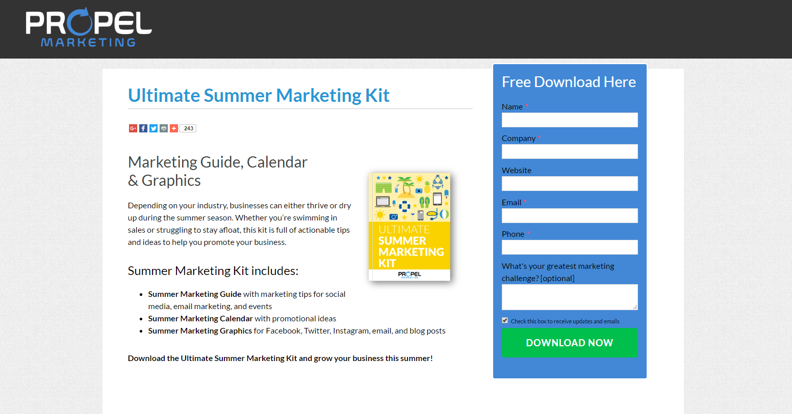
Key Takeaways
- The headline clearly conveys all the values to the prospects.
- The CTA button shading flies on this present page's experience.
- “Now” in the content compels customers to hit the button.
- Bulleted format of the content makes content easy to understand for the customers.
- The picture fills in as a visual portrayal of the offer, showing guests what they'll get subsequent to changing over.
A/B Testing
- An excessive number of online media connections that can take customers off the page.
- They can be more creative with the CTA button.
43. Problogger

Key Takeaways
- The headline and the subheadline conveys the message clearly.
- The "Yes Please" CTA button utilizes a brilliant shading to draw consideration.
- A two-field structure makes changing over straightforward for possibilities.
A/B Testing
- The yellow colour of the text makes it difficult for the customers to read the text.
44. Lurn

Key Takeaways
- The headline conveys a clear message to the customers.
- This CTA button shading flies off the page, drawing prospect consideration well.
- This CTA is written in first person, to make believe that if I were you I would go for Lurn.
- A bolt fills in as a visual guide to direct the possibility's eyes to the CTA button.
- Tributes from notable figures reinforce the convincingness of this post-click point of arrival.
- "Free" stresses the no-cost nature of the offer.
A/B Testing
- This bustling footer gives prospects excessively numerous approaches to forsake the page.
45. Munchery

Key Takeaways
- The headline conveys a clear message
- The foundation picture is delicious and applicable to the offer.
- Almost 900 Trustpilot client surveys assist the guest with choosing whether they should arrange from Munchery.
- The client top picks area gives guests a look of what sort of suppers they can anticipate from Munchery.
- The $20 off identification urges guests to make a move and request food.
- The multi-step structure assists guests with finishing the sign-up measure.
A/B Testing
- The $20 off coupon could stand out enough to be noticed in the headline.
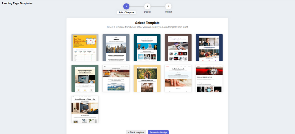
Manage Your Landing Pages with Deskera
With the above examples we have understood that there are a lot of elements to take care of in a landing page, both while designing it and even after you have designed it. So, to do this Deskera CRM+ helps you with just that.
Deskera CRM+ is a software that has a special section dedicated to landing pages. This section is designed such that it will help you throughout the process of designing, launching, tracking, and optimizing your landing pages.
Deskera CRM+ comes with some pre-installed landing page templates that you can use or you can even choose to design your landing page from the start. Both of these options are supported in the Deskera CRM+’s landing page module. This will ensure that you can create beautiful and professional-looking landing pages that generate leads without the help of any designers or IT professionals.
With Deskera CRM, you can enhance your business productivity by facilitating the automation of your email marketing strategies. Deskera is based on a cloud system model that can help to fulfill all your business needs. Be it data integration, or real-time analytics, Deskera can help you in every aspect.
Deskera CRM is the best platform that can help you with contact and deal administration, sales pipeline management, email marketing campaigns, to name a few. Not only this, but you can also generate leads for your business by creating email campaigns and view performance with detailed analytics on open rates and click-through rates (CTR).
Deskera CRM Plus can help your business by providing you with landing page building templates for your business. Deskera CRM helps small businesses get more from each landing page you create. It lets you build and optimize landing pages that prompt you to improve conversions for your business and increase your sales and revenue. The lead magnets will help generate better responsive landing pages.
Deskera CRM Plus provides you with the tools and templates to build customized landing pages as per your business. It provides you the option to modify images, text, customer sign-up form, embeds custom, HTML, and lets you monitor your website visitors’ behavior. Using the website and landing page analytics, you can understand your customer's psychology and improve your sales.
Having a focused sign-up landing page, your business will be able to increase its customer database and will help you retarget your existing customers and also manage customer deals and sales funnel better. Managing your customers using a good CRM system, will save your business a lot of time and money in the long run.
We hope this helped you take inspiration, ideas on landing pages, and how Deskera makes one-shop-stop to get your landing pages up and running.
Related Articles